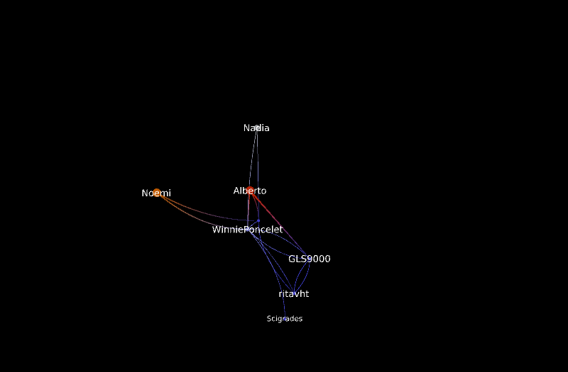
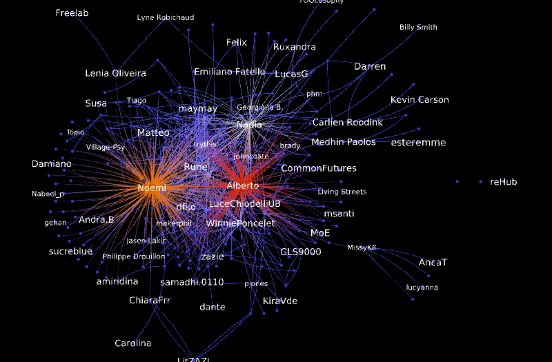
And this is OpenCare as a whole. The visual identity of nodes is preserved by keeping them in the same position across the two graphs. Color means degree, with redder nodes being more connected.
Reference to reading conversations in opencare as networks
Hi guys, some of you who are part of OpenInsulin project may not know about opencare too much, so here’s a little context: Edgeryders is involved in a 2 year participatory research called opencare, on alternative solutions to health and social care problems, the big systemic ones - access, affordability, inclusivity of state provided or private services. In these two years we are discovering projects like yours, and connecting people into a community.
The research also includes building software to visualize the conversations happening here online in graph formats *with the help of University of Bordeaux (@melancon can offer extra details if you ask him!). Some of the graphs can show nodes/ dots as people in the conversation and how they are related - who’s talking to whom and how much, other, more advanced visualizations play with semantics based on what ethnographers code from our online conversations. These semantic network graphs can tell us what are the things being discussed, which are more central in the global network, which associations of topics are more relevant to participants, and so on.
They all support collective intelligence: us talking with each other and generating new knowledge that can be more sophisticated but also more actionable (i.e. at the policy level) than what any of us can produce individually.