How to read and interpret data?
As we at NGI Forward watched SARS-CoV-2 cut into our worlds, we felt the same as everybody else. We feared for loved ones, and for the long-term freedom and prosperity of our societies. We felt powerless, and anxious in the face of uncertainty. We still do.
But, at some point along the way, we realized there was something we could do. We have in our midst a team of data scientists. When the pandemic hit, Kristof and Michal were analysing trends in the evolution of Internet technology. Theirs is a big data method: they do text analysis on large repositories of academic papers, news articles, social media. We realized we could use the same method to investigate the virus and its companion illness. It would be like redirecting our searchlight onto a new target.
So we did that. In the space of only a few weeks, Kristof and Michal came back with results, neatly arranged in an interactive website . And that’s where we need your help.
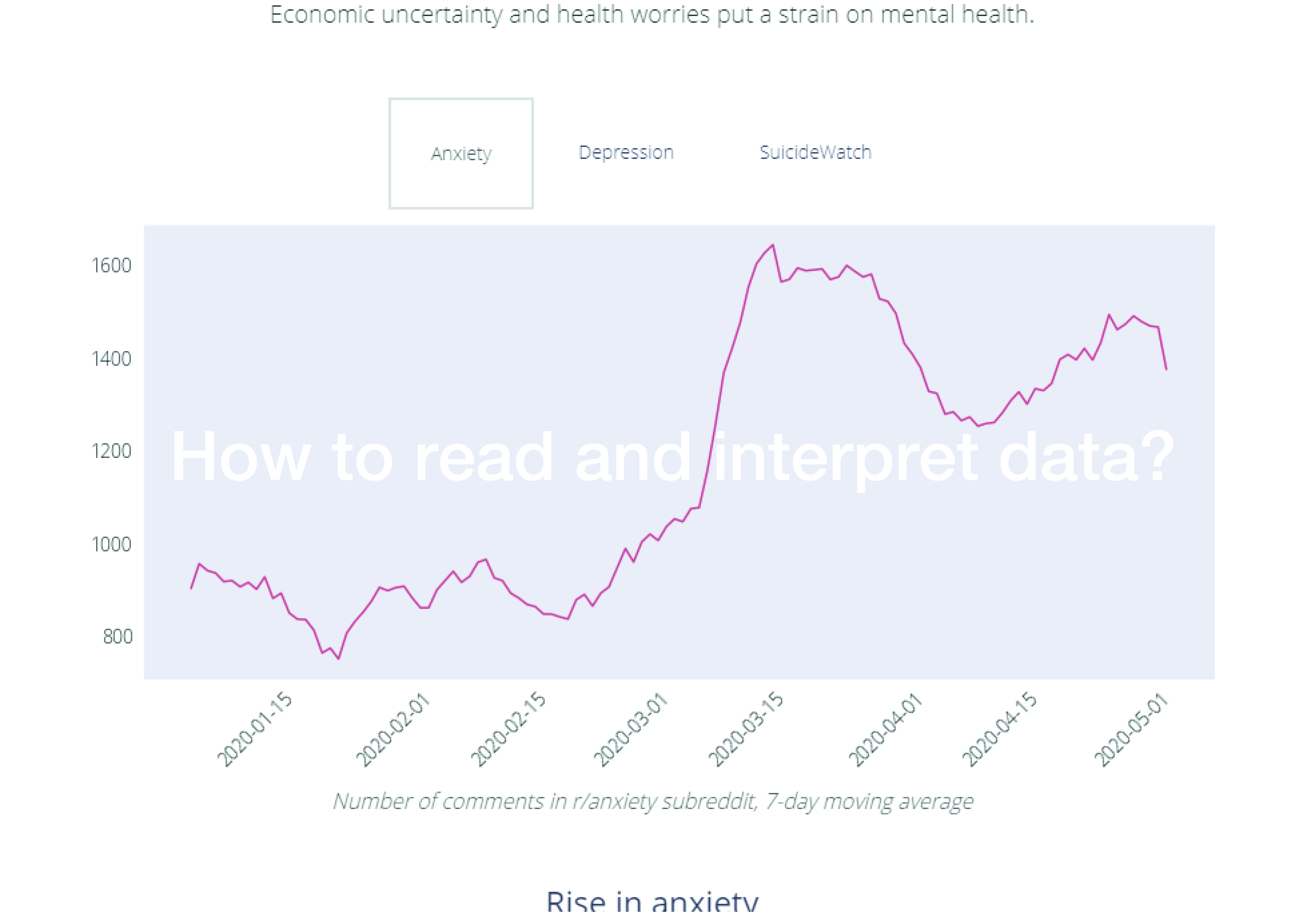
Here’s the thing: this type of analysis scales well, but its results are not easy to interpret. We can see, for example, that technologies associated with the pandemic fall into four groups: remote work, medical, social distancing, contact tracing. This makes sense at first sight, but what does it mean? That people are using these technologies a lot? That researchers are working to improve these technologies over others? Or is the result an artifact of the way we look at the data? Is there a way that we can determine if there are obvious gaps in our technological arsenal? If we found any, we could look into investing to plug them.
This type of analysis becomes much more actionable when you provide context to it. As I pored over early results, I could not help notice a positive sentiment for PEPP-PT. Except that, in the very same days, the PEPP-PT consortium had collapsed due to the withdrawal of several research institutes over privacy concerns. Before the collapse, I might have interpreted the positive sentiment as validation. “Look, the tech community likes this protocol!”. In the light of the collapse, it made more sense to read it as naïve enthusiasm, or even spin. A possible interpretation could be: “it is a good idea to let the community poke holes in any specific solution before we endorse it”. Another one is: “scientists and engineers are still humans. In a crisis, they reach for a solution, and want it to work. Their critical abilities are, for a time, weakened.”
In sum, we have a large trove of data on COVID-19, which seems to hold important knowledge, if we could just unlock it. So, we propose an experiment. Let’s get together (online), and question the data. Let’s look at them, turn them around in our heads, interrogate each other on their possible meaning. Let’s formulate hypoteses, and see if we can think of ways to test them. Kristof and Michal can transform them into queries and visualization in real time, or close enough. In other words, let’s augment big data analysis with collective intelligence methods. It will be a way for us to learn more about both COVID-19 and this particular big data methodology.
When:
3rd of June, 5 PM CEST.
How to join:
Follow this link to sign up:
https://zmurl.com/ngicovid
We will record this webinar for research purposes. You can find more information here: Edgeryders Calls and Webinars? - PARTICIPANT INFORMATION SHEET