A while back, @marina, @matthias, @felix.wolfsteller and I had an interesting discussion on the possibility of using Gource to visualize “in one breath” the (now) over eight years of Edgeryders, closing in on 70,000 posts by 2,500 of the 6,000 registered users. The idea matured for a while, and then suddenly last week I made this:
Here’s what you are looking at:
The story of Edgeryders is compressed in under 3 minutes. Well, part of it: I am still missing all of the Knowledge Collection category. The visualization shows about 40,000 posts, two thirds of the total Edgeryders conversation.
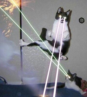
Nodes in the network represents post. Each post is shown as a “leaf” of a “tree” that branches our from the top-level category, to the sub-category, to the topic. Posts that reply to no one in particular are shown as attached to the topic; a post that replies to another is shown as attached to the it. So, long sequences of replies are represented as long chains unraveling from the topic.
Color coding is like in this platform. So, for example, Campfire is shown in red.
Users are shown as avatars zooming around the conversation graph and adding posts to it. The action of adding is represented by them shooting a green beam on the part of the graph where they are creating the new post.
I find it beautiful. Among other things, it is a powerful reminder of what can happens when you treat conversations as data. But what does it mean?
If I squint at the video, and I recall all these years of engaging with this online community, I can see a story that goes more or less like this:
Late 2011: Edgeryders is born mostly as a collective blog – Campfire is the first category to start developing.
2012: very soon, common initiatives start emerging from the interaction on the blog. They are moved on to Workspaces (in gray); for example, each community event becomes a workspace ( we used to call them Living On The Edge: LOTE1, LOTE2, all the way to LOTE6). Some of these nodes are orange, reflecting the early reflections, the color of the Edgeryders company workspaces: a company does not yet exist, but we are starting to think we should make one. The dark blue of the Autarky Lab also appears, reflecting an aspiration to resilience and self-sufficiency.
2013 and 2014: the Edgeryders company is born. More workspaces arise, including the unMonastery and Spot The Future, the very first paid Edgeryders project (thank you @elami5 for the opportunity!). We also start to talk about research (the gray-green of the Research Network), and to share advice for making small companies (the smaller orange-and-grey component of OCI Lab).
2015: we start to publish structured wikis as reference to our methods for Collaboration (in green) with one another ; also, a Culture Squad (purple) assembles and starts to interact. Projects continue in the workspaces.
2016 and 2017: these are the years of OpenCare. You can see it flashing like crazy the Workspaces graph.
2018: all the newer clusters strengthen, especially EarthOS (dark blue), where the extant #autarky conversation sprouts two new projects: The Reef and the Sci-Fi Economics Lab. Also the work on Collaboration becomes more structured, reflecting better collaboration practices in the core of the Edgeryders community and company.
2019: two new large projects come to life: NGI Forward, in turquoise, and POPREBEL, in light blue. The EarthOS cluster grows further, as we launch new projects and revamp extant ones in the second part of the year.
Ok, so that’s me, at 1.14 in the night after spending the day tweaking the code to make these videos. But what about you? This is, after all, your story, as well as my own.
Do you see anything in the video that looks interesting and you would like explained? Do you have a different story to tell?
Should we even use this language to tell the story of our community? I find it poetic, all these little Monopoly pawns moving around and creating a gigantic conversation graph… but maybe you will find it weird, or too abstract.
I am grateful for any feedback. I plan to make a better version of the video, and it will help me very much.
It would be very interesting to add the Communites platforms too. Since the user accounts are preserved among the platforms, the data would for all intents and purposes look the same, no? It would be interesting to see what the difference is in cross-pollination between communities of users that “live” in different categories on ER vs. between communities of users who live on the different communities platforms.
Yes. Unfortunately, there are no visualization options for users that I can see, so you are down to try to perceive the pawns shuttling across the different community graphs. Gource is open source, but written mostly in C++, so not a good idea to tinker with it. We can tinker with the log file to our hearts’ content, since that is generated by my code.
Wouldn’t you see it by looking at the green lasers? For example, looking at the cross-fire between Biofabforum-clusters and the Edgeryders-clusters. As I understand it the pawns sort of hover around the space where they are most active, no?
Would be possible by introducing one more layer in the content hierarchy of what Gource is fed. Then it would be: “Community → Category → Subcategory → Topic → Replies”. I think @alberto might have misunderstood what you want to show?
There’s this interesting effect now of seeing Gource at larger scales, where people become too small to see and observing the day-to-day stuff happening becomes meaningless. But visually it’s still easy to see patterns … which human visual cortex is made for … and to observe the “order” that is emerging from the far-too-many detailed interactions.
Haven’t seen Gource being used at this scale anywhere so far (and I’m amazed the software did hold up so well doing that work).
The animation came out much better than I thought. Great work @alberto
Dates can indeed be formatted.
For labels, as far as I know there is no way to control them separately. There are three options: keep them all, all the time; hide them all; and make them appear when the node is created, and fade later. This last option will make also appear the labels of the parent nodes, including the categories.
Unfortunately, at this scale and speed (1 day => 0.05 seconds) the third option still looks super messy. If you are visualizing one category (~ 2,000 posts, 1 day = 0.1 seconds) it is doable, though some of the paths looks really ugly (catname/subcatname/1234/5/6/7/8/9/10/11 or so).
Any feedback on the Edgeryders stories we could tell with these data? (“Hey, I can see when @johncoate started his monster “Status report” topic!” and similar)
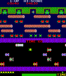
Very cool! Looks like an 80s arcade game, or cell division.
I’m interested in parts where sections go from more shapeless forms to more self-contained, solidified communities. Does that always/only happen through the introduction of projects (e.g. Open Care, Spot the Future), or are there examples of it occurring more organically?
As for those projects themselves, are there moments where they solidify or increase more dramatically, and is it possible to understand why or how?
If nothing else, it’s definitely a cool visual that elicits an affective response from me. All these people coming together and creating stuff.
I got a bit emotional. Thanks @alberto, it’s really wonderful.
Interesting choice of sountrack :-))
Especially because the active conversation are glittering so powerfully - with a different coloring of the background, it makes me think of the star system. We sometimes said we are working in ‘constellations’ - I think this fits nicely.
The things I noticed:
the 2 big projects in 2014: when unMonastery drifted off and Spot the Future picked up
the diversification in 2015: Nepal, Romania, Future Makers and beautiful stories…
2016 - Workspaces showing how much more specialized conversations became - you pointed it too in your description. But they float together somehow.
2018/2019 were also the years when they grow apart. I believe none of us could keep track anymore of everything going on. I see the constellations flowing freely at that time, it’s liberating in a way
More cell division, since 1980s arcade games looked like this:
Nodes are posts. They are added onto topics, which in turn are part of categories. In Edgeryders we are very action-oriented, so lively discussions tend to lead to “why don’t we do X?”. When a discussion becomes large, it receives its own category, and that’s when you see these “blossomings”.
That’s the holy grail, is it not? I guess we would need to start with smaller viz of individual projects (example), and make hypotheses: “We had a successful event in Warsaw in September, we should visually detect a “blossoming” of the conversation tree between August and October… look, there it is!”. Dataviz: telling stories with the data.
For you personally. @amelia, and the mighty @leonie and @ccs: we should be thinking about ways to use Gource to represent coding. This is not intuitive at all, for reasons connected to the high specificity of Gource. But for example, we could represent annotating as an edit to a node (supported in Gource: it shows a different-colored “laser beam”). To keep a visual record of the annotated node, we could create a second node representing the annotation, and assign to it a different color (this, would show also an extra green laser beam. Oh well.). In the end, the conversation graph would be a set of (say) green beads representing posts, interspersed by (say) blue ones representing annotations.
Another possibility is to represent annotations and codes as separate root branches. Instantiate codes as if they were topics; and annotations as if they were posts. Visually, you should see if some codes occur a lot (many annotations-nodes clustered around the same code-node). The main constraint is this: Gource can only deal with acyclical graphs (trees). So, we cannot watch the code-code network (or the social network) form in real time.
When we were working together at The Reef you were brute-forcing your graphics board to render in real time, which it could not do (n x 10ˆ4 objects to animate). In this case, I chose instead to output each frame to x264 codec. When you open the resulting file with an MP4 player, it runs smoothly.