I am building a landing page for would be LOTE5 participants to give a quick and easy way to understand what is going on, why it makes sense to get involved and a simple form to submit your story to secure a ticket, or schedule an interview with someone (and then get help turning it into a story to secure a ticket). What is still missing are:
Round icons to replace the template ones I put in. Especially one icon each for: “interview”, “story”, “session”. I am using nounproject.com as the source of the icons design files which I then set against a monochromed round background.
A proper form to replace the template I put in
A block for featured speakers ( high resolution photos + names + 1 paragraph introducing the speaker and the name/topic of their talk or session.
Very nicely done, Nadia. I thought there’s a chance that people who want to submit a story won’t necessarily have a session in mind, and the other way around. So I took the liberty to set those fields in the form as non-mandatory.
I’ve set up a content experiment using google analytics to see which one is more successful in driving signups. So now we need to have an intensive 2 week campaign to drive a large number of visits to the landing page for LOTE5 to be able to determine which version is better. Then we choose the winning version.
The only thing to fix on the new version of the langing page is to make it clearer that you need to be signed in. And a link to where you can sign up if you don’t already have an account. Can you fix?
We just need to add the menu block to it. @Noemi maybe can help with that? I need to re-focus on partnership building now.
BTW one of the challenges we have with the workspace is notifications initially. I think we need to onboard each new team member one by one explaining how they can set their notifications at the right level for them (maybe in the confirmation email you get when your membership is confirmed…
Menu added. As far as I know users don’t get a welcome email when they join teams. Maybe now that teams are growing each team coordinator should craft a message. Or we can just include this in the next newsletter… which by the way I’ll need to work on.
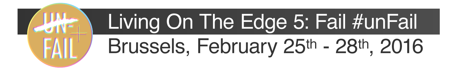
Thanks Rossella, me I don’t mind either, but Nadia was saying we should get rid of the logos of AH and ER. So maybe just one with the event logo + name and dates? Natalia was saying elsewhere we need to have the dates up and visible. (25 - 28 February 2016)
Oh, my bad, I had misunderstood this! Here is a couple ideas with only the LOTE5 logo and the dates, I added Brussels I guess it’s also useful information. If the venue is already known, it might be good to add that too?
I have one problem, can’t define the font size exactly. I read in the instructions that there should be no more than three font sizes on a page and I totally agree with that but working on a different place I’m not sure how to keep this under control on my side, if I make an image for the header, the text will resize when the image is uploaded in a different size. Any suggestion how to solve this?