----------------------------------------------------------- fold-----------------------------------------------------------------------------
Reword and trim menu?
Lots of pairwise overlap between “About”, “Company”, “Services”. Perhaps it is unavoidable… let’s see.
I propose:
- Vision: the vision + business model. Open consulting, community + corporate shell, values etc.
- What we do: a list of services provided.
- Who we are: legal status as nonprofit, management team, governance.
- What clients say: as we collect three raving reviews from clients (Global challenge, Matera, UNDP?) we put it in there.
- Contacts: this one is clear.
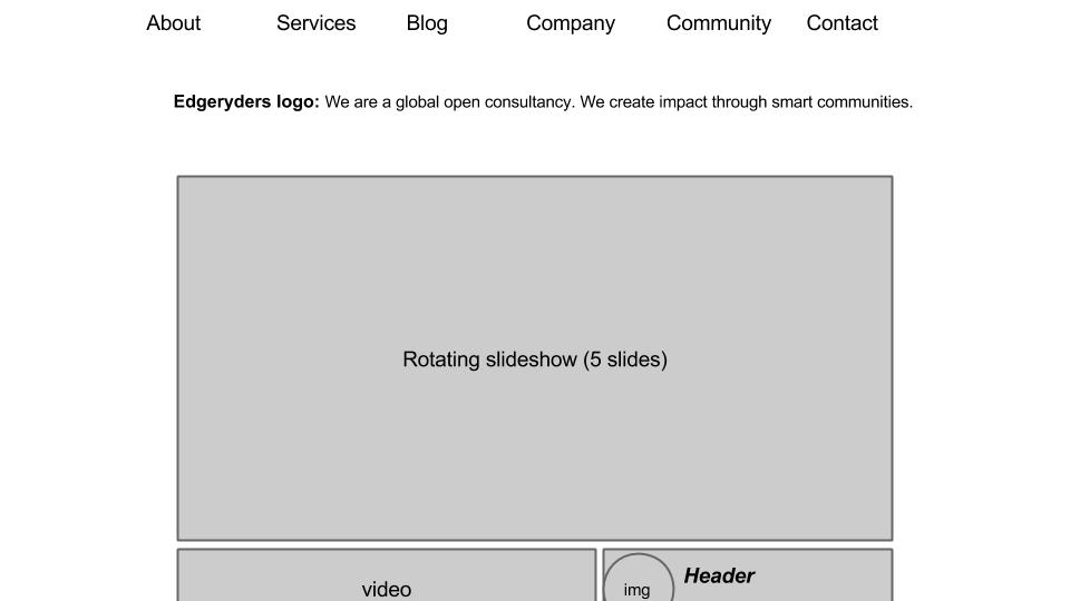
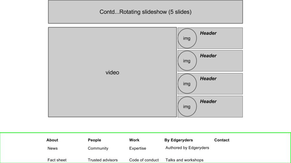
I would scrap the blog as a menu item and limit ourselves to displaying posts on the home page (bottom right, next to the video). The function of these posts is simply to provide variety to recurring visitors, conveying the idea what we are buzzing underneath the surface.
What does everyone think?
1 Like
Works for me