Hi everyone,
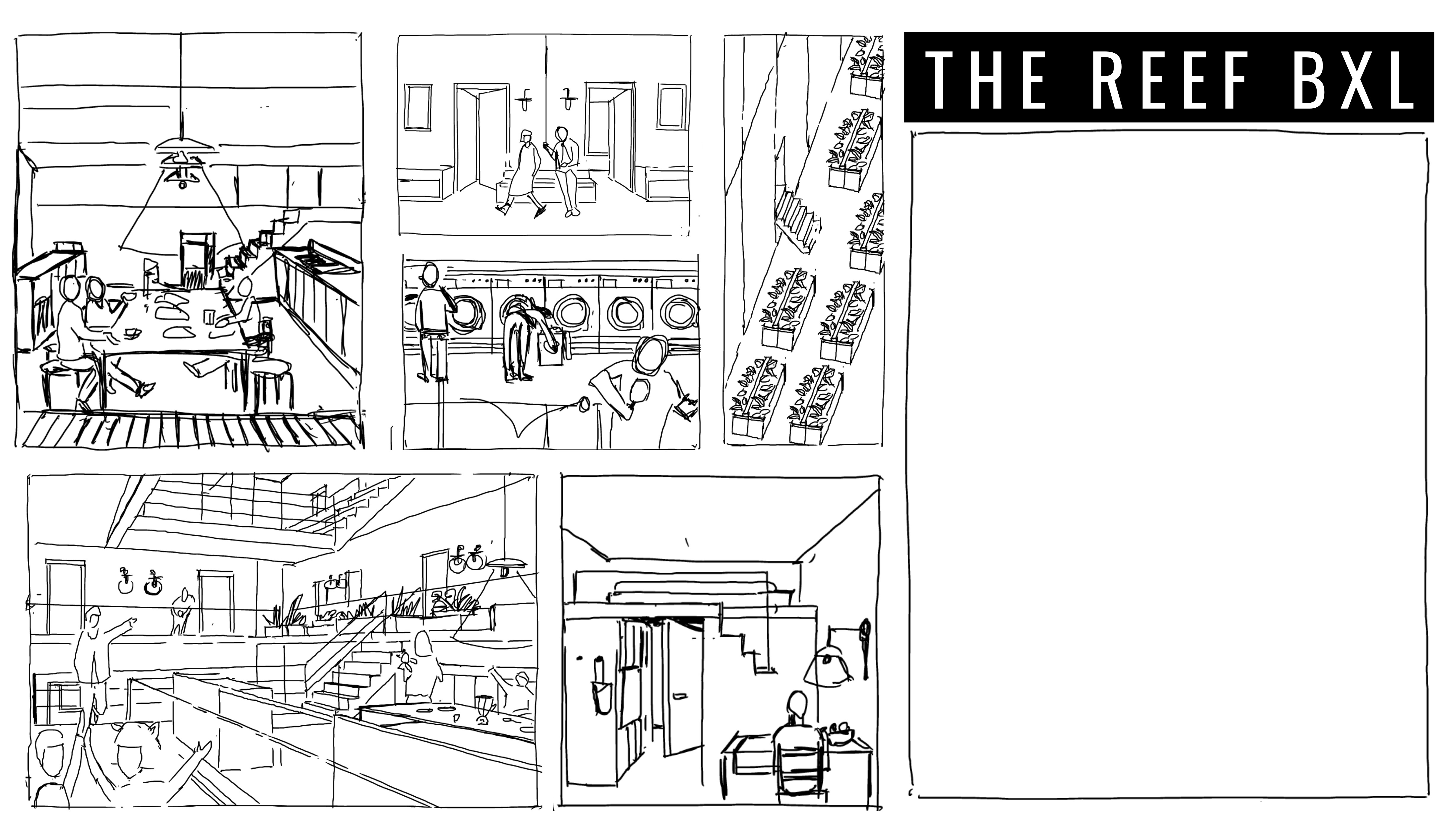
@alberto and @lee approached me about visuals for the reef to use on website, event flyer etc. So I though I would share the first sketch with you and see what everyone thinks…

Hi everyone,
@alberto and @lee approached me about visuals for the reef to use on website, event flyer etc. So I though I would share the first sketch with you and see what everyone thinks…

Hi @nadia,
Thank you so much! To me it looks really beautiful!
Is there any more specific feedback that you need from us?
is there any specific activity or scene in the house that you want to convey?
Maybe the common garden and some children playing would be a nice to have?
@nadia if you or any reefer can take panopictures by a smartphone app of each room and send the files to me i could create and share with all of you a virtual tour. Tiny planets are also intriguing as in this example shot at the Rose garden in Rome
Thanks, Federico, but there are no rooms. The Reef is still on paper. 
its a really nice idea though!
Thank you @nadia, hello @reeflings
Wow, creativity abounds!
I think an additional image of ‘circle practice’ (the community meeting for deliberation) would be nice.
thank you ! this looks really nice . good work, if we are going to include this in the printed flyers we need this illustration ready by 14 march latest  . merci!
I don’t know if it’s possible but we need a banner for the facebook event. in case we can deliver the illustration also in banner size, just open wishes
ok sure no problem
Hi @nadia,
Ideally the Facebook event should go published a bit sooner if possible.
Would you have something that you feel artistically comfortable with that we could use in the meantime, or would you rather not?
So the idea is to just have some graphically appealing visual to create a Facebook event. The event will then link to The Reef’s website, where people can find a registration form.
end date
when do you need it by?
Aha. Then do this, please:
Thanks!
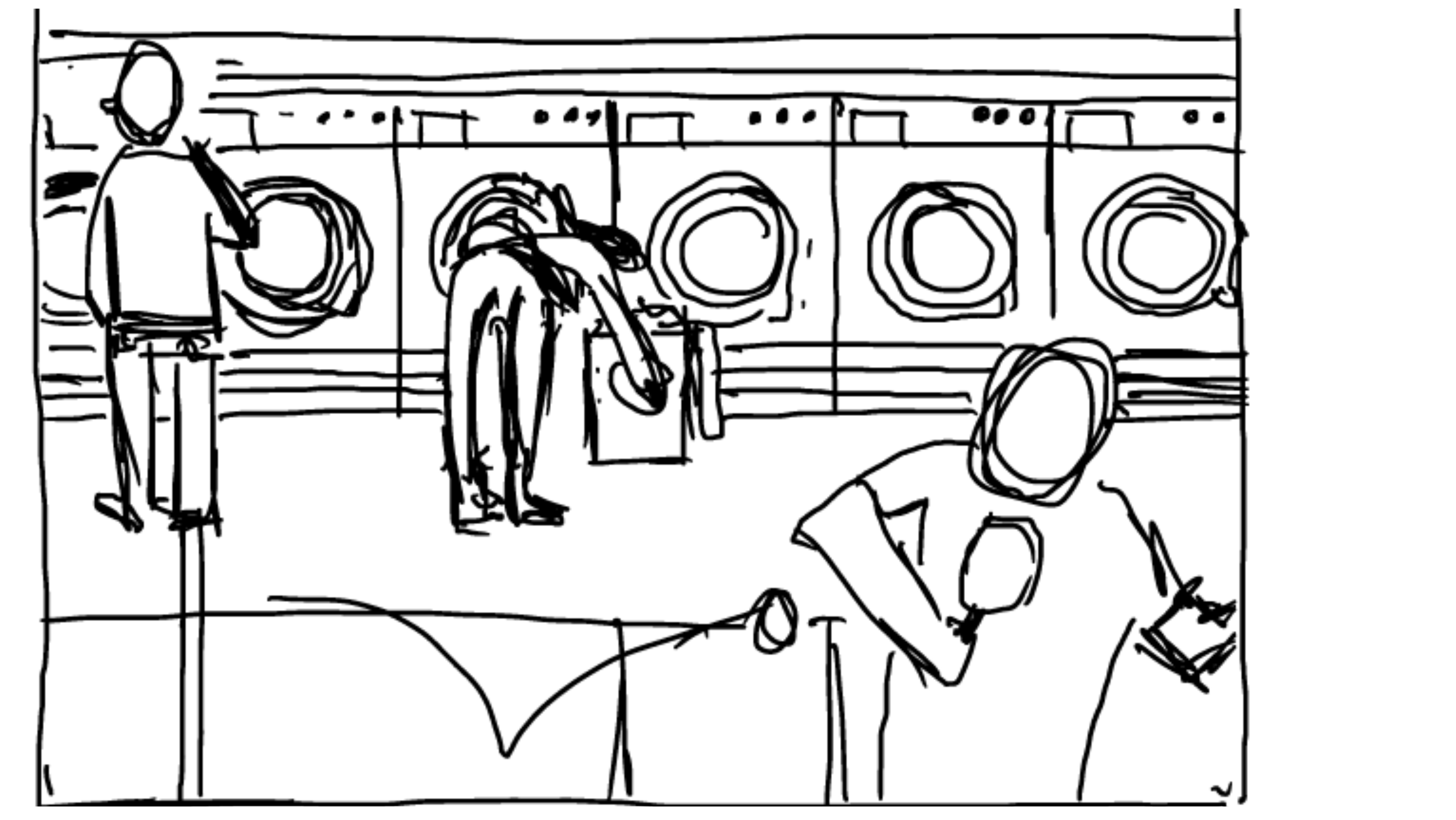
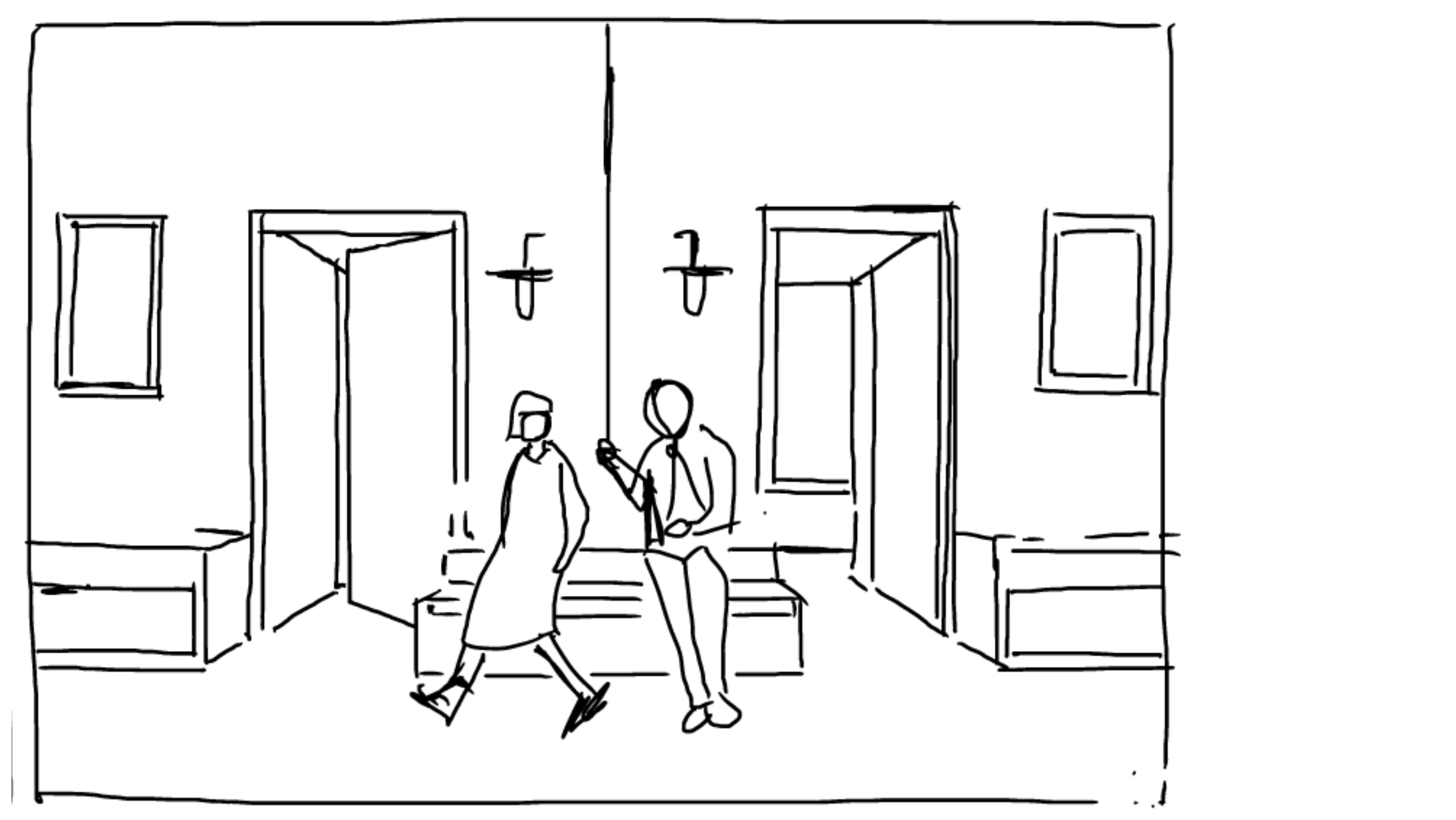
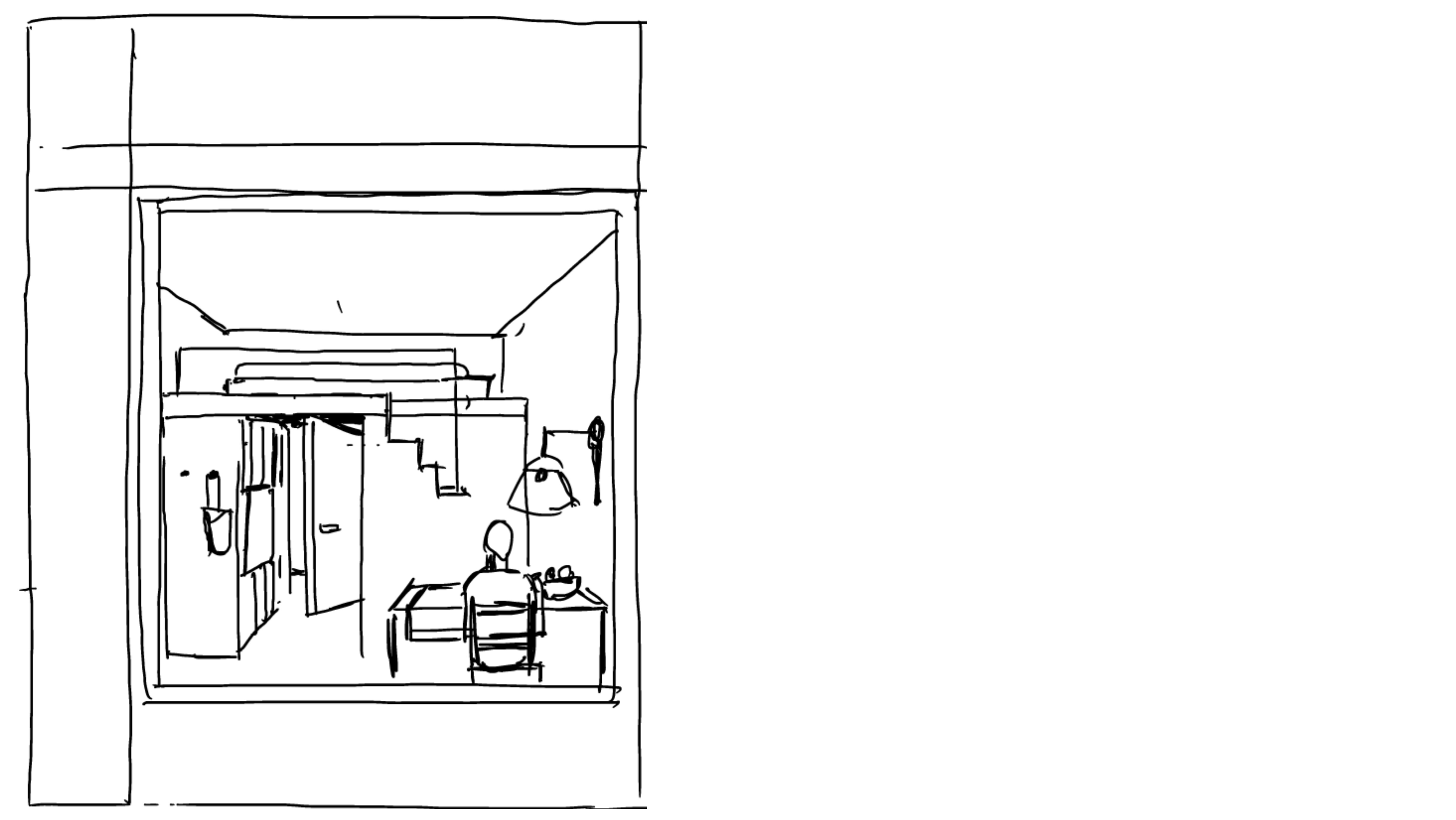
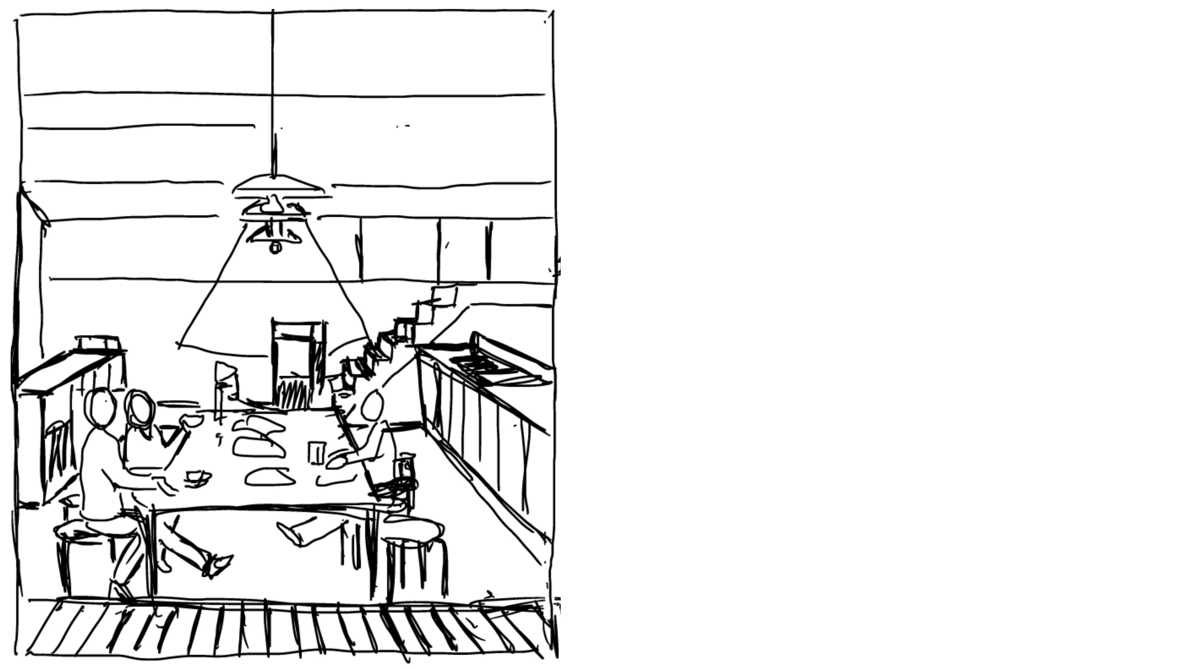
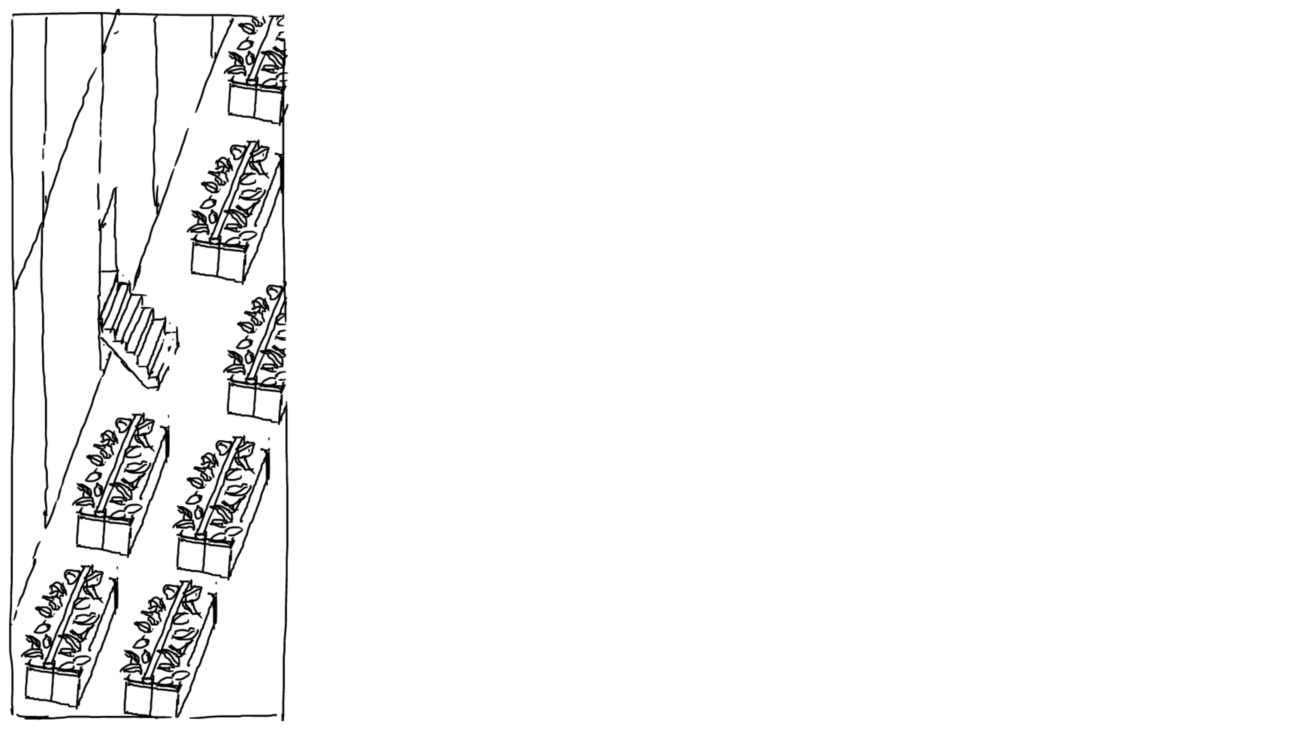
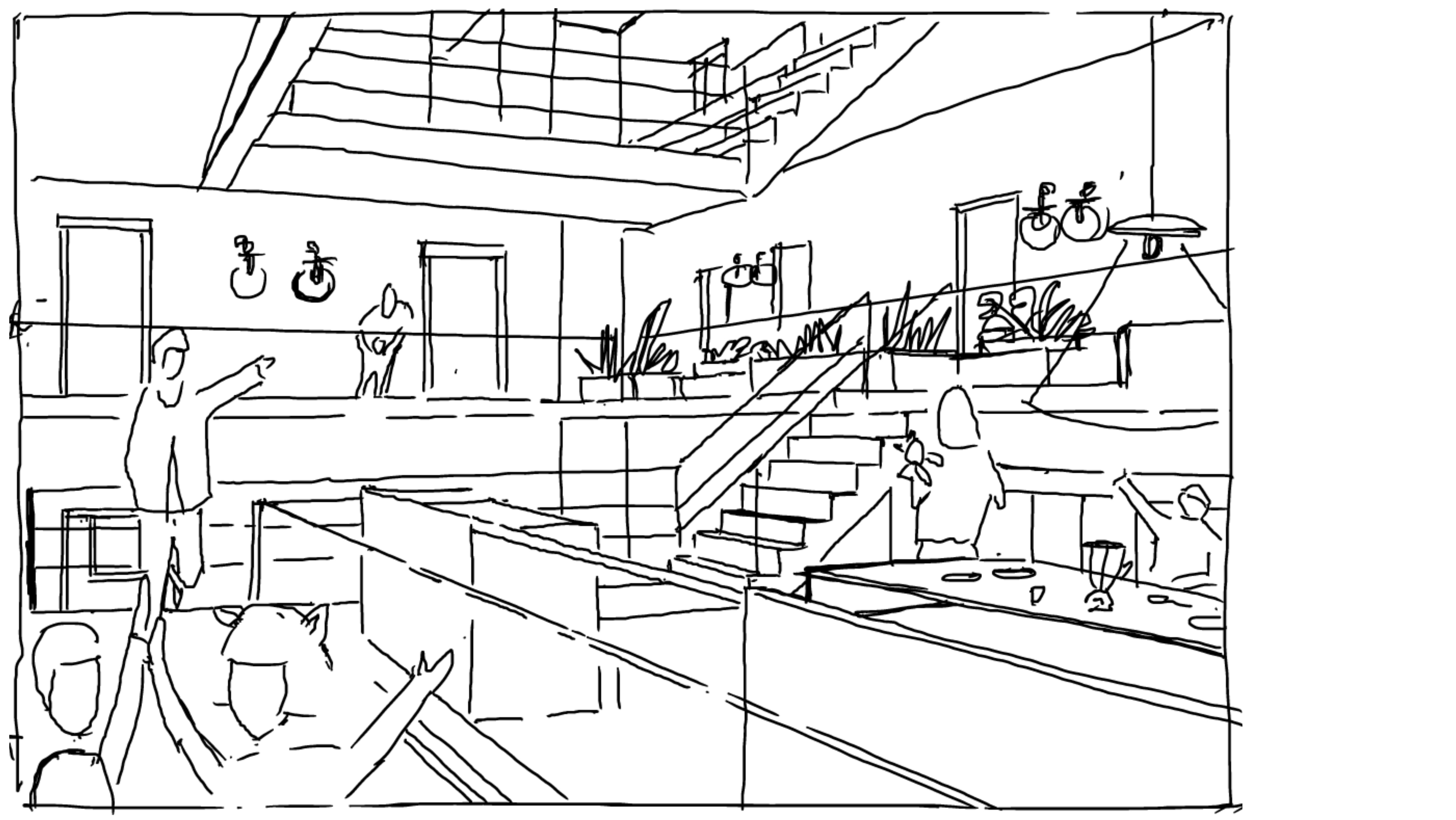
@nadia it’s lovely and already up un the site… But I think a bit of colour would help. This is what it looks like now: https://thereef.brussels.
Ok ill look into it. Personally I think too much polish does not invite participation, but consumption. Whereas sketches indicate there is still room for people to get involved.