I have a question for network scientists like @alberto and @melancon.
The Edgeryders co-developed Realities tool for stakeholder mapping is now being used in the wild by two organizations – Kiezburn (@Waldov) and the Borderland. With use comes data and complexity, and that’s where we start seeing some of the most interesting benefits of mapping your organization like this.
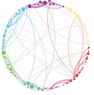
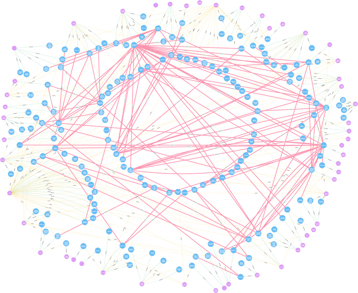
Purple dots are people, blue dots are responsibilities. Green edges are of type ‘realizes’, meaning that the person is in charge of some responsibility. In this graph, I have manually organized the nodes and edges so that people form a circle, with the responsibilities they have clustered in front of them. Responsibilities that are currently unclaimed or lack clear ownership are the circle in the middle. I quite like this layout since it mirrors the “tribe” circle, with the commons in the middle – visible for anyone to step up and claim.
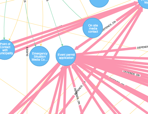
There are two other kinds of edges in this graph: Guides and Depends on.
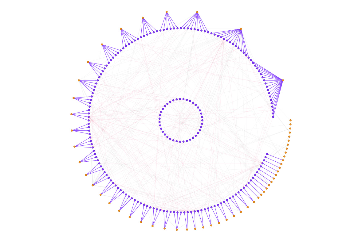
In the graph above, the ‘guides’ edges have been accentuated. These edges mean that someone is very familiar with the requirements of a responsibility and could help find someone to take it on if the ‘realizer’ suddenly drops the ball or leaves. All responsibilities have guides per default. When you define a responsibility you become the guide for it and you cannot get out of that without finding someone else to take over.
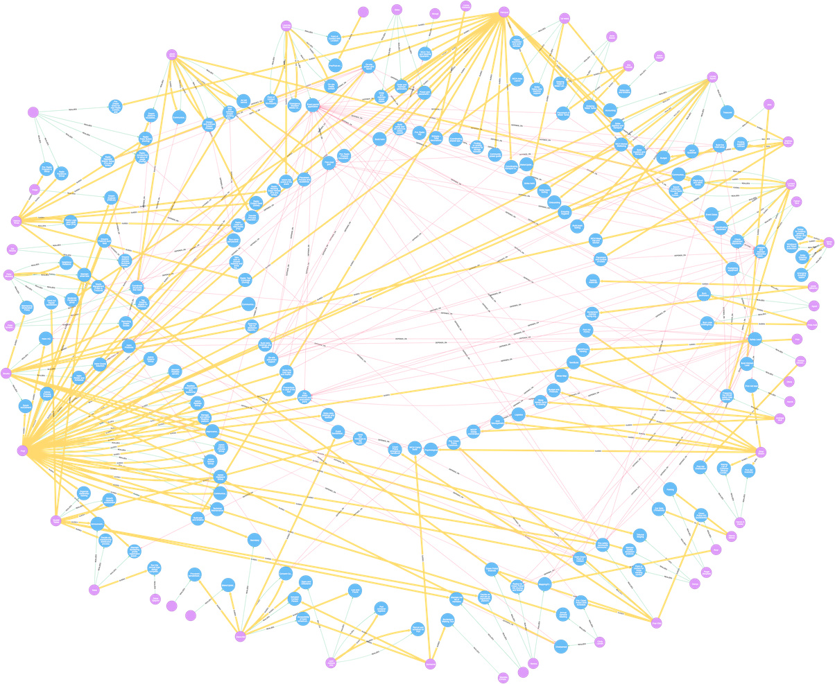
Finally, there are the “depends on” edges which show how different responsibilities depend on each other. For example, the node in close to the top-center of the outer circle has a lot of incoming and outgoing dependencies.
People in the organization should take note of this bottleneck and make sure the realizer of this very important responsibility has everything they ask for on time.
I think there is something very interesting here that we can learn from and keep developing. I would like to write a graph algorithm that takes the data from Realities (a web application with an interface similar to a task manager, using Neo4j as its database) and displays it in this way: People forming an outer circle, their direct responsibilities right in front of them and unclaimed responsibilities in the middle. I can already get the graphdata into the front end in a format that for example Vis.js understands, so what I need is to write the clustering algorithm and implement it with the graph drawing library.
Those among you with insights into the world of graph algorithms, where should I start? Are there good algorithms to base this on?
this is a quite interesting and nice looking diagram, that moreover seems to lead itself to easy interpretation – you’ve got a winner here I believe.
As for the algorithm, I would proceed by layers You need to be able to process your data according to their attributes (by attributes, I mean knowing a node corresponds to a person, knowing an edge is of a given type, etc.).
In the first image, people are obviously drawn on the circumference of a circle whose diameter is determined by the total number of responsibilities they hold, each being more or less drawn at the barycenter of these responsibilities, themselves drawn on the circumference of an inner circle. Let me rephrase this in more algorithmic terms:
You sort responsibilities according to people (it seems responsibilities are not shared, which makes the overall problem easier) p1:[r11, r12, r13, …], p2: [r21, r22, r23, …], p3: …
You map responsibilities using a “circular” algorithm (you’ll find them in the literature, if you know how to handle Tulip, you can easily and quickly prototype all of it), nodes being mapped on a circle in the above order r11, r12, r13, …, r21, r22, … each rij being assigned a (rho, theta) value (polar coordinates). Deciding on the diameter of the circle is a mater of readability (size of nodes, padding between nodes, etc.)
Inducing variations (being more or less “on” the circle", distance between people being non uniform) can make things trickier
Map person at the barycenter of their responsibilities (mean of a person’s responsibilities theta values), with greater radius so people sit on an outer circle.
Similarly map unclaimed responsibilities on an inner circle, in no particular order
Voilà !
That being said, you may want to keep the artistic look of the drawing and avoid having responsibilities aligned on a circle and vary things. As in your drawing, you may want to push some responsibilities further away a person closer to the center. This can save space to have a more compact drawing. But optimizing that kind of criteria is hard. Furthermore, you may want to optimize the order in which people are ordered to have a more readable map when introducing the “Guides” and “Depends_on” edges. Makes the whole a bit more complex, nothing unfeasible, you then enter the edge crossing minimization problem, a classic.
Now, the incoming and outgoing dependencies thing could also inspire another avenue to process the data – this all depends how much you need responsibilities to sit right in front of the people that claim them. I would be curious to draw the dependencies graph using a hierarchical layout (I am assuming there are no cycle in your graph, dependencies), introducing people around this dependency graph. This might offer an alternative view on things – you may simply want to draw both views and alternate between them (à la Detangler).
Thanks a ton Guy, this is extremely helpful. I really appreciate it.
Right, something like this, clustering those with dependencies and/or guides close to each other:
Circular dependencies are allowed to exist right now, but should give a prompt in the frontend warning that this is the case and that you should use caution. The reason is of course that in a hairy real-world organization, two people sometimes depend on each in a number of back-and-forth interactions, making it hard to define the direction of the dependency. For example, setting up a large power grid at a remote location requires radio coms, but the radio repeater station itself requires power. In the real world, this is not a big problem – you simply set up the power for the repeater station first, hook up the radios, and get going. But breaking the responsibilities down to make the dependencies work out is counter-intuitive – the same person is responsible for setting up the first generator as is responsible for setting up the last one. Breaking the responsibilities down into more granular pieces would often make the system noisy.
However, making people aware of circular dependencies involving many edges that could potentially cause real problems, could be a good use case in a complex organization. When a new dependency results in a loop, it is allowed to stay, but a warning appears on all the responsibilities in the loop urging people to double check if the workflow is sane.
Anyway, I digress, that’s not a graph problem but a human problem.
Indeed. And I will be sure to deep dive into Tulip when I get the time to experiment.
Agree. Furthermore, there is no need to have one viz to rule them all: you have complex data, so it makes sense to look at them from different perspectives. If I were using Realities for my org, I would like to know: which dependencies am I (most) vulnerable to? You can do this focusing on the dependency graph. In it, a high in-degree indicates a responsibility that unlocks a lot of other responsibilities. High eigenvector centrality indicates responsibilities that unlock other eigenvector-central responsibilities.
It seems to me that that your double circle layout works best to visualize the relationship between people and their responsibilities. “Which gridlocks might happen because of “cascading failures” from unmet responsibilities across the dependency graph?” is a different question. You can probably get a more intuitive viz by ignoring people and drawing the dependency network, then color-coding responsibilities by in-degree or eigenvector centrality.
Great piece of work, congrats to you and Erik. The picture is quite neat, and although had this artistic touch, this machine-rendered drawing helps see where similar structural patterns occur — well, IMHO.
Is the algorithm/code accessible? I am sure @jason_vallet will appreciate it.
Thanks @melancon! Yes, the code is open source and available here. Thanks again for your help. That’s the library for all graph vis in Realities, and the relevant function is getMasterGraph and it’s auxiliary functions.
I already have quite a few ideas for what else to do. Will post updates in this thread when we come up with new and interesting stuff.
 You need to be able to process your data according to their attributes (by attributes, I mean knowing a node corresponds to a person, knowing an edge is of a given type, etc.).