Current Standard Webkit
https://webkitsandbox.netlify.app
Edgeryders Standard Theme
- Fonts + Colour Scheme:
- Use same as for: http://er-campaigns.surge.sh/
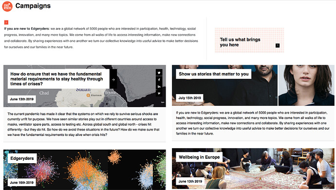
- Header Block #1: Split box, text on the left - Square Red button on the right
- Text styling: “If you are new to Edgeryders…near future.”
- Link Styling : “Tell us what brings you here” - Black text against red dotty background
- Display of post summaries: Block of four post teasers below Header Block #1
- Layout/presentation: Static and on mouse-over
- Layout/presentation: Display of topic teasers/summary (ref: 6 boxes)
- Fonts + Colours
- Topic subject/ Headers: Black text against white background
- Topic Date: Black text against white background
- Topic summary text: Black text against white background
- Links: white text/icons vs black background)
- Background images: Post Images displayed as background to header
- Social Share: One click functionality
- Social Buttons: White icon against black background
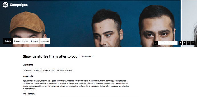
- Header Block #2: Background photo with timer & social sharing buttons ( white icon, black background)
- Countdown timer
- Image in Background
- Social share: Functionality & styling (one click share, customised link)
- Organisers tags: Ability to add Link to individual user profiles on the platform (like ping works now)
- How page reacts when you scroll down (see how page seems to fold under the header block
- Fonts + Colour Scheme:
- Change to same as for: http://er-campaigns.surge.sh
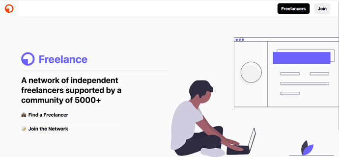
- Background image: Add Photo instead of illustration
- Foreground text on left: use same font and colour scheme of http://er-campaigns.surge.sh
- Functionality:
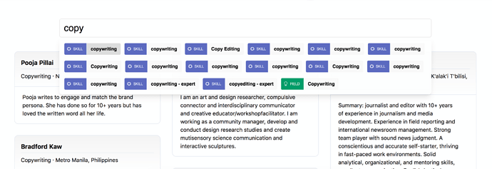
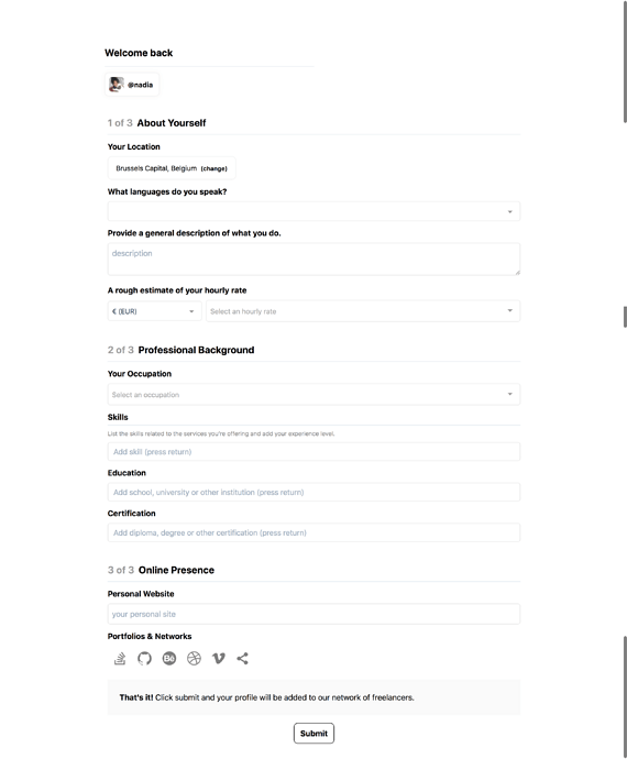
- Keep ability to search the directory of submitted profiles by skill/ keyword
- Keep ability to social share
- Make it so that a new topic is generated on submission of form
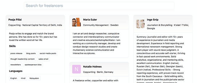
- Make it so that Topic subject: Occupation · Location
- Make it so that
- Fonts + Colour Scheme:
- Change to same as for: http://er-campaigns.surge.sh
- Display of Freelancer Profiles: Assuming that a new topic for each personal profile is created on submission of the form, we want to adopt the same styling as for the block of 4 post teasers onr http://er-campaigns.surge.sh
- Layout/presentation: Static and on mouse-over
- Layout/presentation: Display of topic teasers/summary (ref: 6 boxes)
- Fonts + Colours
- Topic subject/ Headers: Black text against white background
- Topic Date: Black text against white background
- Topic summary text: Black text against white background
- Links: white text/icons vs black background)
- Background images: Post Images displayed as background to header
- Social Share: One click functionality
- Social Buttons: White icon against black background
Summary
1. From campaign generator
Github: https://github.com/edgeryders/campaigns
Other relevant code repositories?
- Basically, the whole thing broken down into standard webkit components that can be integrated into different sites/landing pages we set up (e.g for presenting topics tagged “blog” on the platform)
- Use case: we would have these elements as the “top” part of a landing page, and then add below it one of the forms from our webkit.
- Especially: Be able to generate single campaign landing pages, and have them be aggregated into the campaign overview. e.g We would have a form that people fill in (with pre-set questions) if they want generate a campaign page
2. From Freelancers directory
Github: GitHub - edgeryders/freelance
Other relevant code repositories?
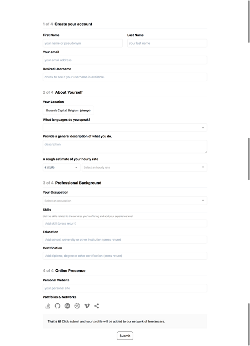
- Key Functionality we would like to transfer to webkit elements: being able to fill in form as signed in Edgeryders member and have it automatically be attributed to your profile
- We also want to keep this Information Architecture for those webkit elements/flow between them:
- Display of user profiles that have filled in the form
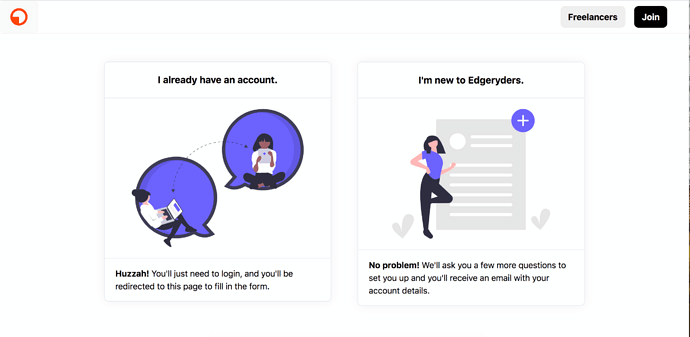
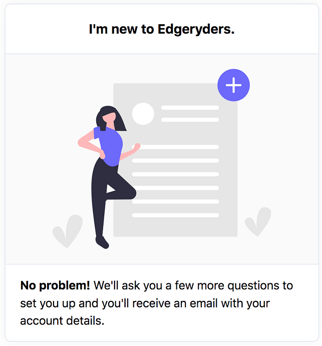
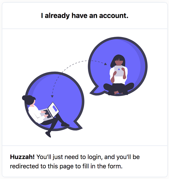
- Intermediate Funnel for (choice between filling in form as signed in user vs as new)
- Changes to Styling:
- Maintain style overall but Adapt fonts, colours, Link and button design, to those of the campaigns site.
- illustrations are sourced from: @owen you had a place where you pick up most of the illustrations I think? Could you add it here please?
More specifically …
1.a. From campaign generator: Single Campaign Page Styling
Github repo: add here
Other relevant repositories: add here
Details to include in the webkit elements
- Fonts & Colour Scheme
- Header Block elements:
- Countdown timer
- Image in Background
- Social share: Functionality & styling (one click share, customised link)
- Organisers tags: Ability to add Link to individual user profiles on the platform (like ping works now)
- How page reacts when you scroll down (see how page seems to fold under the header block
1.b. From campaign generator: Single Page Aggregator
Github repo: add here
Any other useful repositories: add here
Elements/ features we wish to include in the webkit
- Fonts + Colour Scheme
- Header: Intro Text + Link Styling(“Tell us what brings you here”)
- Display of post summaries:
- Layout/presentation: Static and on mouse-over
- Layout/presentation: Display of topic teasers/summary (ref: 6 boxes)
- Fonts + Colours
- Topic subject/ Headers: Black text against white background
- Topic Date: Black text against white background
- Topic summary text: Black text against white background
- Links: white text/icons vs black background)
- Background images: Post Images displayed as background to header
- Social Share: One click functionality
- Social Buttons: White icon against black background
2. From Freelancers Directory: Registration form elements
Github repo: Add here
Other useful repositories: add here
What we want to transfer/ include in the webkit:
- Ability to fill in form as signed in Edgeryders member and have it automatically be attributed to your profile
- We also want to keep this Information Architecture for those webkit elements/flow between them:
- Display of user profiles that have filled in the form
- Intermediate Funnel for (choice between filling in form as signed in user vs as new)
- Changes to Styling:
- Maintain style overall but Adapt fonts, colours, Link and button design, to those of the campaigns site.
- illustrations are sourced from: @owen you had a place where you pick up most of the illustrations I think? Could you add it here please?
3. From Register: Standalone Form
Edgeryders.eu
Github:
Other useful repositories:
What we want to transfer/ include in the webkit:
-
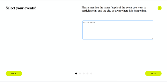
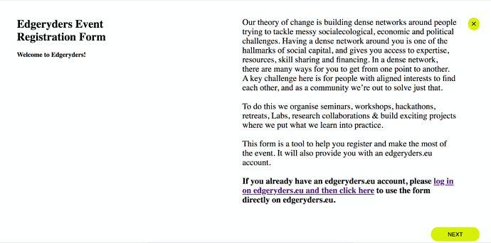
The Layout:
- Question Header on one side
- On other side: question bread text and response/ text entry field
- Buttons: Back and forward on bottom
- Indicator of where you are in the process (like a slideshow)
-
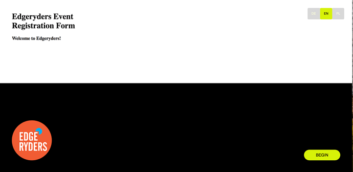
The ability to set up multilingual form
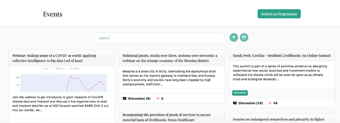
4. From Summit Website
These two blocks should be included into the standard webkit:
