In the last post we left you with a form and an invitation to share with us your opinion: the goal was to choose, among the 4 presented proposals, the most suitable sticker to identify the shops involved in open rampette project and the accessible shops in general.
Throughout the dialogue with the shopkeepers and the final users what has recurrently emerged is the need for an effective communication. So the sticker has two different roles: it is a way to transfer the message clearly making the community more aware, but it is also a collective activation element to improve the accessibility experience in the city.
We received a lot of feedback, several positive comments, suggestions for improvement and also some critical advice, in particular regarding the two-color proposals, which may be confused with a prohibition sign because of the diagonal cut passing through the center of the circle. According to our purpose - use the sticker to communicate accessibility - this reversal of meaning was a quite considerable issue.
So, treasuring your advices, we worked on a new version of the sticker.
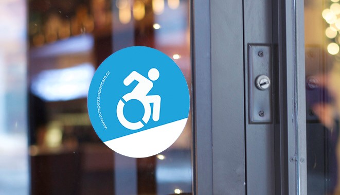
Considered the many feedback regarding the importance of having a representation of the ramp under the icon, we lowered the diagonal line dividing the two colors, creating a sturdy white ramp.
The color combination has been also reviewed to maximize the contrast and make the icon as recognizable as possible.
Last but not least we reduced the size of the text “rampette.opencare.cc”, to put more emphasis on the icon that is quite self explanatory.
Hope you like the new version of the sticker!