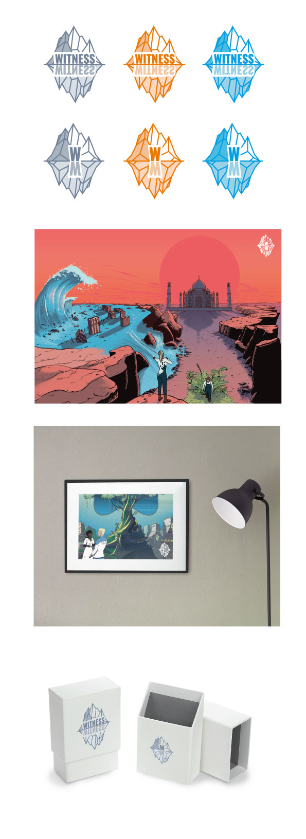
Hey everyone, some sketches to figure out direction. Thoughts? Maybe you want to propose something yourself?
1.
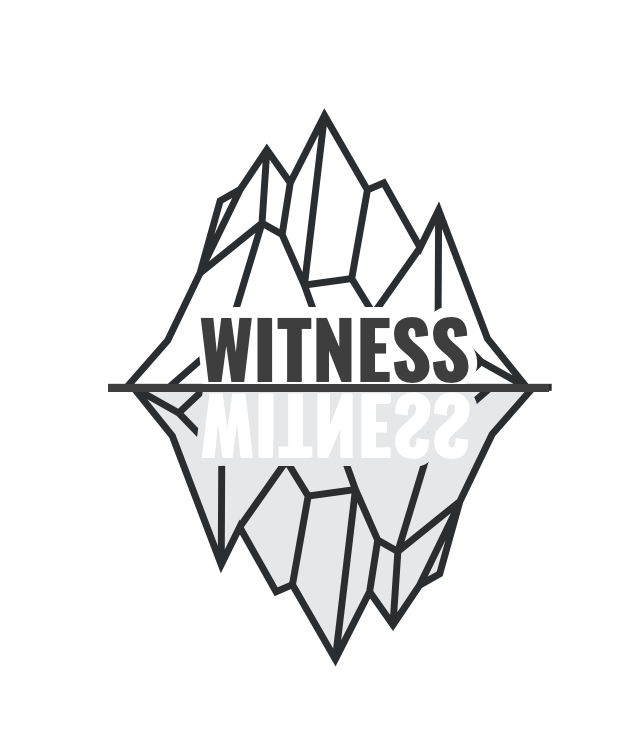
2.
3.
4.
5.
6.
7.
1 Like
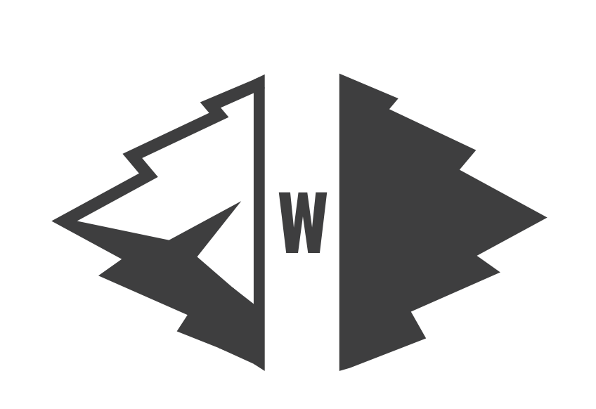
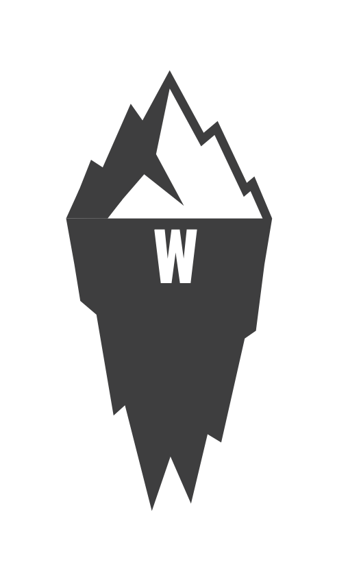
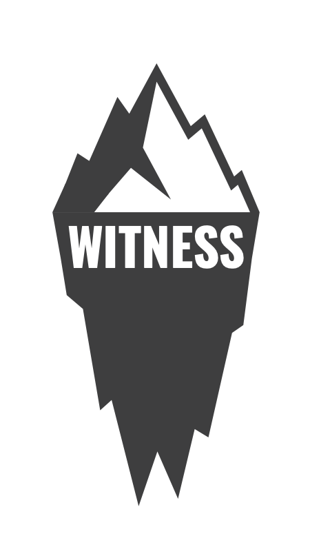
I think 6 and 7 feel solid to me. (7 has a tiny line error in the lower left edge) Also, I would make the W and M larger. I always test logos for scaling. What would you use for the tiny version? How does it look huge. Most of these feel a tad complex. 6 really works.
1 Like
I like #7. It not overplaying the iceberg association.
1 Like
I like 6 and 7 personally, I think the fractal island design is cool. @nadia
1 Like

Hello @nadia: 2
1 Like
yea 2
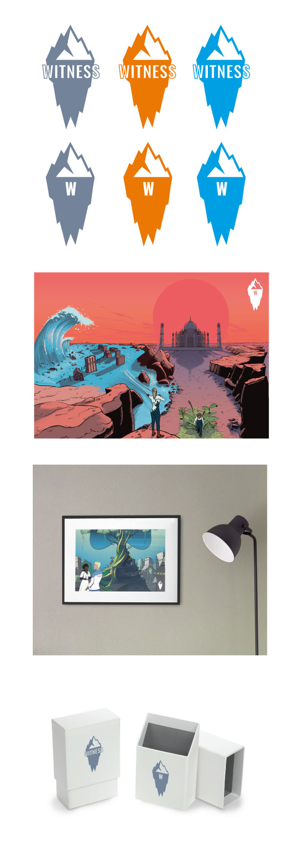
1 is more legible. 2 is more fun.
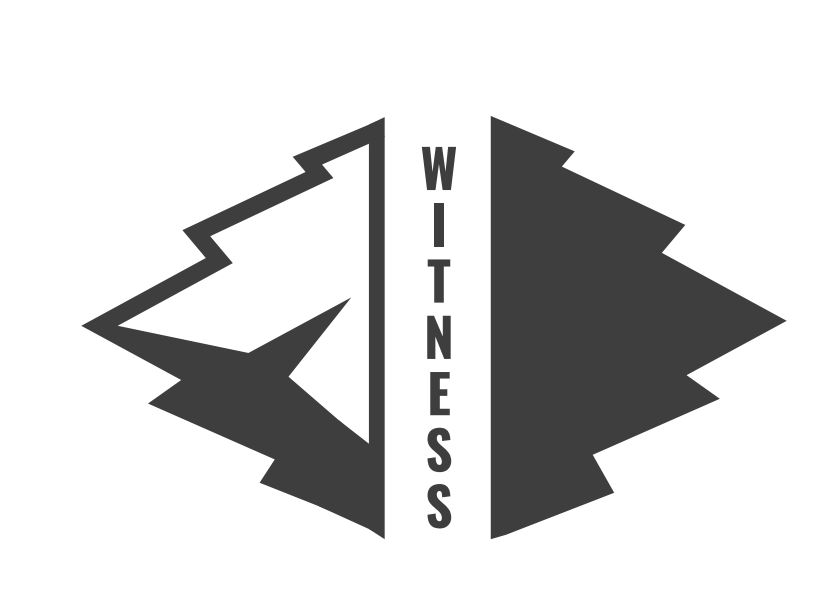
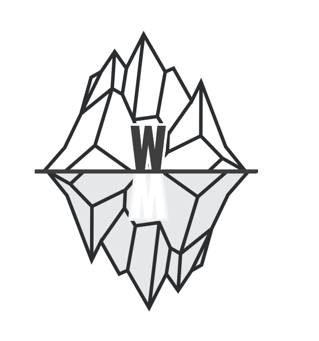
ok I did some more work on it. This works afaic:
2 Likes
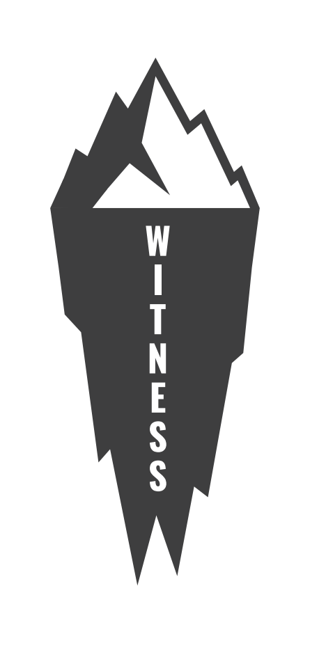
This one is a winner