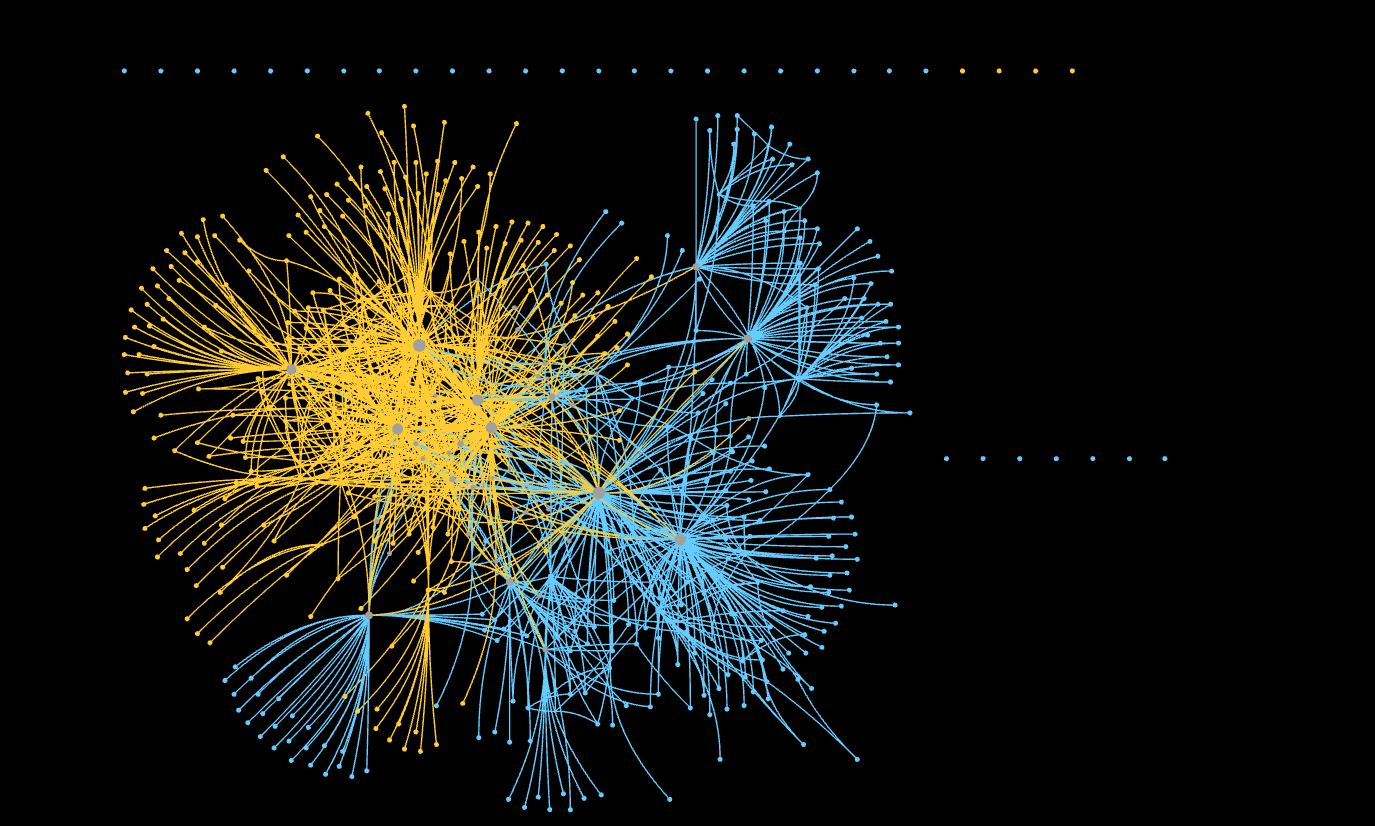
My first guess would be that orange is NGI and blue is Poprebel. With pop rebel casting a wider net and NGI topics having more similar/near to each other topics. Nice to see that there is usually at least one line connecting the nodes of the conversations of the different projects and for it to look like the one project is trying to hug the other ;).
Agree, POPREBEL is a lot more fragmented with a higher number (and proportion?) of disconnected nodes. I imagine the centres of the ‘blue stars’ are the language based community managers.
While we suspected that the language forums will be disconnected from each other, the main reflection for me is that we should strive to better connect isolated nodes, but also aim for a denser conversation - I wonder what are the edges of an average active NGI community member versus an average active POPREBEL member (someone like @ Sonia or @aleks.jaszczyk),
Of course, we are well aware that each project is different, but such a comparison would help point to what could be considered a reasonable ‘target’ community health indicator after two years
I was waiting for more responses, but… yes, you are exactly correct. Topologically, the main feature of POPREBEL are the mutliple hubs, corresponding to the language based community managers. That of NGI Forward is the densely connected core, with over half of the participants having more than one link to other participants.