Introduction to Graphryder Platform
The objective of this guide is onboarding researchers on Graphryder by providing a general first glance at the primary purpose of Graphryder.
Graphryder is an interactive dashboard that helps to understand how people interact on a topic and in a community. Edgeryders and the University of Bordeaux developed Graphryder as a prototype tool for a new way of doing ethnography, one that requires ethnographers to be comfortable with the idea of testimonies by their informants as data.
It allows us to visualise the connections between ethnographic codes in a form of graph, providing various levels of detail.
As we are dealing with posts written by users and annotated by ethnographers, building a graph is a suitable means to explore these implicit communities (more detail about the data and the graph-building process can be found here - not ready).
Analyzing data through a graph structure enables us to find more insight.
Working with qualitative data in a rigorous way
A word about the design principles underpinning Graphryder, and SSNs themselves.
Graphryder enables practitioners of online ethnography to do visual analytics. About 30% of neurons in the human brain’s cortex are dedicated to processing visual input. The idea behind visual analytics is to use this capacity to process data. Of course, you can do network analysis using mathematical tools, but that is a slow, clunky process that requires substantial training. Proponents of visual analytics techniques suggest that you can deploy your visual cortex to see the analysis results, rather than derive them. This leads to a more immediate, deeper understanding of what the data are saying. The downside is that any glitch in the data representation, or in cognition itself can mislead the analyst into a wrong conclusion… that looks seductively right!
For this reason, rigour is essential when doing Social Semantic Network Analysis (SSNA). Using Graphryder does not require any knowledge of computer science of mathematics per se. Nevertheless, a SSN is a formal representation of an online conversation, in the mathematical sense. Full awareness of how the network was built is necessary for a rigorous interpretation of the results produced using Graphryder. Many ethnographers are not familiar with mathematical formalisms, and may be tempted by holistic, intuitive interpretations based on an incorrect understanding of what the data are actually saying. There is nothing wrong with intuition, but, in my experience, a sweeping synthesis or radical big idea is best pursued after the analyst is confident she or he understands what the data have to say.
The dangers of a lack of rigour are, unfortunately, amplified by the very thing that makes SSNA so effective: SSNs are networks. Networks are easy to visualise and intuitive to process using your eyes. They look familiar, but this familiarity is deceiving, because networks are abstractions. An untrained analyst might look at a SSN and exclaim “look, these two concepts are connected! It must mean something”. An experienced one has trained herself to state the same fact in a different way: “these two codes co-occur in the same posts. This means, to a first instance, that at least one person in the conversation has written something that refers to both codes in the same utterance”. There is nothing metaphysical about “connection”. In network science, the meaning of a connection has to be formally defined a priori. Network economist Fernando Vega-Redondo has a wonderful quip: when you talk about networks, you need to define what a link is.
Data flow in dashboard
Graphyder 2.0 will allow you to explore content by filtering by:
- Platform
- Corpus
- Topics
- Posts
- Codes
- Participants
In Graphryder 2.0, data is filtered through the components in sequence. You start by filtering by platform and corpus and then choose the next component. You can then add subsequent components, but components added later in the sequence only show and pass on the filtered data passed by the selection in the previous component. The user can add and remove these components in any sequence they choose, but they must decide if they are going to start by filtering by participants or by codes.
For most users, this will make the software more intuitive, as this is how filtering usually works.
User stories
Use case 1: Loading data
For the purpose of this guide, we will load data from Edgeryders ethno-treasure annotated conversations and explore them by code co-occurrence. The tag ethno-treasure identifies the Treasure related encoded ethnographic corpora on the Edgeryders platform.
Why?
Code co-occurrence means that two ethnographic “codes” (like “resource consumption” or “climate change”) have been used to annotate the same post. We use code co-occurrence to build "Semantic Social Network” graphs. These are then used to understand a conversation and community, either in research or by that community to gain a birds-eye view of their conversations. These semantic social networks are the most important feature of this dashboard and a vital deliverable in many Edgeryders research projects.
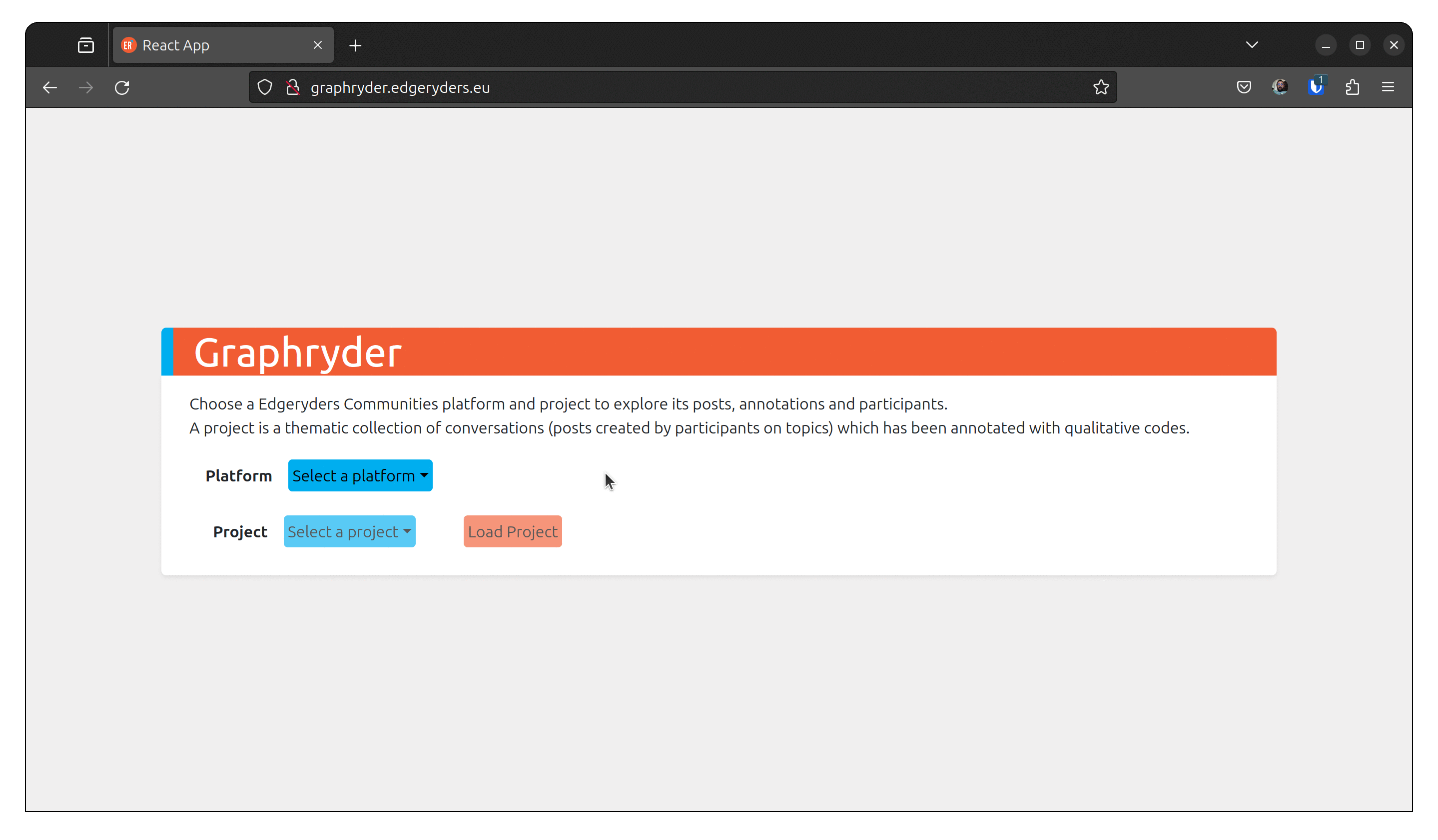
Step 1: Selecting the platform and the corpora you want to explore
With Graphryder, you can select several platforms that include several projects.
This guide will use one of these datasets. One can also, through another process, add datasets to the platform (this is not covert by this guide; more technical detail will be available here)
As shown in the following animation, select the platform (edgeryders) and the project (ethno-treasure).
Click on load project to proceed.
Step 2: Dataset description and control panel
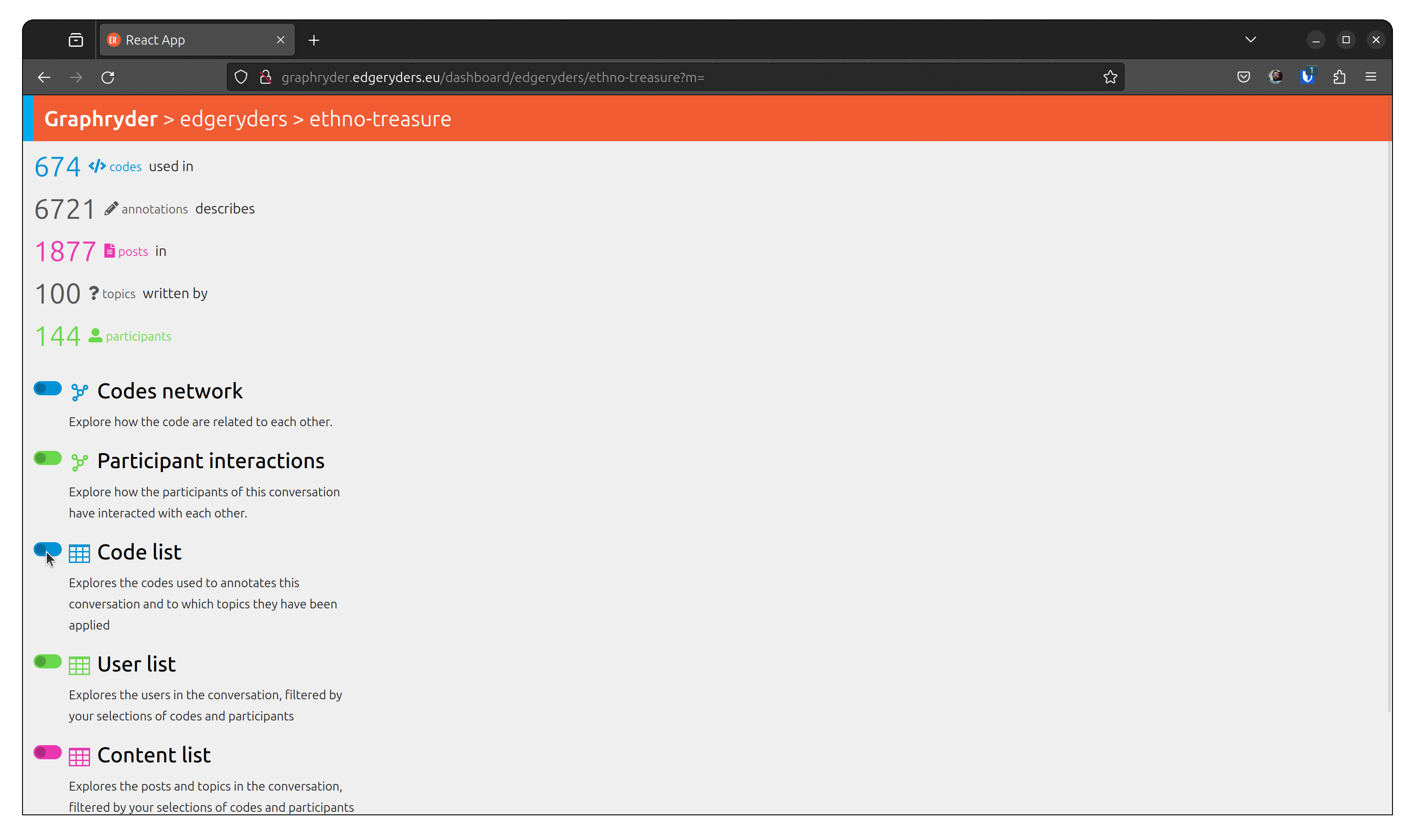
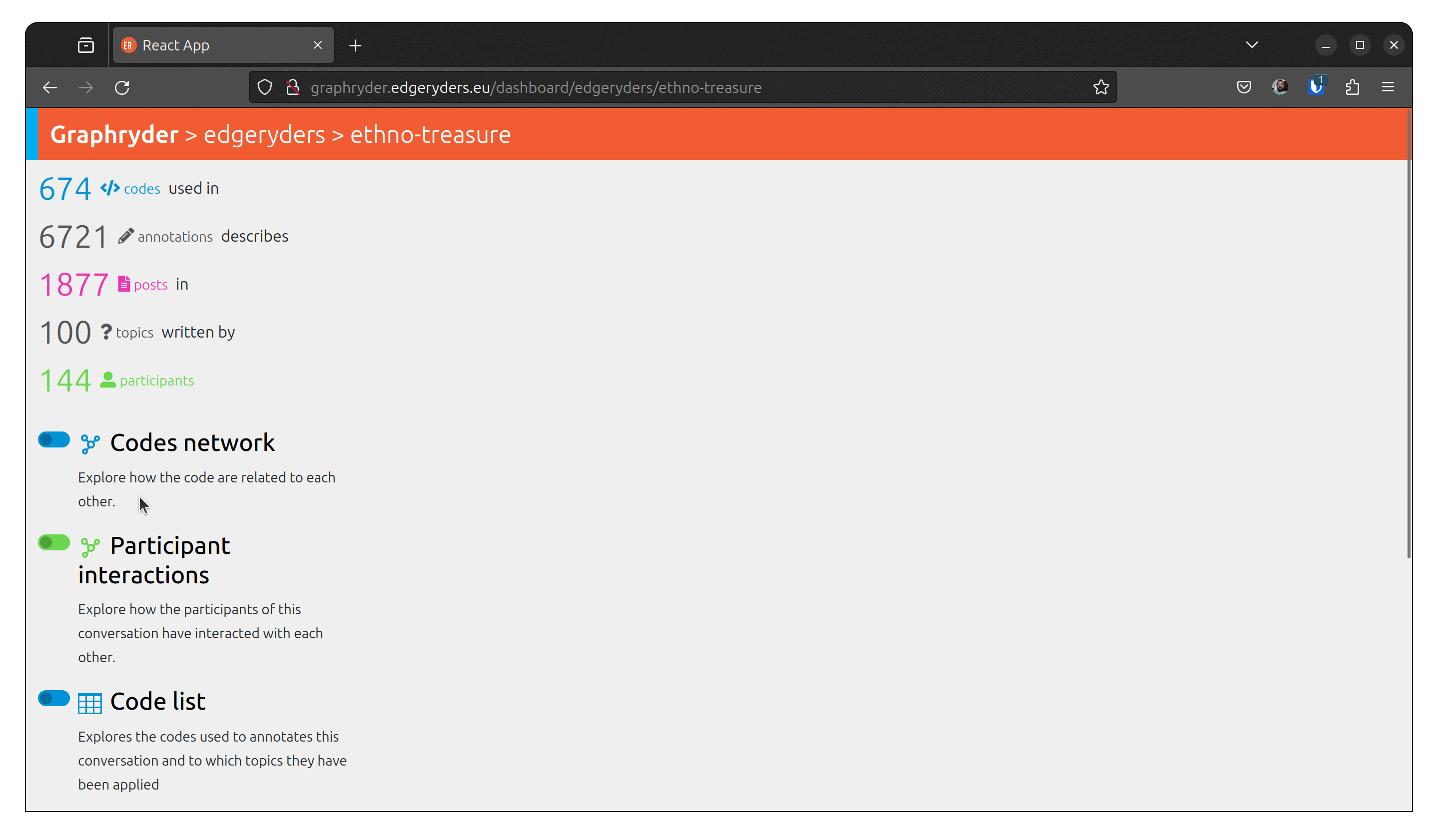
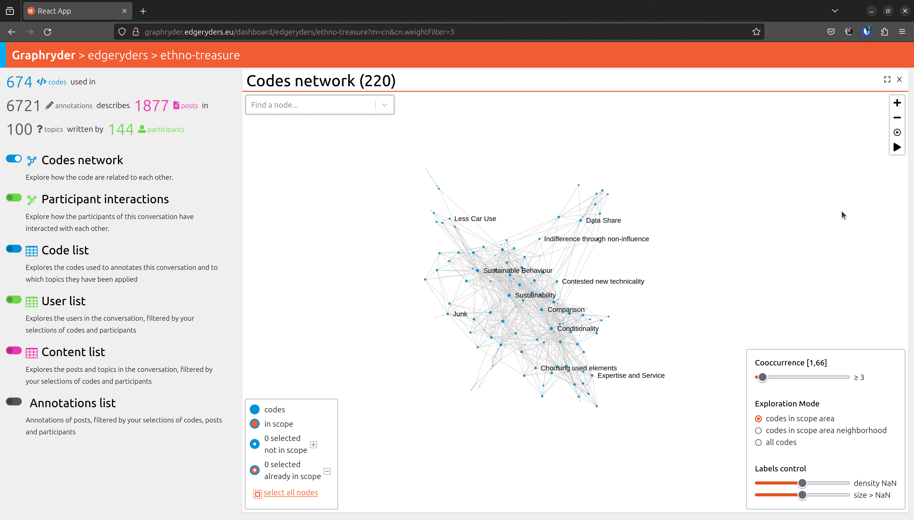
by loading this dataset, we have different objects and their link that have been loaded. At the date of writing the dataset contains:
- 674 </> codes used in
- 6721 annotations
- 1877 posts
- 100 topics
- 144 participants

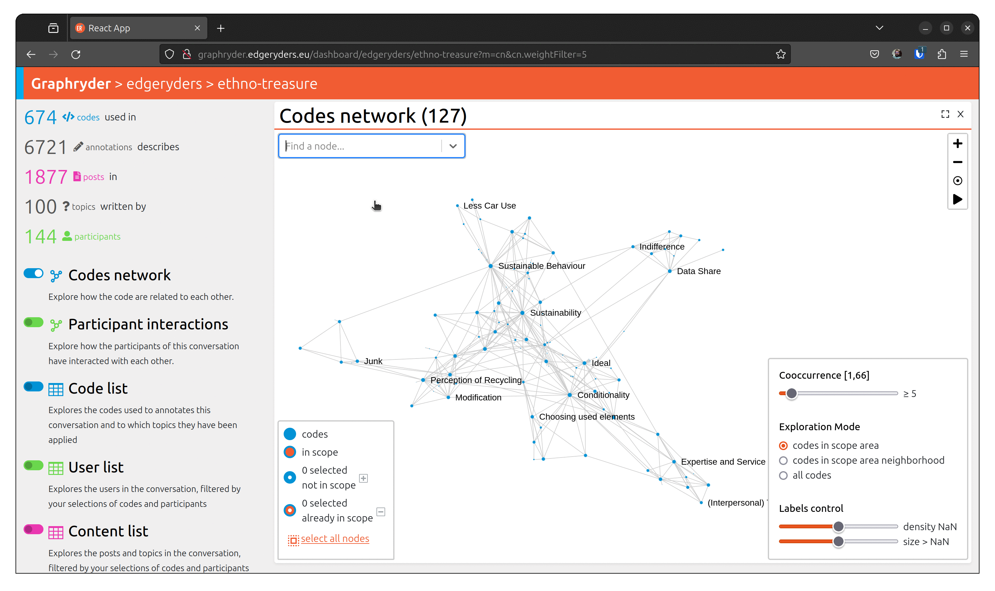
The user can choose different views of this dataset. One of them is the up-called co-occurrence graph.
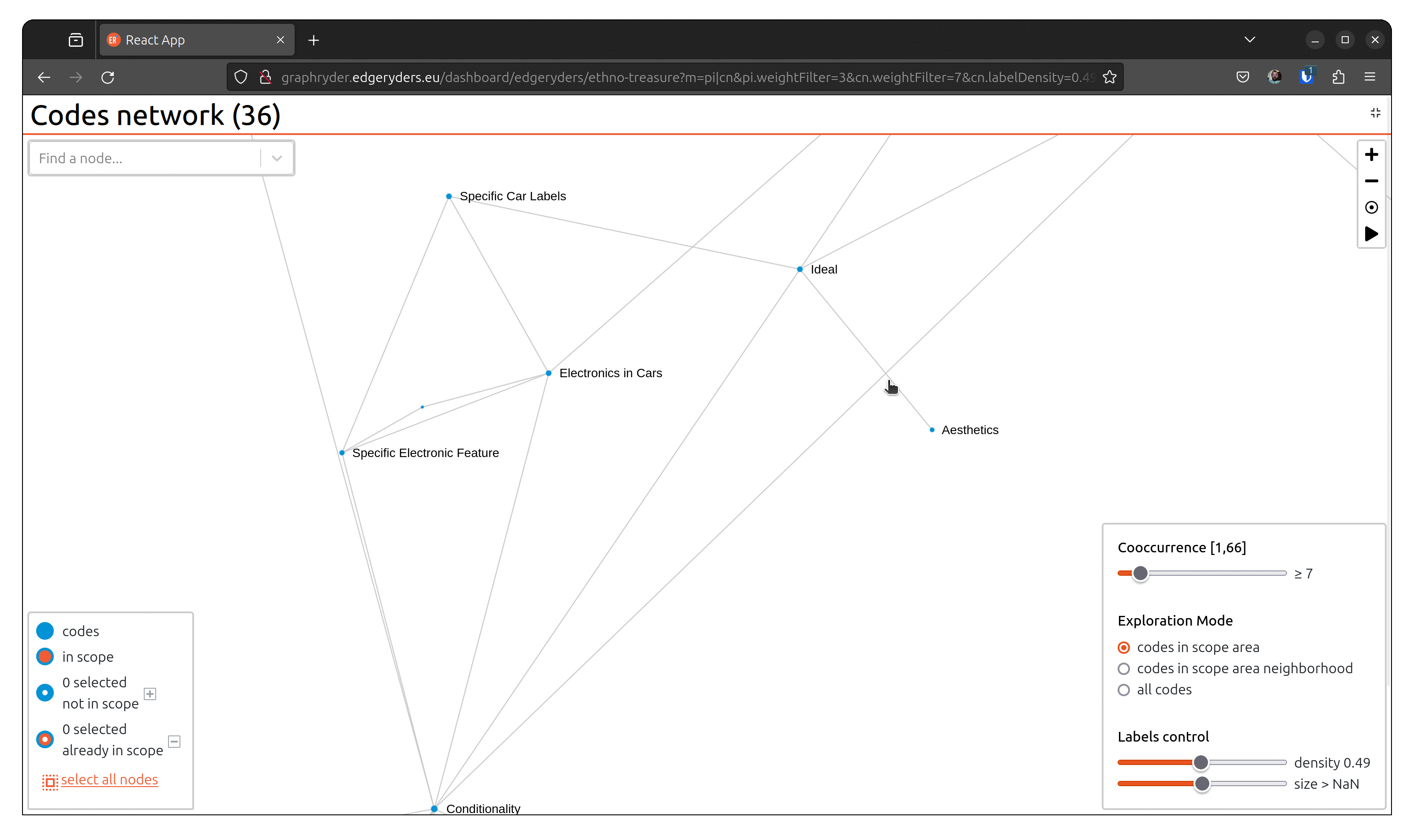
By clicking on the toggle button “Codes network,” we will show this graph. A force-directed algorithm displays the graph’s nodes. This algorithm is iterative and updates the nodes’ position at each step.
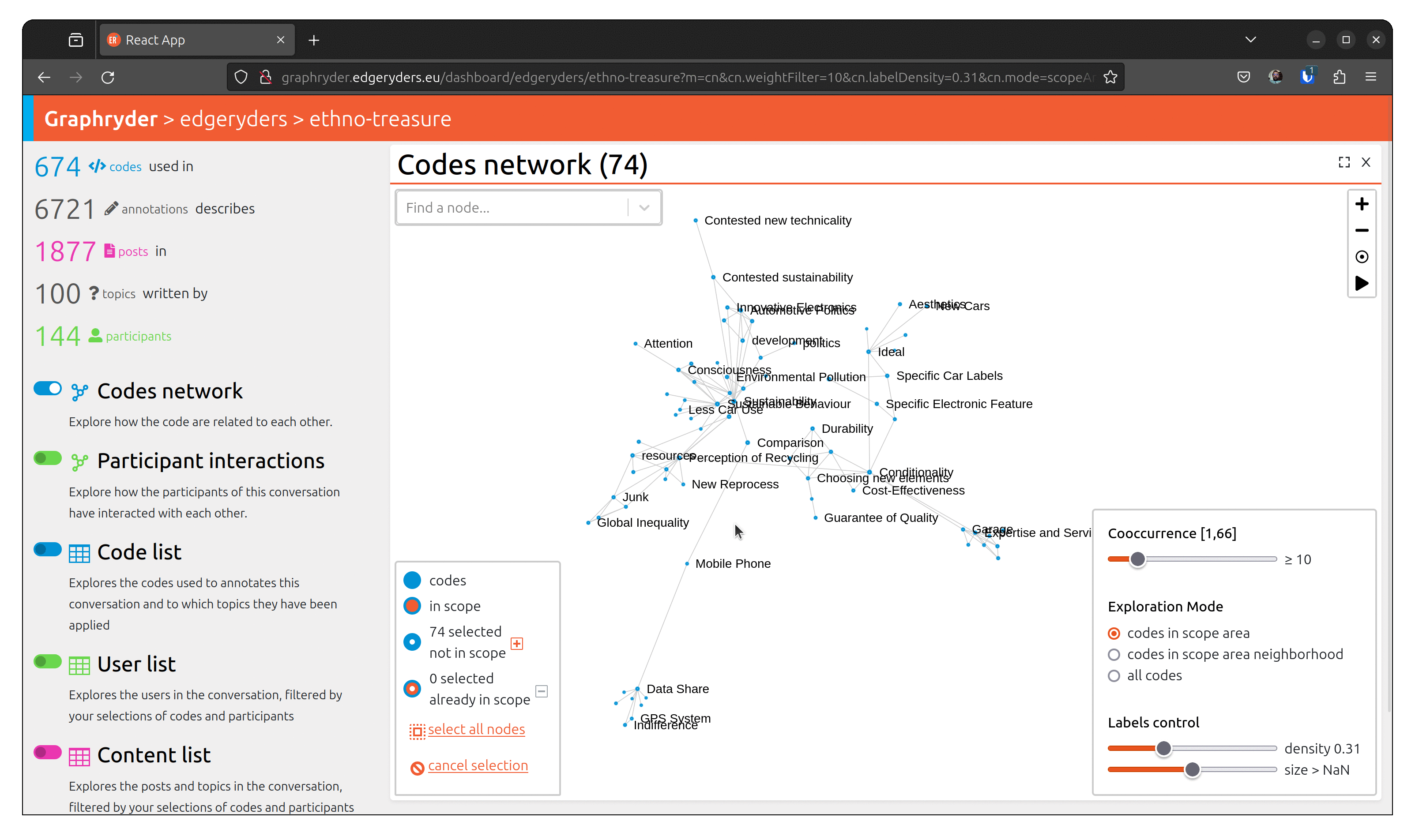
Step 3 : Filtering out nodes that co-occur less than four times
Relationships between nodes can be complex to understand due to a vast number of edges.
One simple simplification is to remove edges based on a co-occur criteria.
Filter out nodes that co-occur less than four times.
Using a dedicated slider (“Co-ocurrence” [1, 66]), we will filter out nodes
that co-occur less than X times. Moving this slide will automatically update the graph (graph layout - position of nodes) to ease its visualization.
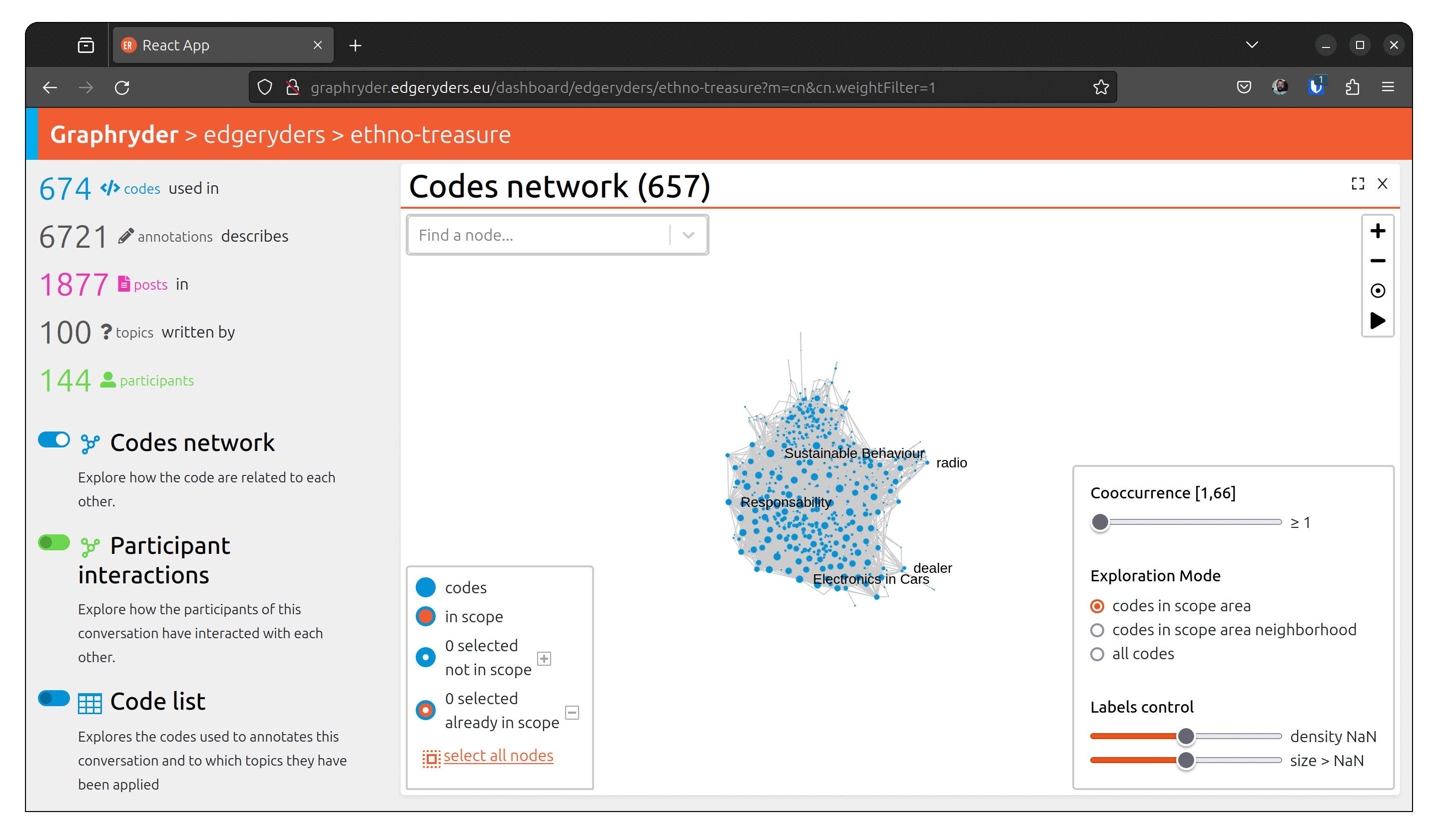
Step 4: Exploring the graph
Explore the graph to get a better overview of the visible nodes.
This button should always apply the force direction algorithm on any set of visible nodes in the graph. Usually, there is no need to launch the forced directed algorithm - changing the filter parameter launches it directly.
To navigate into the graph visualization, on the top right of the view,
a set of small buttons allows one to zoom in (+)/ zoom out (-), center the view (°), or re-compute node positioning. This button should always apply the force direction algorithm on any set of visible nodes in the graph.
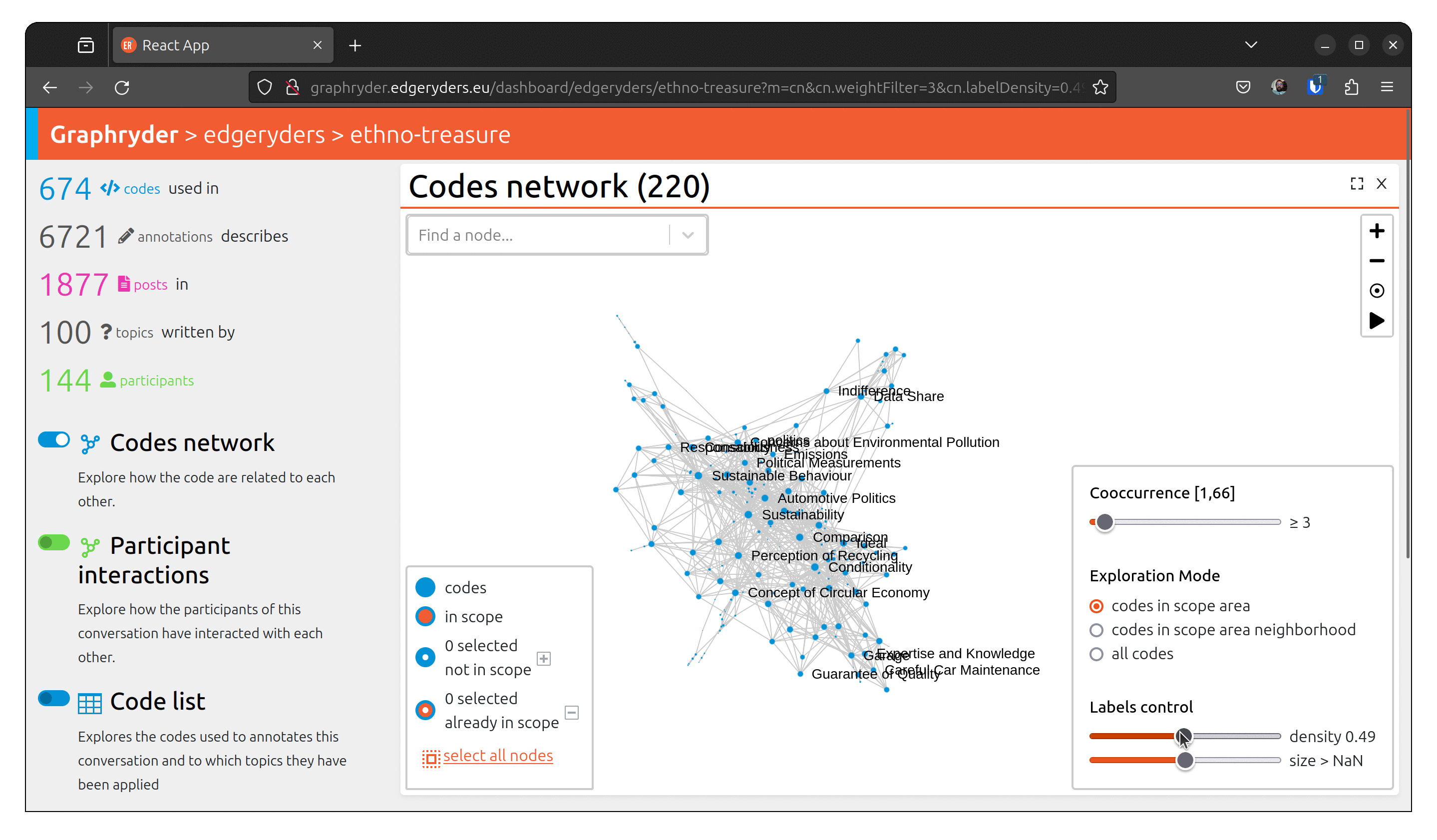
Step 5: Customising the label
Set labels to all nodes. The label slider starts by setting labels on codes with the highest
number of annotations.
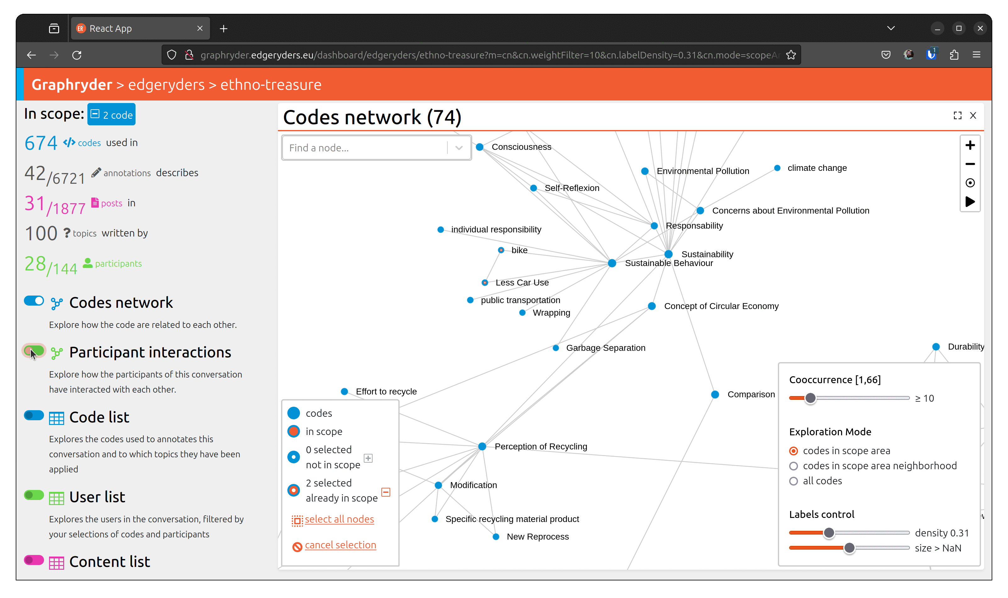
Step 6: Focus on neighborhood
Filter on selected node only and or their neighborhood.
Zoom in on selected nodes*:
Show the neighborhood of the selected nodes to see the adjacent concepts in the conversation.

Use case 2: Isolating participants who engaged with identified concepts
Why?
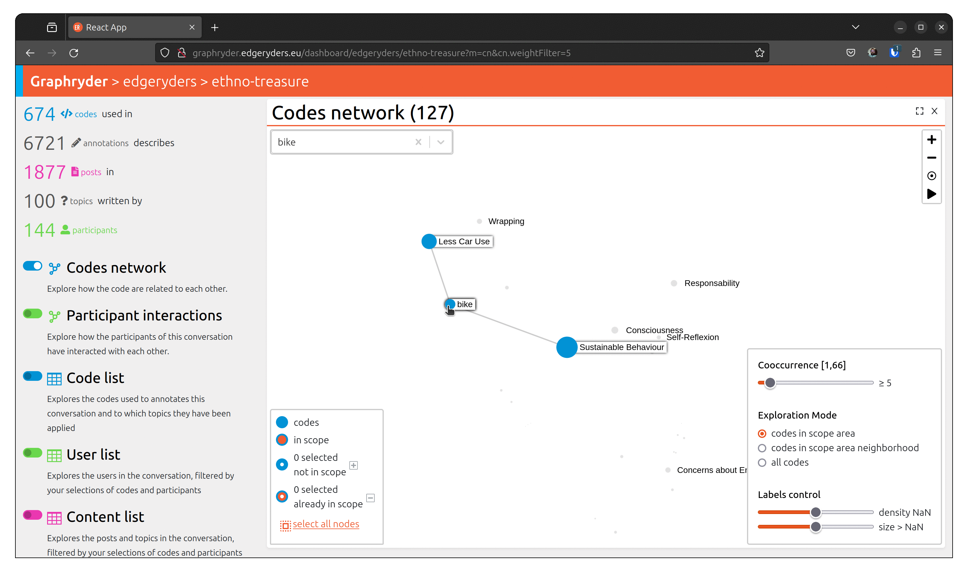
To understand a conversation and community, it’s not enough to know what has been talked about. You also need to know who has talked about something, and with whom. For example, you may find a strong connection (many co-occurrences) between “bike” and “Less Car Use”, but when inspecting the participant network of the sub-conversation of posts annotated with both of those codes, you may discover that only few participant makes that connection.
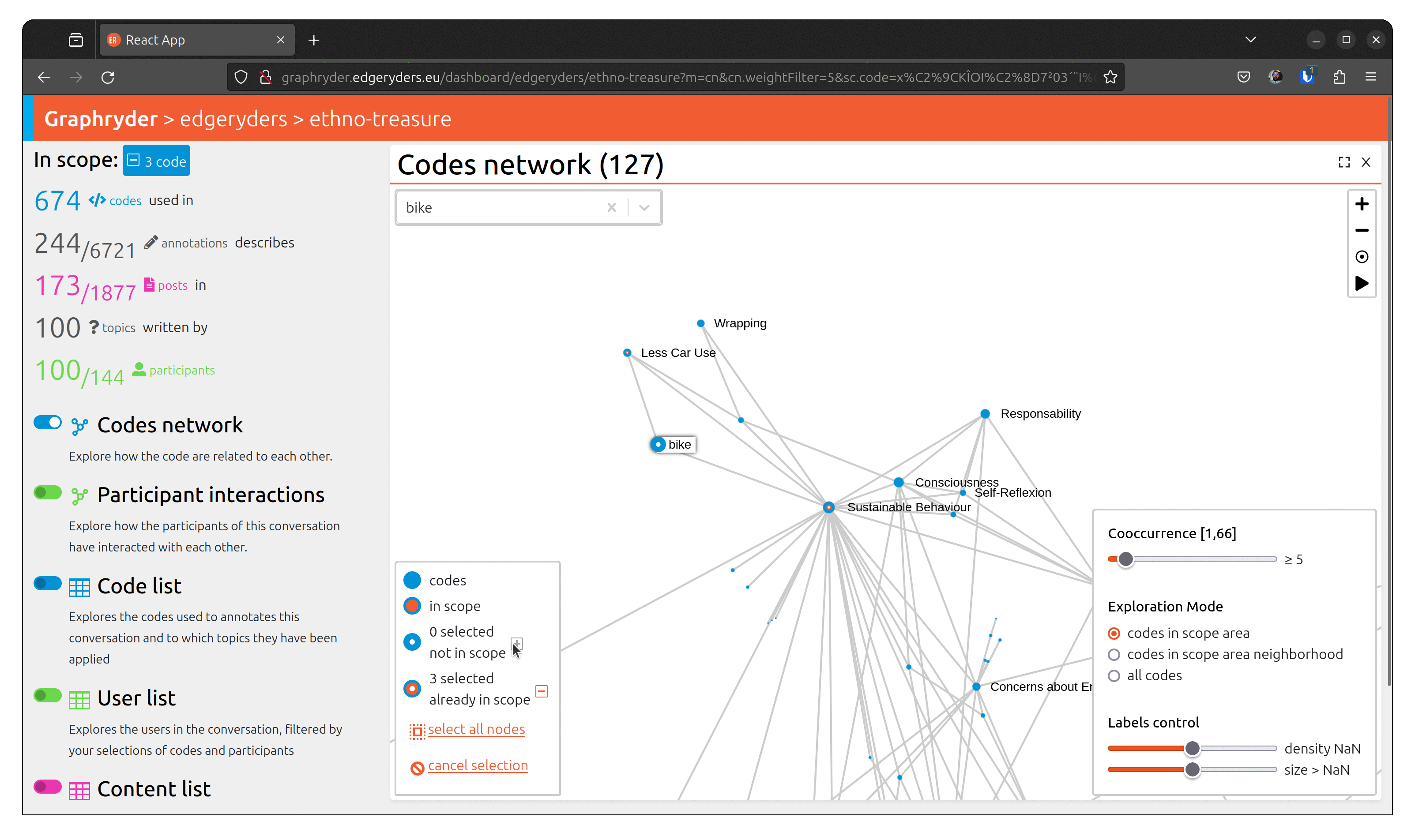
From the graph view, select a node by clicking on it. The bottom left panel should now indicate “1 selected not in scope”. Selecting several nodes will increase this number.
When all desired nodes are selected, the + button will add them to the scope.
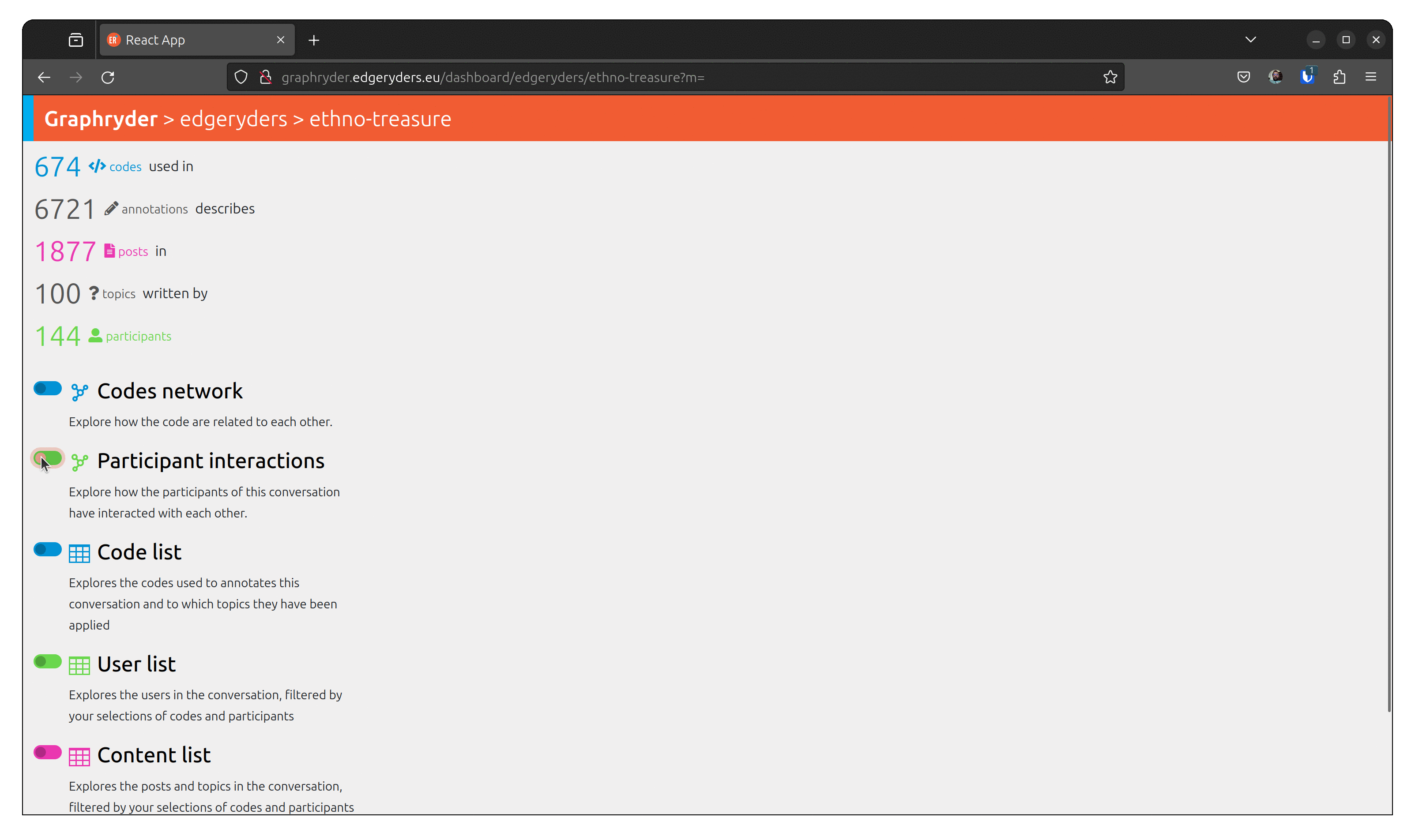
To visualize people who talked about this code, toggle the button
“Participant interactions” (Left panel of the platform).
Use case 3: Seeing Posts annotated with selected codes
Why?
Once you have found an interesting connection, you often want to explore the posts
in which that connection was made. This feature is used by our researchers when writing periodic reports and by community managers looking to engage participants around specific topics.
Step1: Finding a specific node
You can identify a node by its label using the search bar. In the following animation, we search for the code “contact tracing”.
Step 2: Selecting the node
When we find the node we are looking for, we can inspect its neighborhood and select it by clicking on it. The aspect of the node changes, passing from a full blue circle to a white circle with a blue border. The bottom left panel is updated, showing that X nodes are selected now.
Step 3: Selecting the scope
In the bottom left panel, at the end of the number of selected nodes, an add button allows us to add the selected node to our scope.
Pressing it, we can see that the bottom left panel is updated. We can also see the number of posts in our scope in the left panel.
The user can access the tabular view of the corresponding content by pressing the toggle button “Content list” on the left panel.
Use case 4: Close views
Why?
We want to allow users to open and close components as they see fit, so that they can focus on exactly the question they are trying to answer without their view being cluttered.
Use case 5: Starting from participants to find topics they have engaged with
Why?
Community managers might want to center on a group of participants to see which conversations they are engaged in. Participants themselves may also be curious to see the code-cooccurrence graph of their own posts, or the posts of someone they are interested in reading more from. Ahead of community events or seminars that follow a long online conversation, participant breakout groups can be given a graph of the concepts they have in common before the session to act as an ice-breaker.
Use case 6: Showing filtered codes in a list
Why?
Most of the codes applied have more information attached to them, like a definition and the number of times they have been applied in total. It can often be useful for the researchers to see a table of the codes that pertain to a particular co-occurrence graph or list of posts.
Use case 7: Showing posts annotated with selected codes in a list
Why?
Sometimes it may be a lot easier to filter out codes through selecting them in a list than to find and select them in a graph. A researcher may want to do this in order to look at only posts that have been annotated with a subset of the codes that are currently visible in the co-occurrence graph.