Last week I posted this report on the webkit, and came to the conclusion that there are issues that need to be addressed with:
- Content fragmentation (ie sites disconnected and navigationally isolated)
- Design fragmentation (inconsistent ui, sites visually isolated, confusing UX)
- Code fragmentation (multiple codebases, at different levels, serving different sites)
A few days later I had a conversation with @nadia on where these problems leave us. Much of it boils down to a lack of coherent content strategy - in how sites work, how they are connected and how they are presented.
The solution she proposed, was to:
- Organise pages around projects (in discourse terms, categories)
- Make it as frictionless as possible (zero to no configuration or tagging) to add content
- Develop a consistent UX and UI throughout
To deal with the first point, we determined that the best starting point is to use the existing categories on the Discourse platform. To establish a content hierarchy around this solves the issue of having disconnected pages related to the same theme.
Prototype
The following prototype shows you what a webkit Project page looks like.
It picks up its content from a category on Discourse, and it inherits a configuration from that category. These include visual identifiers (color, icon) and metadata (members, topics). In this case it is the reef category.
In practice, it will work with any category based on the parameter in the url.
When you click on a page thumbnail in that project category, you are taken to a webkit page. This inherits its UI from a global stylesheet, but still allows for some customisation (fonts, colours). The UI components on this page are loaded progressively, to minimise page load.
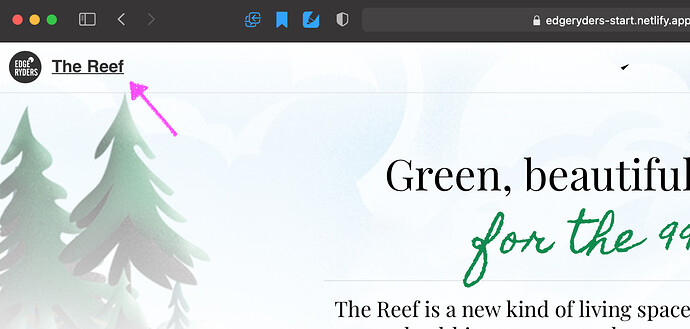
When you click on the upper left menu item ‘The Reef’, you are taken back to the project page.
This makes it very easy to get a macro view of a project without losing your sense of place or getting confused.
How it solves past issues
This configuration fixes all three problems from the report, if done right.
Namely:
- it establishes (and imposes) a unified and coherent UI, as close as possible to the discourse platform UI to avoid confusion.
- it inherits a coherent content hierarchy from the platform - one that is easy to navigate, and provides a sense of place to the user
- it unifies the codebase of all pages, including styling
- it provides a way for creating nice content with no configuration, with the help of smart templates for articles (and the same eventually for newsletters, research papers, campaign pages, media).
- it uses component lazy loading to be as light weight as possible while providing fast navigation.
It also should serve as a useful scaffolding for @nadia and others to strategise content - it is more satisfying and clear to visually grasp what content is needed in each project and fill it in.
Proposal
My proposal is to complete this prototype so we can establish and agree upon a solid UX and UI that caries through across all types of pages.
The analogy here is measure twice, cut once. In development it may be easy to make changes later on, but we save a lot of problems if we all agree and nail down the basic UI standard from the beginning.
This also allows us to consolidate and boil down the essential UI required by all pages that will share the same style assets.
Plan
Similar to the timetable I had discussed with @hugi before, I would like to do this in stages so we are on the same page on each step.
Phase 1: Prototyping
Flesh out the prototype with the following sections:
- The project page, which will include the following sections:
- Pages
- News
- Members
The other sections (currently media, newsletter, etc), which we can discuss after, should be discussed and implemented at another phase or I’ll get overloaded.
-
Templates that dynamically load via the router:
- Page (webkit template)
- Article (read template)
-
Sub page components that we agree on as necessary UI:
- Cards
- Sliders
- Tables
- Information Boxes
- Gallery
Est. time: 2-3 weeks.
Phase 2. Implementing
Once @nadia, @hugi, myself (+ anyone else involved) are happy with the established UX, UI and visual elements, I will transition the prototype to using live data from the platform
At this point we test it with each category on the platform and make necessary adjustments.
Est. time: 1-2 weeks.
Phase 3. Test and Deploy
Workflow
During this development, it would be really good if @hugi can oversee the development, depending of course on his schedule. Checking in every few days is good enough, as long as someone is keeping tabs on how it’s going relative to the schedule.
What’s important is that while I’m doing this, we don’t need to build new sites. This will create a huge muddle. So if there is something urgent, we do it before the plumbing workd.
In the very worst case, if something comes up in the middle of this, you can clone any of the existing webkit templates on the platform, modify the text and see it on live.edgeryders.eu.
Thanks for giving your feedback @hugi, @nadia, @MariaEuler, @alberto.
