The Masters of Networks (#MoN3) event some of us attended this week in Rome re-asserted (in case you still have doubts!) how empowering it is to have full, collective access to the data we are producing.
Gathering a series of serious collective intelligence researchers, data scientists and community managers, the hackathon focused on making sense of the different ways in which people engage in online conversations (mailing lists, forums, social environments like twitter, or other independent platforms). These conversations are scalable and encodable, so for every comment posted, a relationship is created in the database between the sender and the person to which the comment was addressed. When you extract the database and put it in a network analysis software, you can get a graph visualization of the network and key metrics hinting at several characteristics, among which the number of unique relationships formed (edges), number of comments (degrees), no. of connections a user would need to make to reach any other user (average distance).
We had over ten comparable datasets to play with, and dove directly into our burning questions, my own being essentially how to measure the effect (if any) of community managers work on community health? This is harder than it seems because health could mean such different things: it could be a very high rate of user account creation and content generation, it could be dense conversations between members, or it could be many smaller groups connected by very efficient brokers, so that anyone is at two steps away from each other and resources if needed. For some, it simply means a lively environment where people are busy connecting to each other, so we operationalized it as users’ activity (comments) that’s not directed at moderators.
To community builders investing energy nurturing conversation after conversation, a correlation with the amount of community contributions would mean that they’re doing something right (whether community response is a direct effect of their dedication among other factors, that is harder to establish).
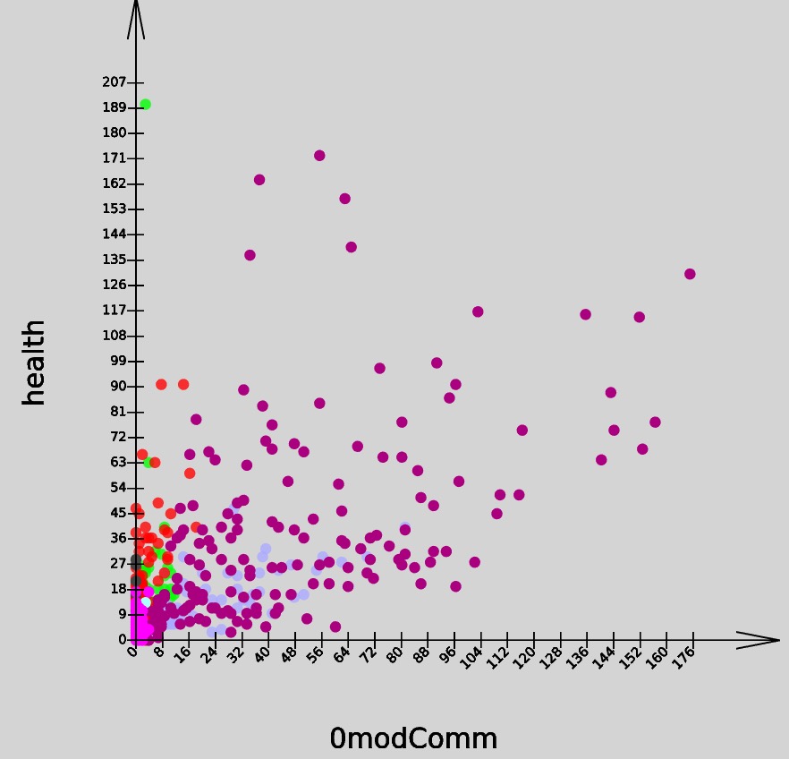
The above is a scatterplot of how this relationship unfolds in Edgeryders (global network of change makers), Matera 2019 (local community of citizens), Innovatori PA (a community of practitioners in the NGO sector) and other mailing list communities. Each dot is the number of comments by community (Y axis) corresponding to a number of comments by moderator (X axis) in a week during the last two years. The violet dots are Edgeryders, and it is also where the relationship was most significant.
Context: These are mostly lasting communities, but their moderation policies are very different, and so is the response: you would see high activity when moderators are little visible, or low, but consistent activity allowing the community to keep decent member ranks. In Edgeryders, a small group go out of their way to make everyone feel welcome and encourage collaboration. Not surprisingly, a dozen moderators account for half of all relationships in the network, which means they know everyone and are part of most conversations. The different shapes of networks offer some clues as to how connections are made. Check out these beautiful visualizations by Edgesense (dots are people, edges are relationships):
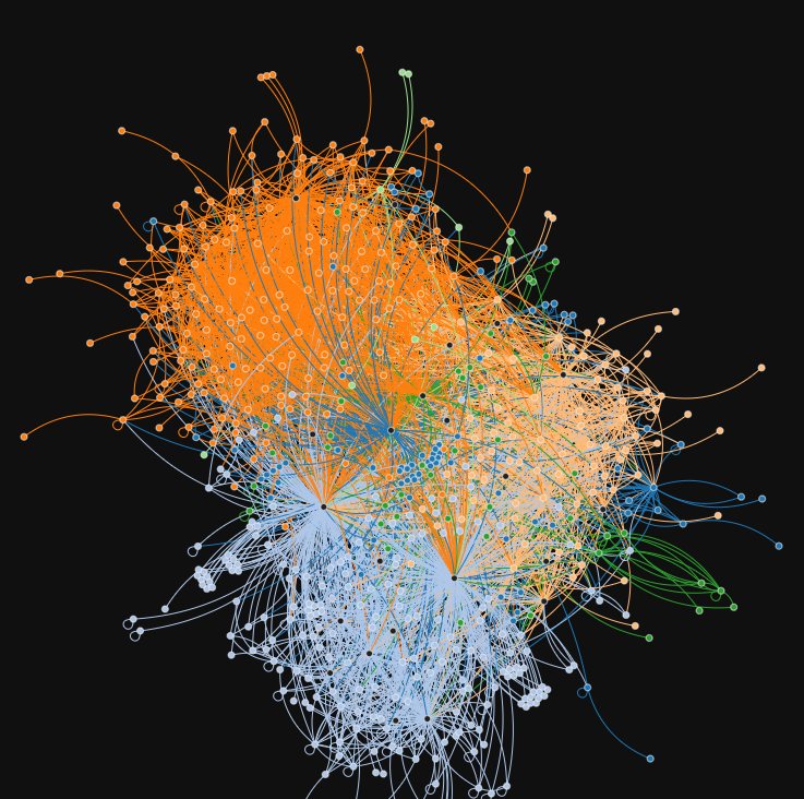
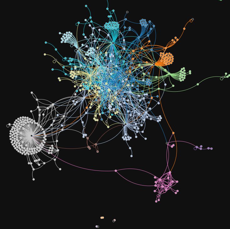
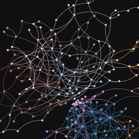
Edgeryders (left), InnovatoriPA (centre). ImaginationForPeople - correspondants Mailing List (right).
Seeing this and hacking away more data (God bless the tons of it), we can decide where to go next and what new connections to help create, what groups could benefit of being brought closer together etc.
The second question we asked was “Can we see user life cycle patterns that could inform engagement practices?” Looking at the Edgeryders database which provided the most substantial data, there was no observable pattern in comments posted by users in their first months following registration. This confirms experience: some people start off as really active contributors and then disappear; others come in, look around, lay low, and then surface when a topic perceived as meaningful emerges. The relevance of the content is clearly an important variable, and it is what most informs our style of engagement - which is stronger when associated with major events or community projects.
Observing Edgeryders registered in August/Sept 2013 throughout 3 months, and same for the year after, we see some common behavior (look at the curves below), mainly because the period is synced to the Living on the Edge events #3 and #4, which see more evenly distributed platform activity.
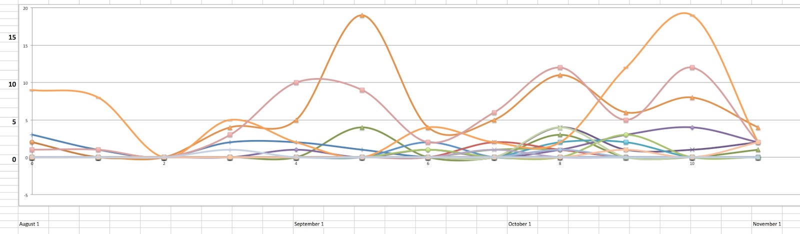
2013
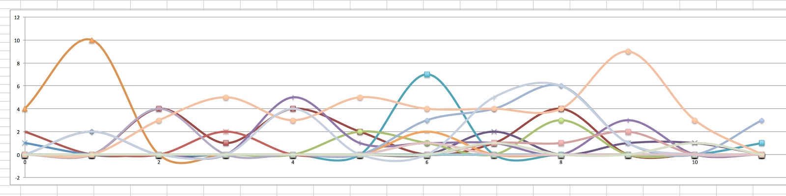
2014
So much more is to be dug from the data, hacked and learned, and luckily we have in @brenoust, @melancon, @Luca_Mearelli, @Alberto and others here true help (thanks to all of you for providing the infrastructure and beautiful network representations/ visualizations during MoN3!). Human behavior being highly complex and unpredictable, we are still a long way of learning what is shaping any person’s ability to contribute. What’s pretty clear to me, having worked closely with Edgeryders and confirmed more of own intuitions, is that online community management is crucial and pays off when working for social change, especially when forging relationships between global citizens or facilitating conditions for highly capable knowledge workers to work remotely from each other and in their own terms.