This thread is dedicated to presentation and discussion of the illustration material related to the Worldbuilding Academy.
1. Witness Community
2. Witness World & Distrikts
Witness Birdview
Project Viking
Libria
The Assembly
The Covenant
3. Witness Updates
Status updates
4. Concept Development
This is the graphic novel development scheme with explanation bullet points for the drawings as presented by the illustrators:
General considerations:
the form is a diary: graphic novel and illustrations
it serves the distant evocative models of a journey through imagination as the journal, the ship diary, the illustrated touring guide
its narrative formula is the closest to the participatory nature of the web which is one of the bases of the project
Three phases of the story:
the participation
the visions
the writing
Each phase is covered with 3 tables of the graphic novel
The fourth element of the story is the territory - always present in the visual description: both in “remote” and immaterial presence of the participants and its material substance
PHASE I - three tables
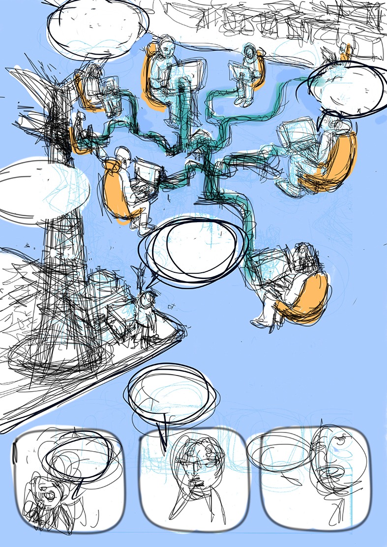
three principal actors of the project sharing the objectives of their missions in a long distance, asynchronous dialogue
the place is virtual, the characters are depicted by the avatars of the participating associations
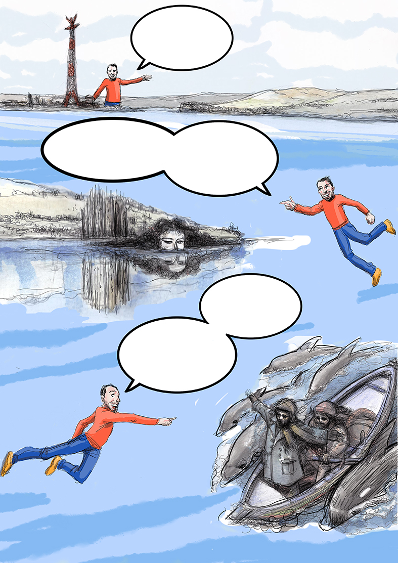
TAV 1 — sketch
The form of this cyberspace is the Straights area over which the avatars hover connected through a “connected collective” structure.
Below them we see fragments of discussions and synthesis of the keystone ideas
TAV 2 & 3— sketches
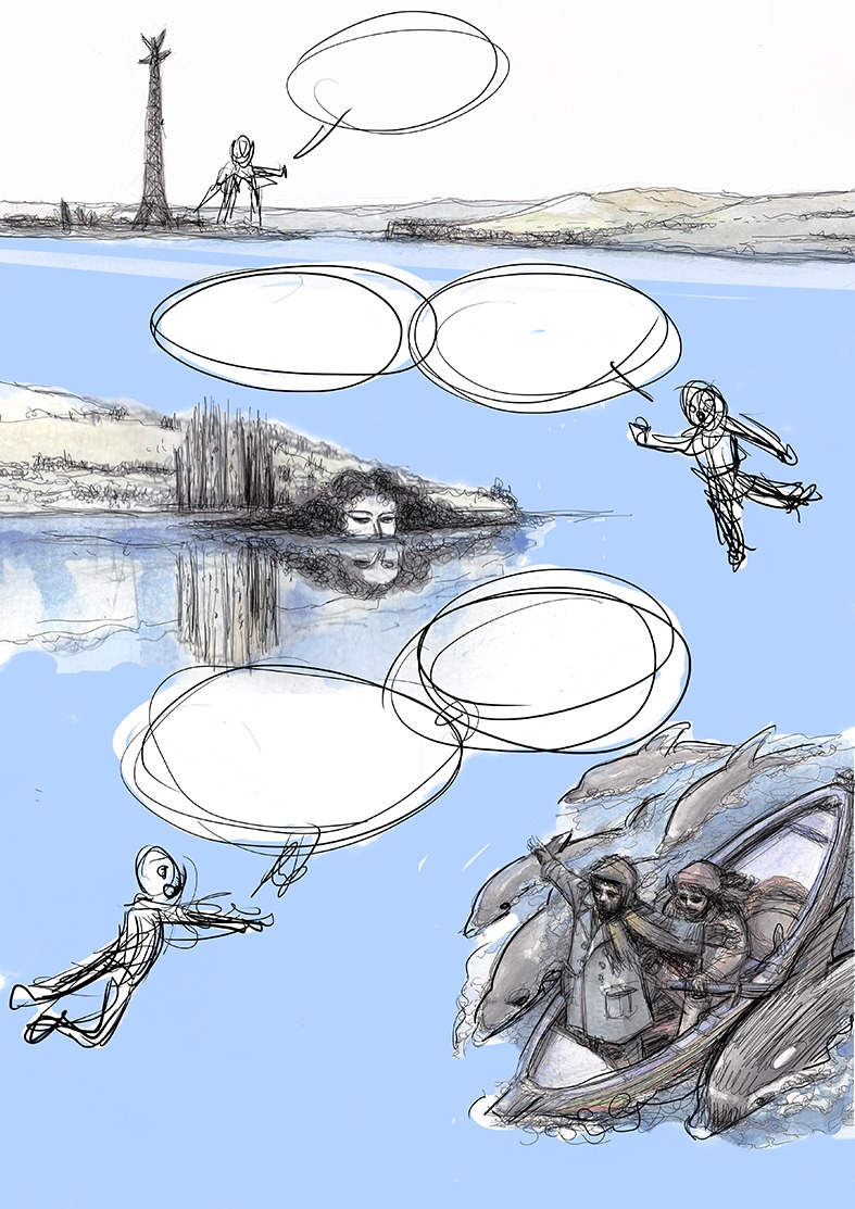
Team members are guided by one of them (supposedly FdCM) to get to know the area of the future Residency which will be the site of the social and economic laboratory and the experiments on different economic systems
The points present are Eex Enel antenna, the mythological (fata morgana) and literary (Horcynus Orca by Stefano D’Arrigo, which gives name to the parc that will host the Residency) references.
The tour ends at the sea which hosts abandoned beach establishments which represent the necessity of a change (social and economic) connected to the territory.
(This may open considerations on the character of economic development proper and peculiar to this area which have changed the architectural profile).
There is a mention of the fishing practices of swordfish with the typical boats (feluca) which refers to a multilayer relationship of the city with the sea.
PHASE II
The visions
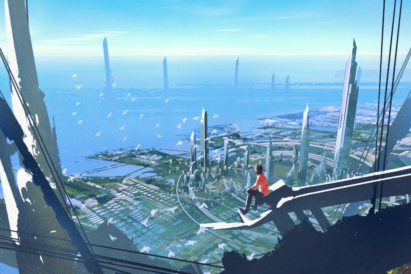
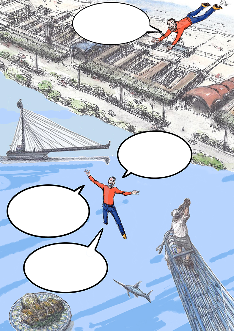
The first sketch uses a bird’s view to represent the future derivation of the Straights area. The structure at the centre, a floating flower which hosts different structures, is taken from the concept note and will be the starting point for the visual description of the districts.
TAV 4 - sketch see in the above post
A postcard from the future: the floating mother structure is represented with moments in life of its inhabitants.
The following sketches will present “the writer” as a central point directing the narrative. Around him, orchestraly (to be defined) the districts arise and are represented in their peculiar aspects.
PHASE III - the writing
defines the epilogue of the experiment and its public presentation
This is the first image by Michela illustrating the concept note.
The task of the illustrators is to create a storyboard that follows the development of the idea of the academy using their own style and to produce 5 visions of 5 districts as well as some details.
To do this, they will need your comments and support because we are talking about a work in progress.
The time frame to produce the final images is not big, so there will not be much space for major corrections. For that reason, the suggestions and the comments of the builders are necessary and appreciated, so guys, please let our illustrators know your ideas on the visual aspects of the districts as well as their descriptions, founding ideas etc.
This is the graphic novel development scheme with explanation bullet points for the drawings as presented by the illustrators:
General considerations:
the form is a diary: graphic novel and illustrations
it serves the distant evocative models of a journey through imagination as the journal, the ship diary, the illustrated touring guide
its narrative formula is the closest to the participatory nature of the web which is one of the bases of the project
Three phases of the story:
the participation
the visions
the writing
Each phase is covered with 3 tables of the graphic novel
The fourth element of the story is the territory - always present in the visual description: both in “remote” and immaterial presence of the participants and its material substance
PHASE I - three tables
three principal actors of the project sharing the objectives of their missions in a long distance, asynchronous dialogue
the place is virtual, the characters are depicted by the avatars of the participating associations
TAV 1 — sketch
The form of this cyberspace is the Straights area over which the avatars hover connected through a “connected collective” structure.
Below them we see fragments of discussions and synthesis of the keystone ideas
TAV 2 & 3— sketches
Team members are guided by one of them (supposedly FdCM) to get to know the area of the future Residency which will be the site of the social and economic laboratory and the experiments on different economic systems
The points present are Eex Enel antenna, the mythological (fata morgana) and literary (Horcynus Orca by Stefano D’Arrigo, which gives name to the parc that will host the Residency) references.
The tour ends at the sea which hosts abandoned beach establishments which represent the necessity of a change (social and economic) connected to the territory.
(This may open considerations on the character of economic development proper and peculiar to this area which have changed the architectural profile).
There is a mention of the fishing practices of swordfish with the typical boats (feluca) which refers to a multilayer relationship of the city with the sea.
PHASE II
The visions
The first sketch uses a bird’s view to represent the future derivation of the Straights area. The structure at the centre, a floating flower which hosts different structures, is taken from the concept note and will be the starting point for the visual description of the districts.
TAV 4 - sketch see in the above post
A postcard from the future: the floating mother structure is represented with moments in life of its inhabitants.
The following sketches will present “the writer” as a central point directing the narrative. Around him, orchestraly (to be defined) the districts arise and are represented in their peculiar aspects.
PHASE III - the writing
defines the epilogue of the experiment and its public presentation
the concept is not bad. I think the final aesthetics will need to be different from what I have seen so far - also because we need to have persons/individuals in there rather than anonymous people. How do people want to be represented? Portraits? Avatars? What style?
The other part is that we need to have acknowledgement of the community members who have and will contribute to this story up until december - how to include their presence in this?
I have perhaps shortened it a bit too much.
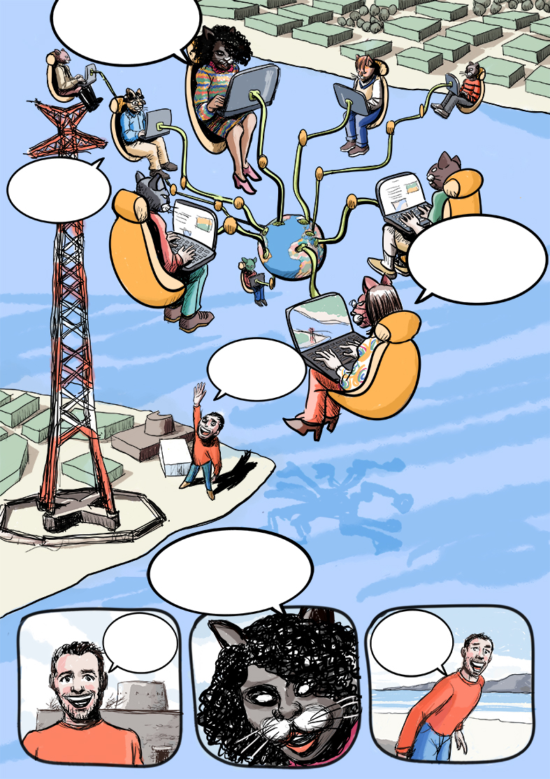
The avatars are going to represent Alberto, Yudhanjaya and Joriam plus Giacomo or someone on the FdCM side. I think we could add one or two more characters, but not more than that. The preparatory sketches above show possible ways of interaction, but we are still waiting for the actual portraits.
The acknowledgement to the community members will go through a final thank you page and the logos of the participatory associations will be on the front and the last page. EIT Climate KIC logo has to be on every page for TCL reasons.
We could really ask you 4 main characters, to choose an animal to dress your avatar with. The idea is precisely to play on the fact that we are building all this at a distance, interacting in a virtual space which, at the moment, has no shape, but which if it had it would be as we wish. More or less. Your words will identify you. The only thing that really looks like it is the territory they move into.
Love the idea, @IvanC. I am +1 for this.
Let me share some artwork that might be of use (or not) to Michela’s imagination - just stuff I’m keeping as reference art for whenever I think of the city itself. They’re from an artist called Tithi Luadthong.
Made some art of buildings using Townscaper and threw them in here → The History of Witness . These are of course just meant to be placeholders, and I’m pretending that these were Denton’s sketches that may or may not have been how Witness actually looks like in practice.
Hi Yudhanjaya (also ping @Joriam and @alberto) , I will be having a chat later on with the illustrators.
Are there any thoughts or ideas that you would like to add to the imagery of the districts?
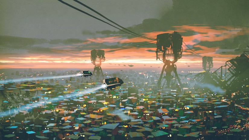
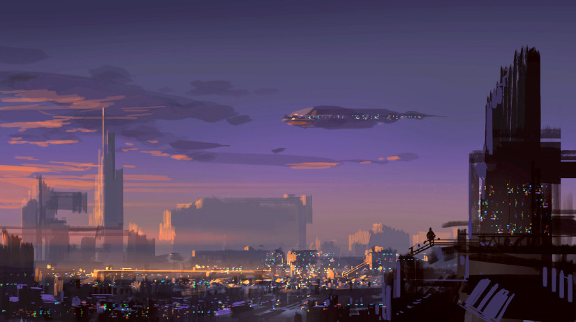
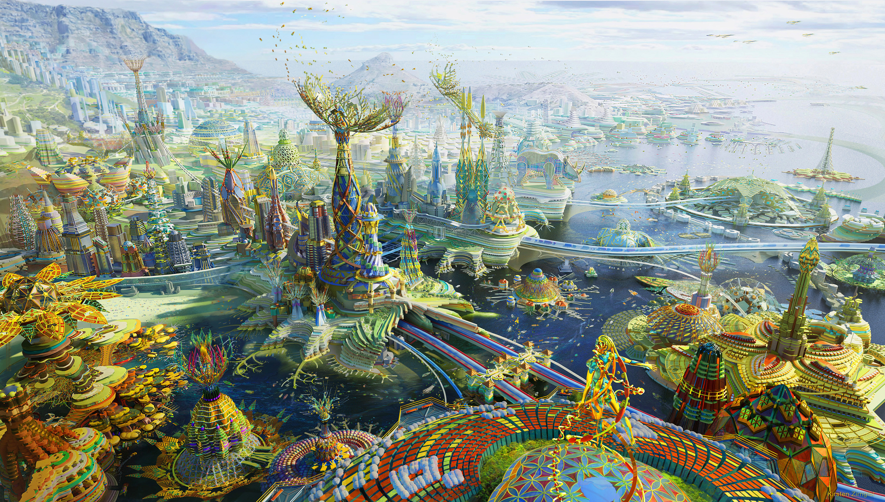
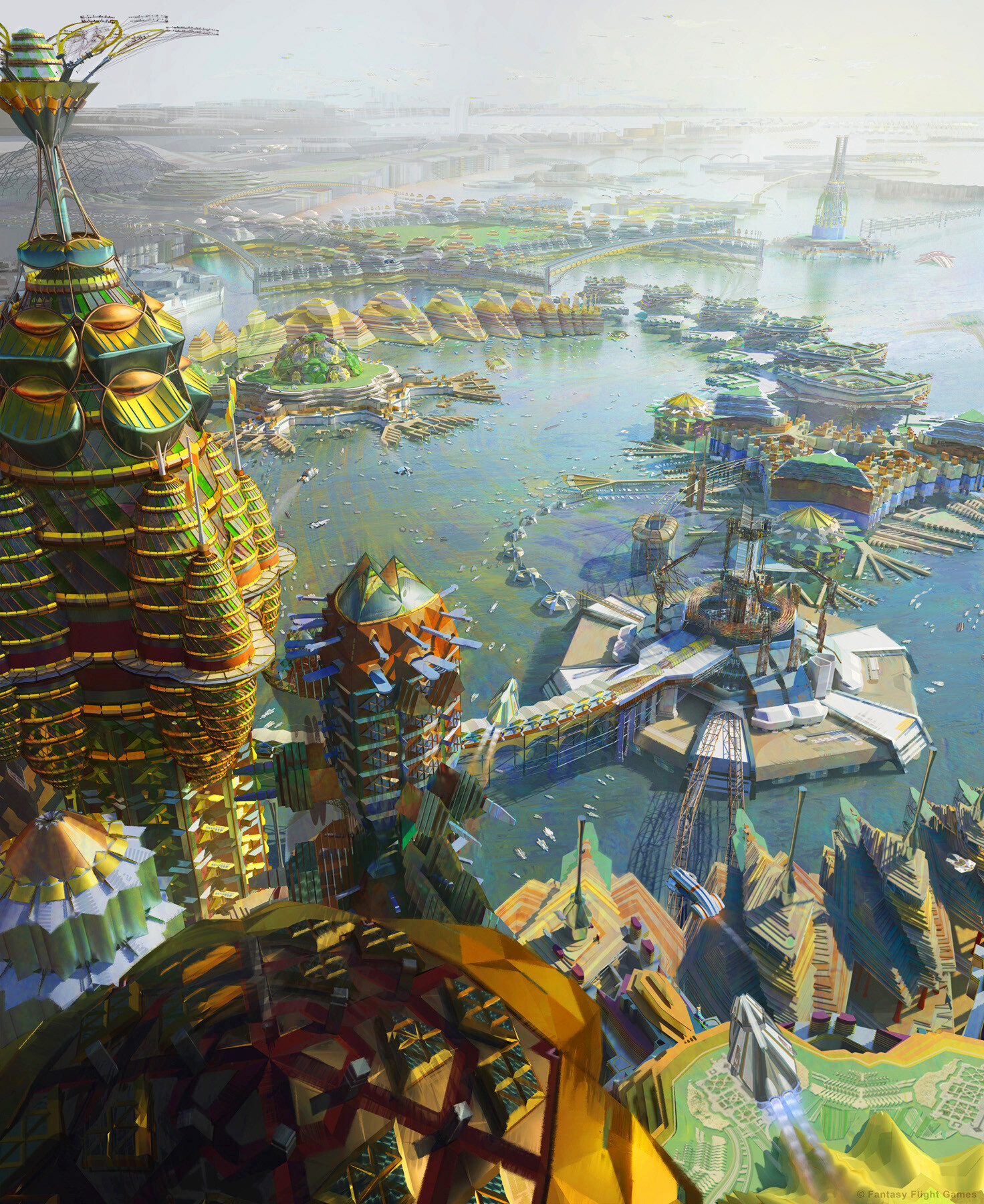
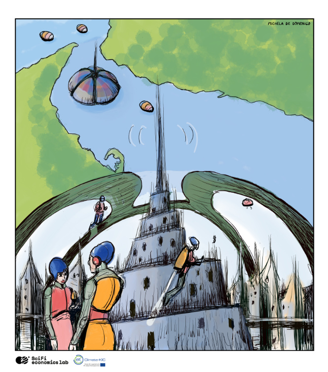
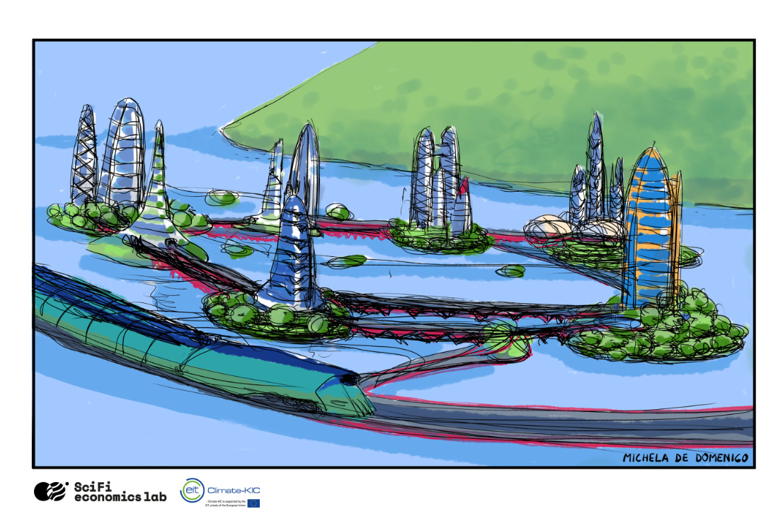
Hi. These are the first panels of the graphic novel we are preparing. The first part contains the meeting between the Edgeryders and the territory of the Strait of Messina, the second part is the presentation of the protagonists and the working method used, finally in the third part the central city and its districts are presented. What do you think?
The final part will take us on a trip with the Migrant Train through the districts.
A couple of explanations here.
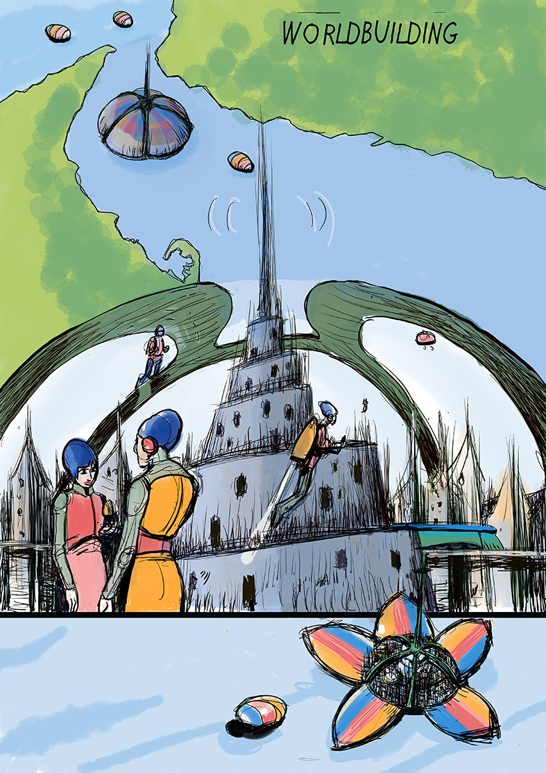
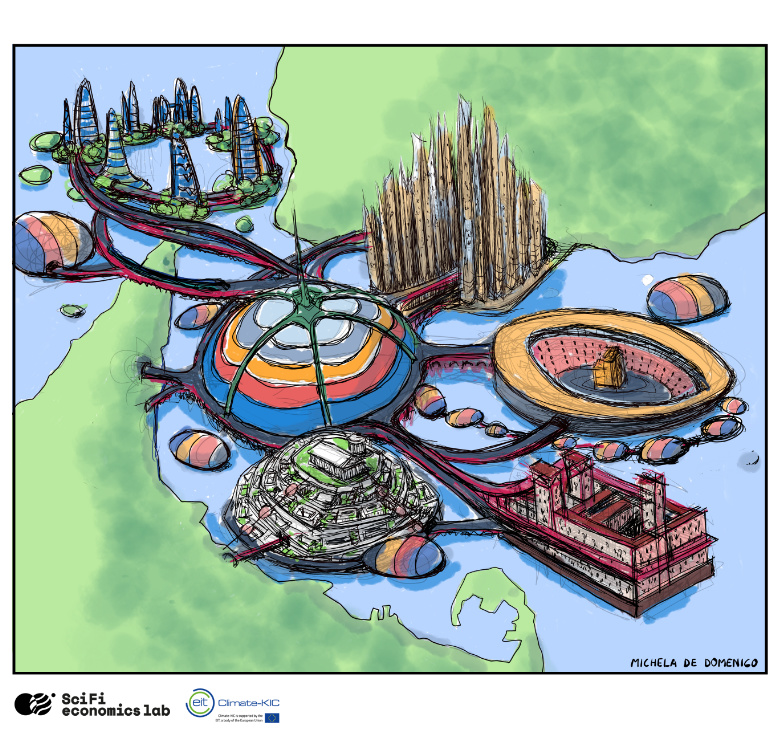
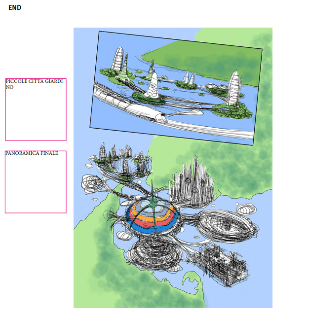
The last image (with “Worldbuilding” in the upper corner) represents actually only the beginning of the Project Viking. At the end of the graphic novel, the districts will appear attached to it giving the sense of their diversity, wastness and unforeseen growth.
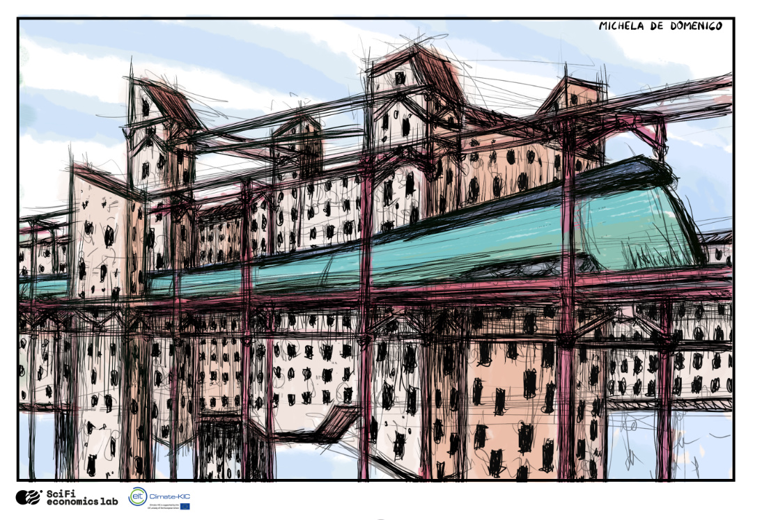
The central structure will have experienced a radical internal transformation from the original city core to become what we now know as the Ramos Harvest Division with its connections which reach out to all of the districts.
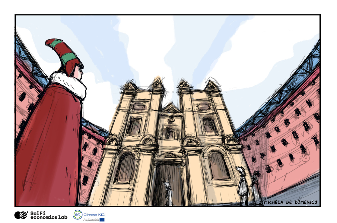
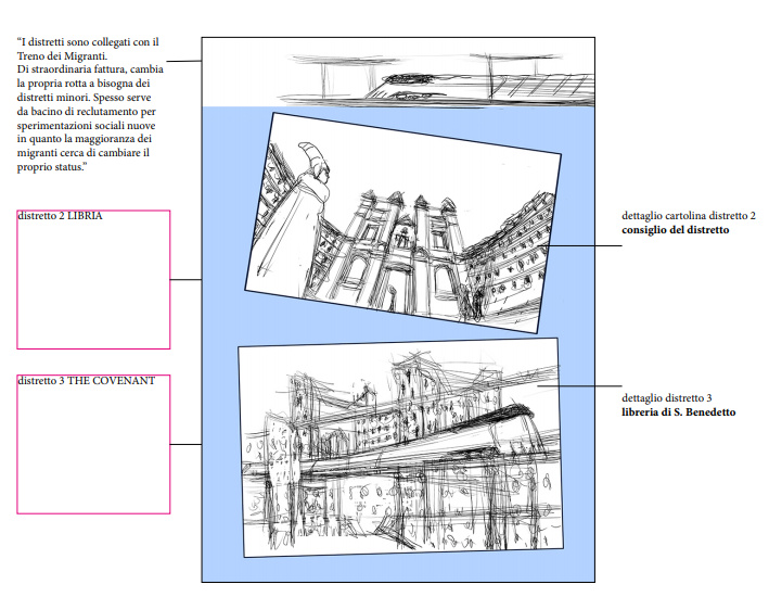
As the landmarks for each district we have chosen the Libria’s District Council - references are the Renaissance Baroque palaces of Rome, but still exploring, Saint Benedict’s Library for the Covenant - Yudhanjaya’s model and Clairvaux, Subiaco and Catania for example and the (hanging?) garden cities for the Assembly. Terminus (hellenistic - roman) and Medium (Yudhanjaya - Shanghai - New York - Dubai skylines) will be sketched in the distance. All other references would be highly appreciated if they arrive in time to be drawn :-).
Hey folks! I’m digging this, though I feel a bit unsure on how to contribute!
Here’s a couple of ideas that I’m not sure if they’re good or not, but some food for thought:
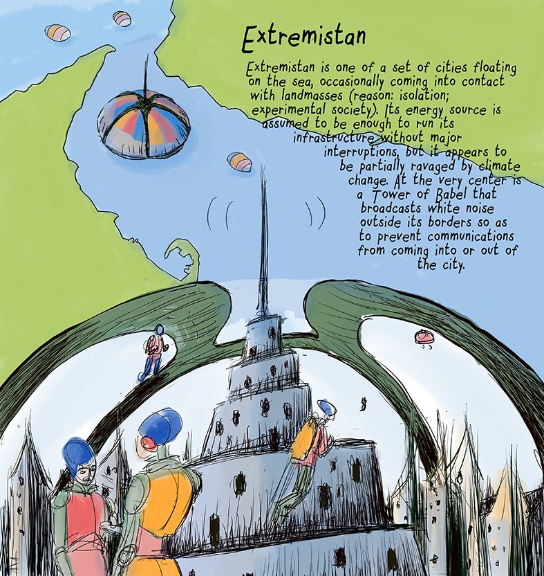
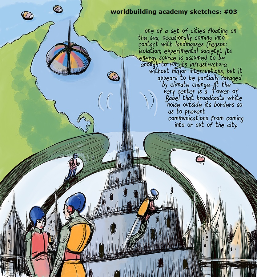
_ I’d love to see the thriving world among the ashes of a self-destructive world — something like the comparison between the water the cities treat VS the polluted waters off the outer ring.
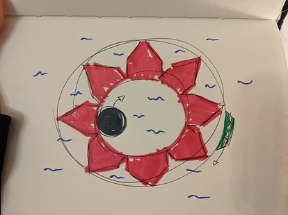
_ I had given this rough sketch of a possible way to organise the cities. It’s not canon, but it had this cool property of creating modular cities and wandering distriks trying to find a home. I don’t wanna push exactly this design, but I wanted the artists to have it around.
In this architecture, each red bit is a distrikt, and they can attach and detach themselves. But there’s also the black circle, which is a moving piece of shared infrastructure that takes care of the water in the middle. (PS. if I’m not mistaken, Yudha asked this train to be in the interior of the circle, not outside like I drew)
The important part here is to show the designs are evolving, modular, everchanging. If we could demonstrate that visually, that’d be a-ma-zing!
_ I found this artist (playing Occupy White Walls lol) and I thought it was inspiring for this project here, perhaps our artists would also dig her work. Her name is Kirsten Zirngibl.
These images are really nice, would love to spend some time in a place like that.
If you take a look, Michela actually developped the first image of the city starting from your design. She interpreted it as a flower with the petals that can open and close. It is now evolving into the Ramos Harvest Division - the “single central power station”
which supplies all the districts with a (minimal) amount of energy.
Reading Yudhanjaya’s description of Witness, the city has grown far out of the original boundaries. To illustrate that, while the centre keeps its circular and orderly form, the geography of each district assumes the shape defined by its internal dynamics and the train - “extraordinary tough construct, a self-sustaining Snowpiercer-like that travels through these Distrikts, occasionally recalibrating its route to account for new or missing Minor Distrikts” - adpats to their social and territorial morphology.
Like that we get to have the elements of unity - energy plant, the train, and the elements of division - the diversity of the districts. Dialectics of the urban planning

 Merging My face + cat face