Help create a logo for LOTE5

Found a great icon :))

A great resource is nounproject.com where there is an icon for pretty much anything you can think of. I did a serach for failure and my absolute favourite was this one :))/p>


Also @KiraVde and @RossellaB, I just remembered that all the design files for lote4 visual communications material are available for reuse and modification here. Why not just modify them a bit e.g. different main colour than orange?
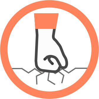
Are they CC?

I got some ideas - great that the source files are still available!

Yes. Everything on or commissioned by ER is.

So remix freely. I think Ola Moller would find it a nice gesture if he were credited for the original files.

I ment the ones from nounproject

But bien sure Ola can have his credit

Aha we need to purchase them few dollars/icon

Tell me which one you want and we’ll get it. Then we can use it as we please

logo ideas

I’ve been meaning to play with Inkscape for a while now, and seeing this burning money inspired me. :slight_smile:

First attempt:


Second attempt with flame from google search:


Third attempt with stolen money and flame. (dunno who did the money and flame, but I can check if you care about licenses):


I can tweak them for you if you have any requests. (Don’t worry if you’re not interested, it was just an excuse to learn Inkscape.)

1 Like

Variations on a theme

I like the orange flame!

Maybe have different colours for the #fail (so maybe blue flame?) and #unfail (Green heart?). And stick to those colours for all communications?

Tried this… What do you think?


Putting the flame and the heart

in one logo is too much going on if you ask me

if we have an illustrator reading this: could it work to have a flame with on the one side money going in and on the other side a phoenix rising out?

checking out if we can do something with the other logo options, otherwise let’s stick to the simple version of money + flame?

1 Like

Marking the assignees

Testing how the task appears in a minisite page.

Is this still open?

Hi folks,

Im new here https://edgeryders.eu/en/arrivals/onco-ampliative-art  I think I could help on this.

As the theme is fail unfail, which I understand as two movements, I’ve thought that maybe could be nice a logo of a fist that fail to the floor and at the same time could seems as a fist that is rising from the ground. If you want I can try :slight_smile:

Cheers

1 Like

Go for it :))

It’s still open. Plus it’s kind of fun if people just kind of do what they want :)) There are so many ways to fail and unfail

Let see if this works

Just for try it. As mentioned above, I’ve tried to make something ambiguous as it could serve for fail or for unfail (rise, stand up from the ground when you fail to it).


2 Likes

I was thinking of something


I was thinking of something like this. Sorry I didn’t have time to follow the discussion beacuse of annoying family issues, I might therefore be completely out of target.

1 Like

It’s different from the style of proposals

that we’ve been having this far.

Personally I like it, but it misses the funny visual element of burning money or a crashing zeppelin.

In your opinion should we prioritize minimalistic, easy to understand over funny?

Well, it depends a lot on the (communication) target. As I missed your call, I’m not sure what the target is, so I can’t make a statement about it. Personally I find this a little funny as well, but that’s because I’m a graphic designer and I’m referring to mistakes in the press process.

People who don’t have a graphic design background should be

Able to get the joke as well :slight_smile:

Aesthetically I really like this image, but I think we should push it in the direction of something that will relate to (un)failure for a bigger audience. Have you seen the suggestions for burning money? Did you find them inspiring? If we could combinethat idea with your graphic design skills we should have something verry nize…

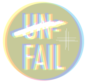
Hi Kira, sorry again for disappearing. I tried working on some solutions in the line you mentioned but didn’t get too far and then I saw that they have already picked the logo.

Actually no worries

We picked your logo as a winner!

In the end, we thought it was the most good-looking. We announced it yesterday, but I guess you didn’t get the announcement

→ https://edgeryders.eu/en/lote5/drumrolls-we-have-a-logo

Oh yes I saw that thanks! I just didn’t want to leave your question unanswered.

1 Like

Very cool :slight_smile:

Rossella, are you up for making the banners etc by modifying pre-existing design files?

I don’t know that we have any budget to offer, but if you could make an estimate of how much time is involved and what you would have asked to be paid for it for a non-profit then this is something we could maybe put into a budget of what the event costs. If we do manage to get funds then we could try to cover at least part of it. Would that work for you?