Masters of Networks - POPREBEL Challenge documentation

This is a wiki. Additions to be made after each day.

Morning intro

Masters of Networks is a series of events organised by Edgeryders and according to @alberto, it is essentially about playing with data and networks. Participants get the time and space to do interdisciplinary work which everyone wants, but it is not easy to do. So Masters of Networks is open to researchers and enthusiasts, irrespective of their level of knowledge and the tools that they use in their analysis work.

Networks, for @melancon, elancon is about ā€™connecting dotsā€™. People talk to each other. They are comprised of:

  1. People, or contributors
  2. What is being said, or content
  3. Nodes: a node is an attribution of meaning that has emerged from the qualitative coding and research done by ethnographers.

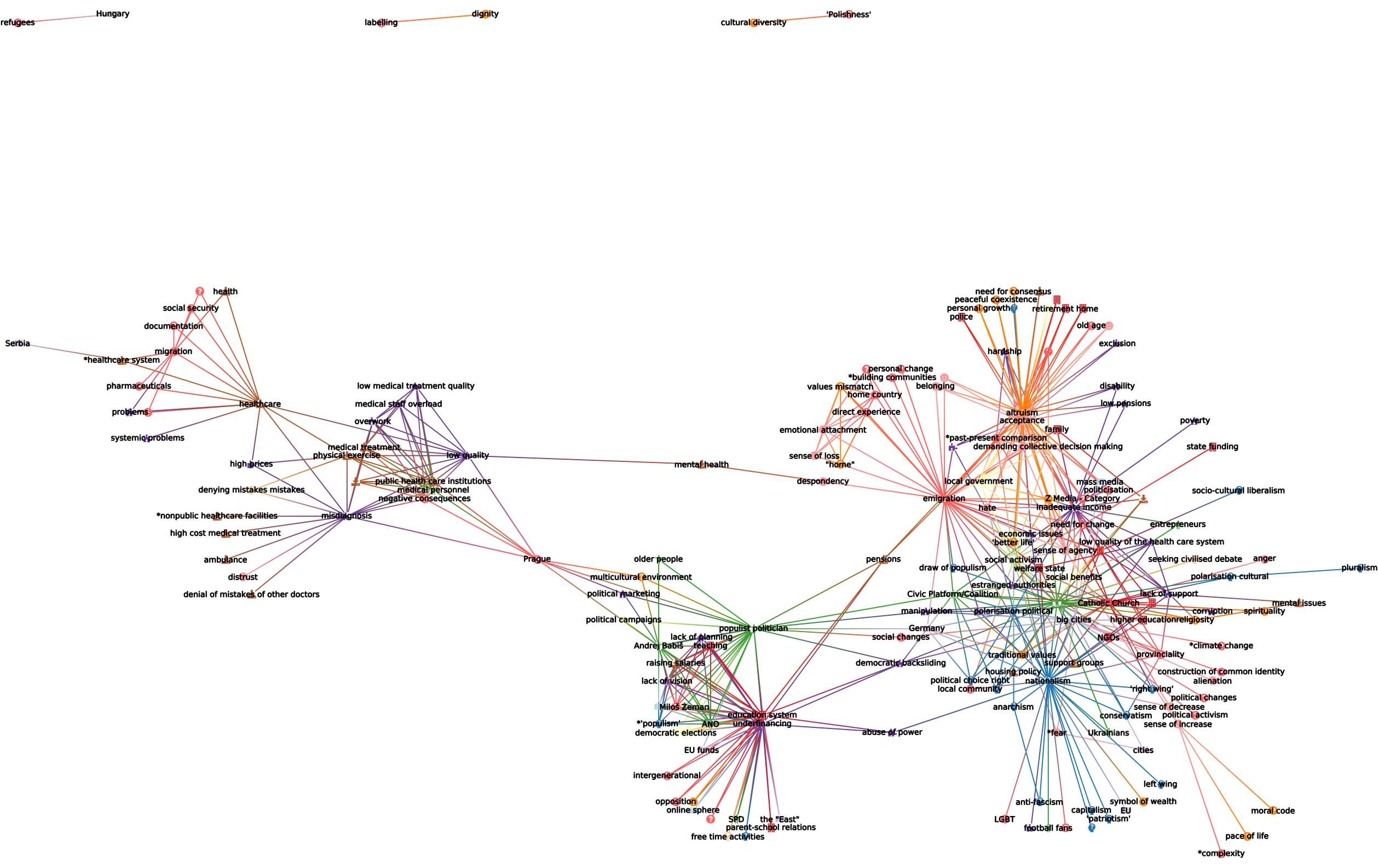
Day 1: POPREBEL Challenge

We are a roomful of (digital) anthropologists and data model experts: @Djan, @Maniamana, @jitka.kralova, @amelia, @Jirka_Kocian, @SZdenek, and respectively @bpinaud and @Hugi.

Above: the POPREBEL community; green = Serbia; blue = Poland; red = Czechia

How do we use SSNA to interact with different kinds of network visualisations?
How can we visualise the data usefully?

Ideas the team had for explorations:

  1. What populist themes are shared or unique to each country? How useful can visualisations be to compare the data across countries? Visualisation is a communication means - if you have the question, visualisations help you to answer it. Sometimes a visualisation can show researchers who have coded separate data that they have the same themes coming up.

  2. Discourse analysis and patterns - drawing from digital spaces. Djan is looking at Telegram chat events - i.e. when a conspiracy theorist (Atila Hildmann) posted a lot of messages and in the analysis you can see what are the patterns of that discursive model of conspiracy myths.

  3. Can we visualise different code categories? Grouping codes into particular categories like ā€˜emotion codesā€™ versus ā€˜people codesā€™? It means we would designate codes based on particular categories (Amelia). Also: we have a lot of codes not right away connected to populism, emotional or ideological elements. If we can see how they connect to other topics more close to populism that would be interesting (Zdenek).

  4. In a timeline: can we see what are the new POPREBEL topics that emerged in the last months? (Jitka)

  5. What other possibilities exist to enhance the overview? Could we render code categories, node interrelations, colors per country in different ways? (Jirka)

What the team converged on:

We started from the Babel visualization model demonstrated by @Hugi. Different codes categories could be visualised in the graph: codes for Characters were highlighted and could be visualized alongside codes related to the story plots (Babel is a fiction writing project). For POPREBEL, this would translate into:

Given that for example the Catholic Church appears in different countries, then Institutions could become a distinct category, and all of the specific institutions would then be lifted from the graph through different coloring.
Similarly, we could color code Emotions and the subsequent emotions codes to understand how they relate to each other and other categories. Example:

All the top level categories that Amelia and Jan are working on:

  • Values and Beliefs

  • Ideologies

  • Emotions

  • Institutions

  • Actions and Activities

  • People and Identities

  • Movements and Events

  • Places

  • Problems

  • Social and Political Processes

  • Resource Needs

  • COVID-19 (can be changed/distributed)

Djan: one thing i noticed is a multilayered understanding of ā€œFreedomā€. Freedom to do something despite lockdown measures vs Freedom from being harmed from those deciding to ignore lockdown measures. How are these laden concepts dealt with visually?

Amelia: this is a code review question, itā€™s not really about dealing with those visually as much as it is making sure the codes are good/specific enough to capture the concept

Day 2:

Morning explorations with Amelia, Dzenek, Jiri, Noemi:

  • When we group codes into categories like Problems, could they support and illustrate key insights about the research? For example what Jan calls the ā€˜cardboard stateā€™? For example, looking at ā€˜corruptionā€™ as a problem and seeing what codes it co-occurs with, in other categories, would be very interesting!
  • Which codes are not being included in the categories ? Where should they belong? This is the case for ā€˜votingā€™ ā†’ which could now belong to something like ā€˜Political processesā€™.
  • The timestamp is interesting before it allows to distinguish the ethnographersā€™ analysis, how it evolved, and also to distinguish between the different datasets!
  • Jirka has been working with Tulip in another study of 80 000 interviews on anti-semitism (?), with semi-automated coding. Weā€™d like to plan an introduction presentation of the methodology they used!

Day 3

Afternoon presentations: see the results in the comments below!

The timeframe is important for POPREBEL - we want to see the difference between pure conversational data and newer methods and datasets that 4 country ethnographers, who came in in early 2021, have adopted.

The chronological dimension is linked to the date of posting, not code appearance.

Noemi: do we need to compare the different datasets? According to Amelia: not so important, but what you can see is how certain codes over time become connected a lot with a whole new set of codes, which shed light on very important connections.


Somewhat more technical documentation for these days can be accessed here:

2 Likes

Ping @Jan maybe this is helpful for you ahead of tomorrow,

1 Like

https://mediapod.u-bordeaux.fr/video/19348-master-of-network-5-poprebel-ethno-code-appearance-tulip-demo/

As discussed this morning, I have created a Tulip Python script to show dynamically ethno code appearance in chronological order. I took posts in chronological order, create a node for each code and add an edge between two codes if they co-appear together in a post. Edges are only displayed if the co-appearance is above a given threshold.
You can see on the low quality video that the graph is updated after dealing with each post and if at least one edge have a co-appearance index above the threshold (5 in the video). I am building the whole graph (not taking the threshold into account) but only displayed edges (and the associated nodes) above the threshold.
Enjoy!!
Amelia saw this demo live!
each generated graph is saved in a subgraph. With a threshold set to 5, i have 221 subgraphs.
Nice isnā€™t it @melancon @alberto

2 Likes

Super enjoyed working with @bpinaud today!

My work was less fun but hopefully will contribute to enhancing our visualisations tomorrow. I have created parent categories for our codes in the backend (as @noemi has listed above) and sorted most of our codes into them. These have a ā€œZā€ in front of them. They are based on the categories discussed with @Jan a while back.

They need refining but really help with the readability of the codes in the backend (so that we can also refine the codes, as well). We will use them tomorrow with @bpinaud to either colorise or use icons for the codes to see how the ā€œtypesā€ interact with each other.

@rebelethno, I also added a list of codes that need translations. They are nested under the top category AAA*NEED TRANSLATION. Please add the translations ASAP! Thanks :slight_smile:

3 Likes

much better quality video:

https://mediapod.u-bordeaux.fr/video/19354-master-of-network-5-poprebel-ethno-code-appearance-tulip-demo-better-quality/

4 Likes

May I have a csv export? I still have some time today to code more. It is my third MoN (I think) and it is still great even if it is virtual. No beer together tonight to continue working :frowning:
cannot attend tomorrow morning. I will be there around 14:00.

1 Like

Hm Iā€™m not sure how to exportā€¦ @hugi, @alberto, still around by chance?

great work @bpinaud, and so fast, well done!!

speed and layout stability can be improved. Itā€™s a first draft. Letā€™s add some nice icons and colors first following code categories. We should check this wilth @amelia this afternoon (Iā€™ll be on zoom around 14:00). I need a new export of the data following the @ameliaā€™s work of yesterday. And of course, you will be able to watch a live demo :slight_smile:

This is great work, well done Bruno and all.

Incidentally, with Federico we sarted lookng at ā€œoldā€ data (opencare) for which we already had worked on an animation showing how conversations evolved (some of you will remember those conversations we had about going from ā€œtalk to actionā€).

Federico had the idea of embedding everything in 3D to allow him to navigate th graph using a VR system he is using. Not sure I will be able to embed the data with the animation though. We hope to showcase recent data with this VR environment for this MoN edition.

1 Like

And instead of simply counting co-appearance, you may want compute a co-occurrence index of the codes. Yesterday I was talking about the Jaccard index (Jaccard index - Wikipedia). We could talk on this. @melancon is a much better expert than I and I think @alberto is also good at this.

1 Like

Of course, but what do you exactly need in it?

Some separate CSV files for posts, users, annotations and codes are here: https://zenodo.org/record/4562451#.YIqBLqHRZhE . But not fully up to date, I made the export 2 weeks ago.

Also, @bpinaud I need about 30 mins of your time to restore my peace of mind. Let me know when you are around, please.

Ok. Should be possible around 13:30. @amelia modified the backend yesterday to add some categories to the codes. Maybe a new version of the codes.csv file should be enough.

Good! Letā€™s trade then.

New export is done, I uploaded it as a new version (2.5) of the same dataset onto Zenodo:

1 Like

connected on zoom. Just realized I have deleted my python script yesterday when doing my every day backup. I am going to rewrite it nowā€¦ :unamused:

So, I rewrote my script (faster than yesterday) after erasing it yesterday by accident and I also added colors and icons following @amelia advices (I found some errors or problems in the dataset. Not all first ancestor are a category and some codes do not eixst). I will try to produce a nice animation for tomorrow. I generated a subgraph for each interesting timestamp. You can still see the dynamic construction of the whole network.

here is one example of a subgraph (question mark in the nodes are used when I found no categories):
image

1 Like

@alberto it shows that the 2.5 version is from 25th February 2021, is that correct? Can we have version of @rebelethno codes from today or yesterday? (@amelia has done some merging and grouping of codes we would like to see in the graph).

  • is somewhere a description/tutorial, how can i import all the csv into my Python or Tupil in order to get the network? I tried it but i got only a square of dots. ā€¦ Last time we worked with .tlpx files.

@bpinaud Thank you, looks interesting. However, it jumps from one place to another. Could we have few codes as fixed points in the 2Dspace and see the others emerge and (re)link to each other and those few ā€œcoreā€ codes?

Version 2.5 is from yesterday.

1 Like

Producing a nice layout of a dynamic graph is a very hard problem. I am working on something better from previous projects. I do not know if I will have time. I already have a better animation but with jumps.

2 Likes