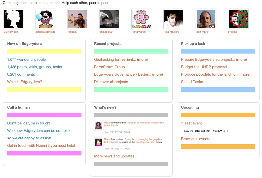
The Edgeryders platform evolves with its community: we know this. We improve by trial and error – and recently people have been pointing out that there is a lot of action happening, and it has gotten more and more difficult to stay on top of it. It is a testimony to the community’s cohesion and passion that people have not disengaged, but now we really need to find a focal point, a “main square” where people can quickly and easily figure out what we can do with Edgeryders at any point in time.

So, we designed a new home page for signed-in users (for now). It is essentially a dashboard based on six color-coded quadrants, each reporting real-time information from the website through databse queries. Each quadrant ends with a live link that contanins a call to action: browse projects or create your own, visit the task manager and accept a task or create a new one and so forth. At the same time, we will be rewiring the main menu to reflect these things.
We are now beginning a test phase: this will work with Google’s Content Experiments, so that some of you might see at some point the new home page, others will still see the old one, and we will track the perfomance of the one vs. the other with respect to goals like visit depth or content creation. If you were served the old home page and are curious about the new one, you can find it here.