Hello followers of the openrampette project.
Here is a brand new update about the procedure track: results and insights from the usability testing of the prototype.
We left last week with an update on the design and development of the prototype for the regulation procedure. This procedure will let a shop owner make an accessible shop in the City of Milan comply with the local government’s building regulations.
At the moment the procedure is entirely paper based, not easy to follow and fill. We tried to digitalize the most part of the process so a shop owner would only need a browser to complete the procedure.
See this post (link) if you want to know more about the prototype of the webapp and about the research that led to this solution.
So what do you do after you create a prototype? You test it!
On the 12th of July we set up a public meeting were shop owners and other citizens could try and test and give feedback about the prototype.
After introducing the user research results and the reasoning behind the design of the prototype, we set up 3 testing stations, each fitted with a laptop and a member of the team taking notes.
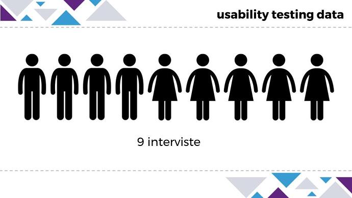
We tested with 9 people, half of which were shop owners (our Minervas), one person with mobility impairment (our Dioniso), and other citizens that showed up because interested in the project.
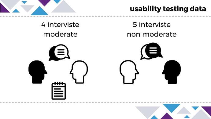
We decided to run two different kinds of tests depending on the tester:
-
UNMODERATED. Minervas were just told to try to fill the procedure as if they were doing it for their own shop, and commenting aloud or asking questions if blocked
-
MODERATED. Dionisos and other people were given some mock data in advance (obstacle height, sidewalk width…), and were asked to complete specific tasks as if they were impersonating Minerva
During the tests we received very useful feedback on many different aspects: information architecture, user interface, navigation, text comprehension, tone of voice, need for assistance.
QUOTES
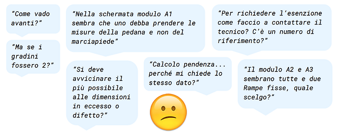
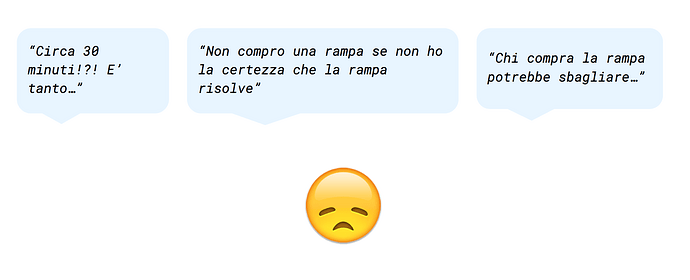
Here are some key quotes from the testers:
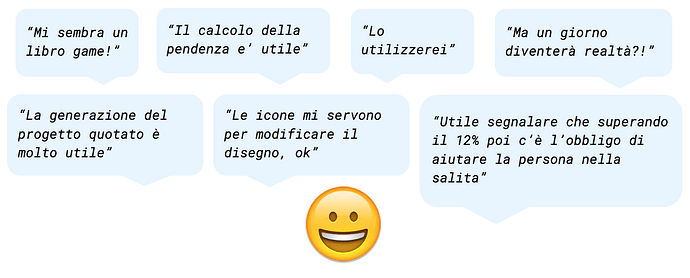
SATISFIED QUOTES
“The math to calculate the slope is very useful”
“The automatic generation of the measured project would solve my issue”
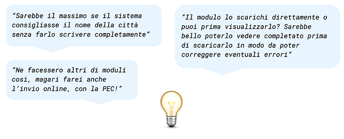
IDEA QUOTES
“It would be cool to have a preview of the filled procedure before downloading so you can double check your data is correct”
“I DON’T UNDERSTAND” QUOTES
“In the screen where you are supposed to input the data is not clear if you need to take the dimension of the ramp or the sidewalk…”
“How do I proceed to the next screen?”
UNSATISFIED QUOTES
“30 mins to complete is too long time…”
“I’m not gonna buy a ramp if I’m not 100% sure it will make me comply to the regulation”
USABILITY PATTERNS
Besides what the testers were saying we could observe interesting patterns in their use of the app:
User Interface
Most of the testers faced issues in the navigation, they couldn’t find a call to action when this is below the browser window’s fold
60% of the testers were able, at first try, to understand and use the interactive elements throughout the flow
» Wording
Most of the testers didn’t properly read the full text before clicking the call to action, too long
Most of the testers couldn’t find a significative difference in the description of some of the different ramps one could choose
Most of the testers have issues understanding which one is the right solution for them, even after reading the descriptions
» Information architecture
Most of the testers didn’t understand it was necessary to look for a ramp online before being able to input the ramp’s dimension in the procedure
» Wishes
Most of the testers showed interest in using this tool to fill all of the different procedures to regulate the shop for accessibility, and not only the one for temporary ramps
» Preoccupations
Many testers were worried of a ramp slope (15%) that, despite its congruity with the regulation, would imply for them to help Dioniso to enter/exit the shop
All the results above were collected and analyzed. This pool of data gave us a starting point to iterate our prototype fixing the architecture and the user interface on one hand, and take note of details that would need to be evaluated and discussed for a possible future re-design of the procedure in its entirety on the other hand.
You can also try the final prototype here (Italian only) and give us feedback below, thanks!
