We received the first draft concept for the visual of Science Fiction Economics Lab graphic design. As Lorenzo said,
This is just a concept, that means that if agreed upon, I will design it, add details and develop it further, so the final result will be visually different from this, but it will follow this basic idea/content/style.
It also contains a first draft for Sci Fi Econ Lab logo. This one as well, if client is happy with it, will be developed further and turned into a polished logo. This logo will then be delivered as standalone element to be used on any other project.
Same goes for the main visual and deliverables.
Let me know if you have any question.
I showed the picture to @augusto and we agreed on a few feedback we can give to Lorenzo.
As we intend to have a participatory event (a lab), where basically two different worlds meet to talk about the future, one single human figure wouldn’t represent the dialogue. So we suggest to represent at least the two worlds - science fiction and economy - and that could be done through human figures but also in a more conceptual way.
It would be better to have the event name written in full. The proposed logo is what you see on the top left of the image. I already told this to Lorenzo, but he suggested, in his experience, that a logo with long words doesn’t work. So we previously agreed on what you see: SciFi Econ Lab. But with @augusto we agreed also that “Econ” could be misleading.
We decided to give Lorenzo a moodboard with some more images to be inspired by. We need your contribution for this too.
Also, we have to keep in mind that we gave him a very short time (15 days) and a limited budget (1k), so by contract they will propose us up to 2 sketch options for the main project visual. The main visual will dictate all other deliverables. Also, consider that for the time and the budget, we couldn’t have a very complicated design
My two cents: I agree there should rather be two “worlds” meeting rather than a single character at the center. Another option could be to focus on the economic utopia ‘common ground’ of economics and science-fiction. So far there is no real sign suggesting it is about discussing and imagining (radically different) economic systems nor that it is about science & fiction - or the fine line in between (or maybe I’m just missing something ).
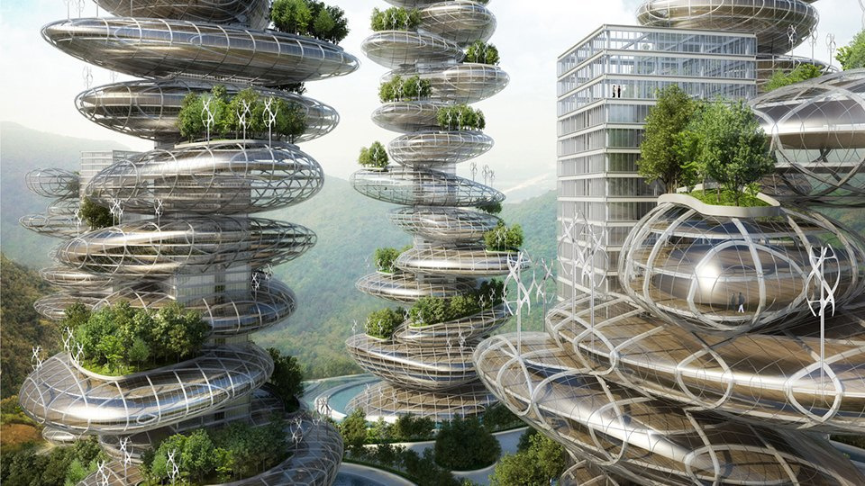
In terms of visual inspiration I suggest he could take a look at the work of Kalle Lasn, founder and editor of Adbusters. He published few years ago Meme Wars – the Creative Destruction of Neo-Classical Economics, you can find the full book via this link. After several decades of culture jamming, subversion of famous ads and campaigning - they initiated for instance the Occupy Wall Street movement with this poster advertising the original protest - he may find some inspiration there. Again, my two cents. Doesn’t sound as the easiest task!
here you can find a simulation that Lorenzo has done with the image @augusto bought and with an illustration - the “polished” image outcome of a first sketch like the one he proposed for SciFi Economics Lab.
Please, look at the two different results and express a preference between the stock image and the illustration. If you choose the latter, then I’ll pass Lorenzo the feedbacks coming out of the previous comments.
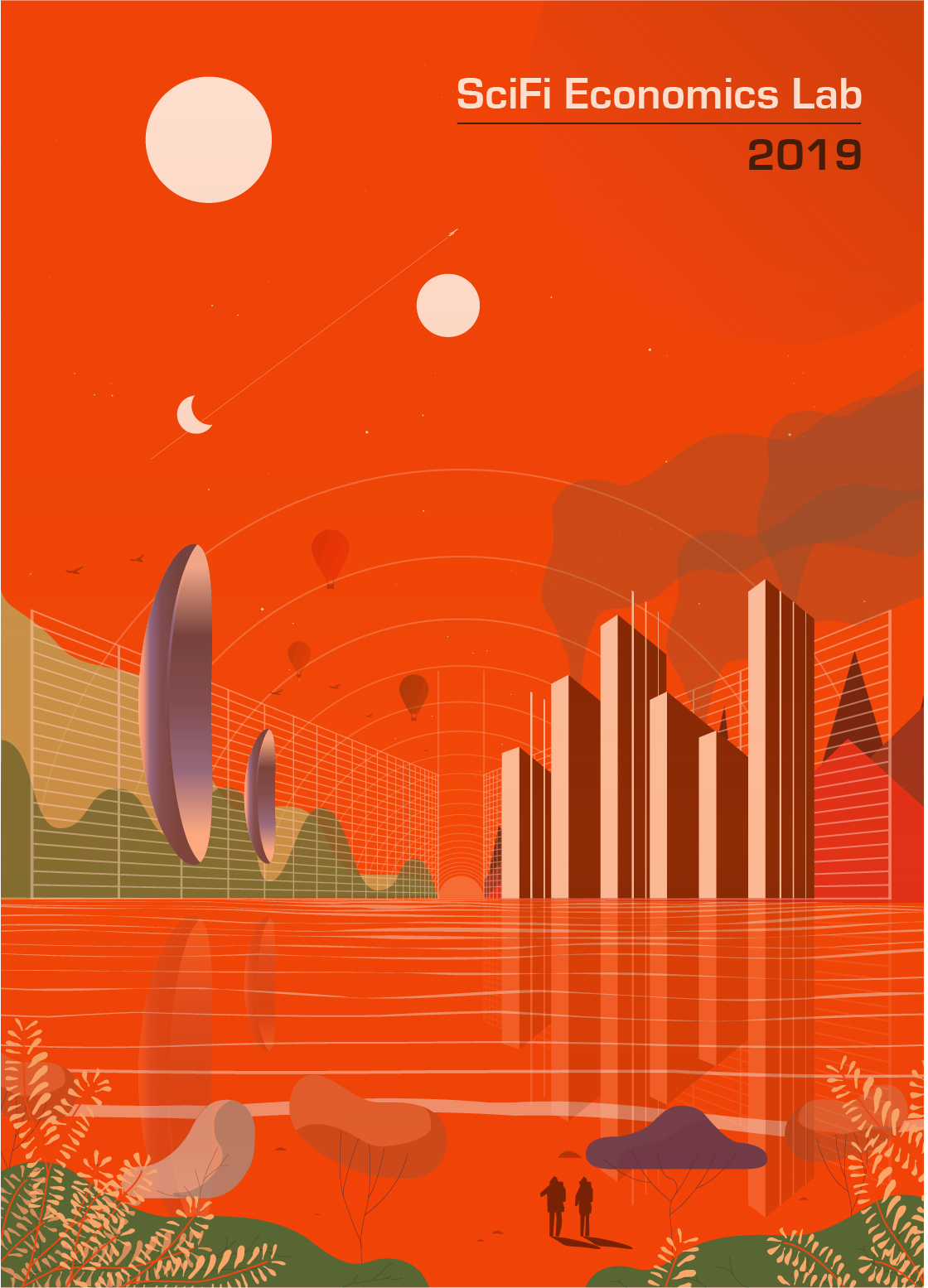
Hello everyone, here is the second proposal Lorenzo did. In this case, because of time scarcity, he directly designed the poster. I personally love it. Let me know @alberto@augusto
Hi Ilaria, given our timeframe I think it will work beautifully.
The logo seems a bit small on the overall size of the artboard but maybe with the rest of the content it is fine (speakers, etc…)
What I would like to see before giving it final approval is the horizontal variant (use for landing page, FB ads, Indigogo splash screen, etc…).
I see a problem for the t-shirt as we are using lots of colours and when I realized custom t-shirts in the past we were limited to a maximum numbers of colors (like 3 or 4). Maybe technology has changed since, @haf you printed t-shirts recently did you have this limitation?
