What seems pricey?
Design is an iterative process, either everyone is happy with the final result - which illustrators will also understand, or it is very pricey because people will want to redo the work later
anyway - too many chefs also makes for a shit result.
I agree with you @nadia and I know that the designer understands and wants us to be happy with the result.
For this reason we have the possibility to give him the more accurate directions to have what we want. Let’s use this possibility well, let’s help him get The Reef spirit.
This is the first time he’s working with Edgeryders, so we can’t take too much for granted.
Agreeing with your points Ilaria, just wanting to emphasize this one point I made before:
Probably to make it understandable, yes. But this way, in the current illustration, the house is a symbol. That’s what does not work because it does not capture the “nature-dominated techno-positive futuristic pleasant solarpunk-y living space” spirit. It should rather be an example of what The Reef 2.0 could look like.
Dear all - @alberto @matthias @nadia @noemi
This morning I had a conversation with Lorenzo who explained me better the kind of work he can do and the kind of request he can accomplish. We decided that he would have done a simulation of the possible final result using an illustration, like he proposed to do with the first visual I posted up here, and with a stock solarpunk image.
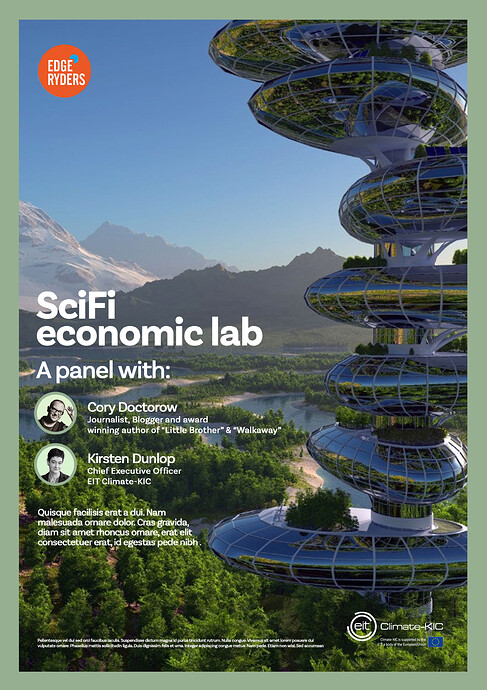
As he’s working on The Reef and SciFi Economics Lab, he used the stock solarpunk image @augusto found and wrote on it the copy of SciFi Economics Lab; but, you know, the purpose it’s to show how it will be in the two cases, in order to visualize it.
Well, he wrote me an email with more details I copy you here.
Hi Ilaria,
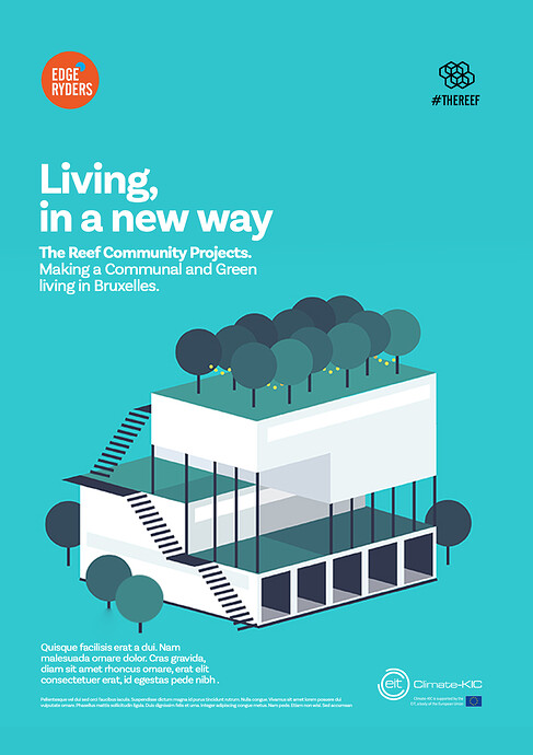
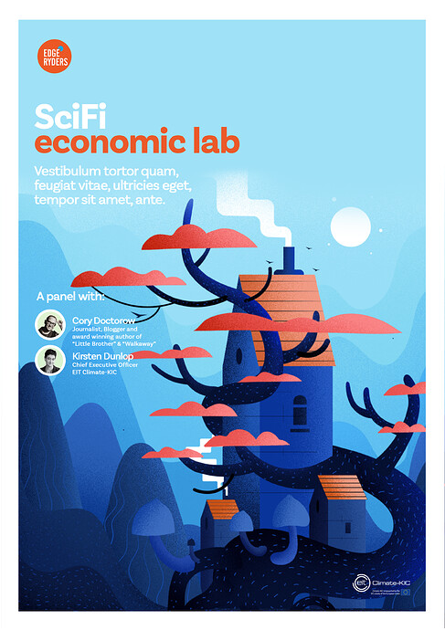
As per our phone conversation, here you can find 2 explorations for style , that could be used on both projects: The Reef, Sci Fi Econ Lab.
I’ve done 2 options for SciFiEconLab, and 1 option for The Reef.
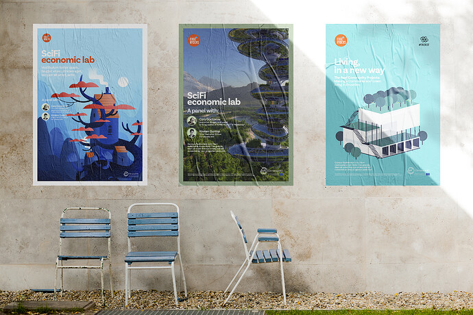
I’ve also added a mockup as a bonus, since some people might struggle to imagine the final look of these visuals.
As we decided, we are doing this as an intermediate step between BRIEF and PROPOSALS ROUND 2. In fact there are countless possible way to design the same content, but as we are all aware, time and budget allow us only a certain number of feasible solutions.
As I’ve explained, this is a style exploration, done, as agreed upon over the phone, to understand the clients’s tastes in matter of visual treatment of the content.
This is not a concept proposal. The illustrations you see here, are the work of art of other professional illustrators. They are not for sale and they are not a concept proposal. They are only examples of what the final outcome could look like, if the clients want to have an illustration as a solution. Just FYI, any of these illustration examples would probably cost easily £2000/£3000 if commissioned to these illustrators. Not considering the cost of producing designed deliverables, twitter posts, and so on.
As you know “bespoke illustrations" are not part of our contract. Anyway, as we discussed over the phone, as a personal favour to you Ilaria, I’m happy to explore a bespoke illustration route for both projects. Of course only if this is appreciated and people understand the amount of skills and work hours that have go into this.
Here I’ve outlined two main approaches that can be delivered on time and budget, and that can match the client / clients personal tastes.
One approach is a minimalistic stylised illustration. As per examples.
If client/clients like this style of visual solution, I’ll go back to the drawing board to put together Proposal Round N2 (of the 2 you have available in the contracts). The final result will be in style with these examples I’m sending.
The other approach is, as per client request, a Royalty Free image in a designed layout with information about the event.
Please check this image, or any future images, can be commercially used and, most importantly, be printed/used on a high number of supports.
As per our contract, any cost related to the purchase of any image and/or its licensing rights, will be solely at client’s expense.
Now, here are the options:
This is the mockup:
So here we have the two options: please, let me know by the end of today which way you prefer to go ![]()
Wow Ilaria, thank you for the effort you put to be the connection point with Lorenzo, it had to be challenging 
I think now we have a very clear vision of what the two different paths could lead us to (btw I really appreciate the mockup Lorenzo created).
Both the stock route and the illustration one are suitable to me, personally I would go with the illustration, given that Lorenzo is able to render the solarpunk esthetics with his illustration style, but if you prefer going with the stock image I’m totally fine.
I like that route. It’s also in line with the style in Nadia’s examples, and we’d get material with full copyrights on our side, so we can publish it under an open source licence if we want to (as per the contract with Lorenzo). It still depends on a bright idea on the designer’s side to transport the solarpunk theme with this style of illustration, but that should be possible to some degree.
A futuristically looking stock image would not be taken seriously for The Reef materials, I think. I prefer an illustration for this.
For the Sci-Fi Economics Lab it could be different since that is clearly utopian already. @alberto’s call to make I’d say.
That was confusing at first but now I think he says: a minimal illustration (shown left and right in the mockup) can be done as part of our contract. A bespoke illustration (center in the mockup) is way beyond the scope of this contract and would cost upwards of 2k GBP. @ilara is that what you discussed? (Just make sure we don’t misunderstand our designer and get into budget related discussions in the end.)
As for the “works of solarpunk” art, I have to agree with Lorenzo that you can’t get that for our budget in Europe. The most polished works that Alberto showed as examples are all detailed, photorealistic 3D renderings, and that is a ton of work. I use this kind of 3D software (Blender) every now and then … so I think I have an idea about the amount of work. For this one for example, my guess is that 3000 GBP would not be enough at European rates:
I will of course be really cool to have a solarpunk 3D rendering for The Reef materials. But the way to get to that with limited money is different and more medium-term than a fast-turnaround design by a professional designer in Europe.
Off-topic: how to get to our own solarpunk renderings
We would provide some 3D raw data (3D scans / photogrammetry) of a candidate building to my favourite Indonesian 3D studio, and ask them to transform it into a solarpunk styled building. We’d get the 3D model (which is no problem with these guys them, I did that kind of deal with them before) and with that model we can do our own 3D illustrations, as many as we like and from any angle. In a second step (with some more budget) we’d ask another 3D designer overseas to provide proper textures and background objects into that model. Over time we can build a little solarpunk 3D world from that model, which then provides the material for all our illustrations. And publish it open source, to fix that absence of open source solarpunk design materials that I noticed when looking for that a few months back. But as you see, all this is definitely more of a medium-term task.
Also, big difference, we can put whatever we want (limited to already said restraints of time+budget+feasibility) in an illustration. A stock photo is croppable but not modifiable (no weird Photoshop accepted, nor by me, nor by Lorenzo). And we also want to think about all supports we could use this illustration on: a stock photo on a tshirt? No, thanks.
The picture in the center of the mockup is a stock photo that he cropped and put some copy on. He can do that, if we buy a stock photo that we like - the good ones are quite expensive though and the nice cheaper ones are those everybody buy - but then we come back to the previous point: not modifiable, not on every support, etc. What he says is that asking him to reproduce a 3D picture like the one in the center with our own wishlist about The Reef is impossible: he’s not a 3D graphic designer, it takes a lot of time and work, much more money.
So, to sum up: I’ll say to Lorenzo that we would have the illustration, minimalistic style. Also, I’ll give him some keywords to stick to:
- community
- nature-dominated
- techno-positive
- futuristic
- pleasant
- solarpunk-y
- city integrated
- geodetic + round shapes
Plus, colours: as in solarpunk style, I’ll tell him to use mainly blue, green, grey (metal) and brown.
FYI, here is the brief I gave him.
Good morning Lorenzo,
I come back to you with a more accurate brief about The Reef.
We decided to have the illustration, minimalistic style. Also, here are some keywords to stick to:
- community
Since it’s a co-housing + co-working aiming to be carbon neutral or maybe positive, a focus is to represent multiplicity. People of different kind are the desirable inhabitants of The Reef. This could be represented as 3+ hands (following the first sketch you sent us) or in the way you prefer. Please, keep in mind diversity (ethnicity, gender, ability, …).
- nature-dominated
The Reef wants to grow nature in and outside of it. Lush flora is a must.
- techno-positive
We imagine a world where technology is a tool for a better living, not for oppression, control or addiction.
- futuristic
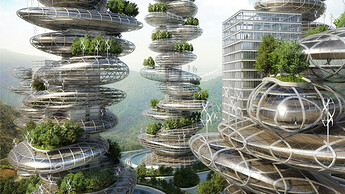
Be inspired by this image.
- pleasant
Communal living can easily be stressful. Our way of imagining it is a pleasant balance between privacy and social relations, where people try to have a positive impact one on the other.
- solarpunk-y
Be inspired by this image.
- city integrated
The Reef, as the thing it takes the name from, is not an island (well, you know what I mean
). It’s integrated in the ecosystem around it. So, the city of Brussels has to be represented in some way - as skyline around The Reef, using Bxl typical architectural elements as part of The Reef (windows or roofs), you name it.
- geodetic + round shapes
As you did in your first sketch, geodetic elements and round shapes are required. Also, please let The Reef have some strange shape using these elements. It has to be a house, but not a classic one.
Colours: as in solarpunk style, please use mainly blue, green, grey (metal) and brown. Other colours can be used in small details.
If you need any informations, please don’t hesitate to call me.
Thank you again, take care,
Ilaria
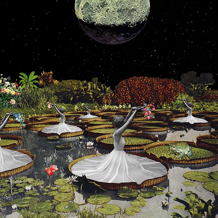
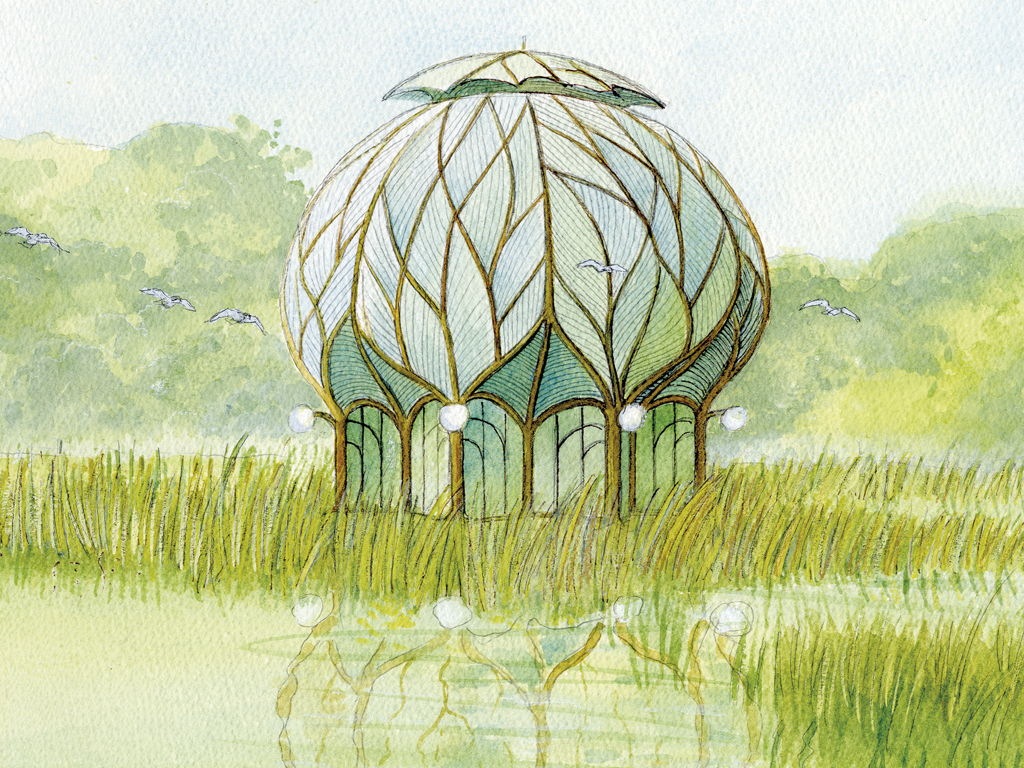
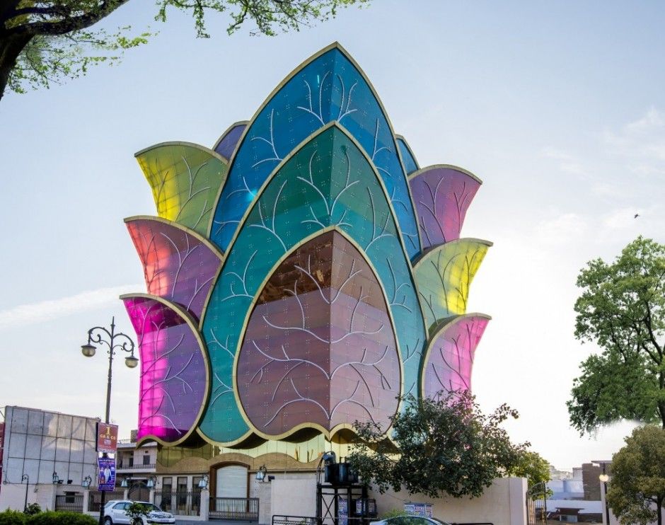
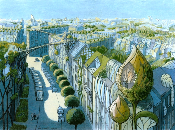
Ilaria here are some examples he could use re: the shape of the housing/illustrations that can be done in “matte”

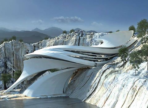

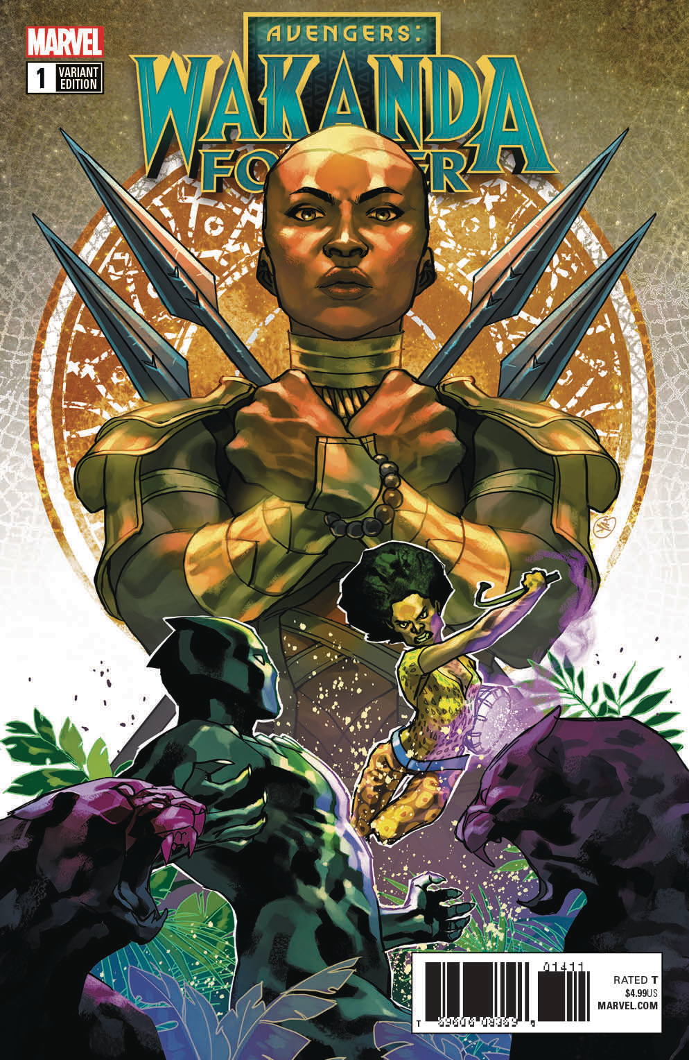
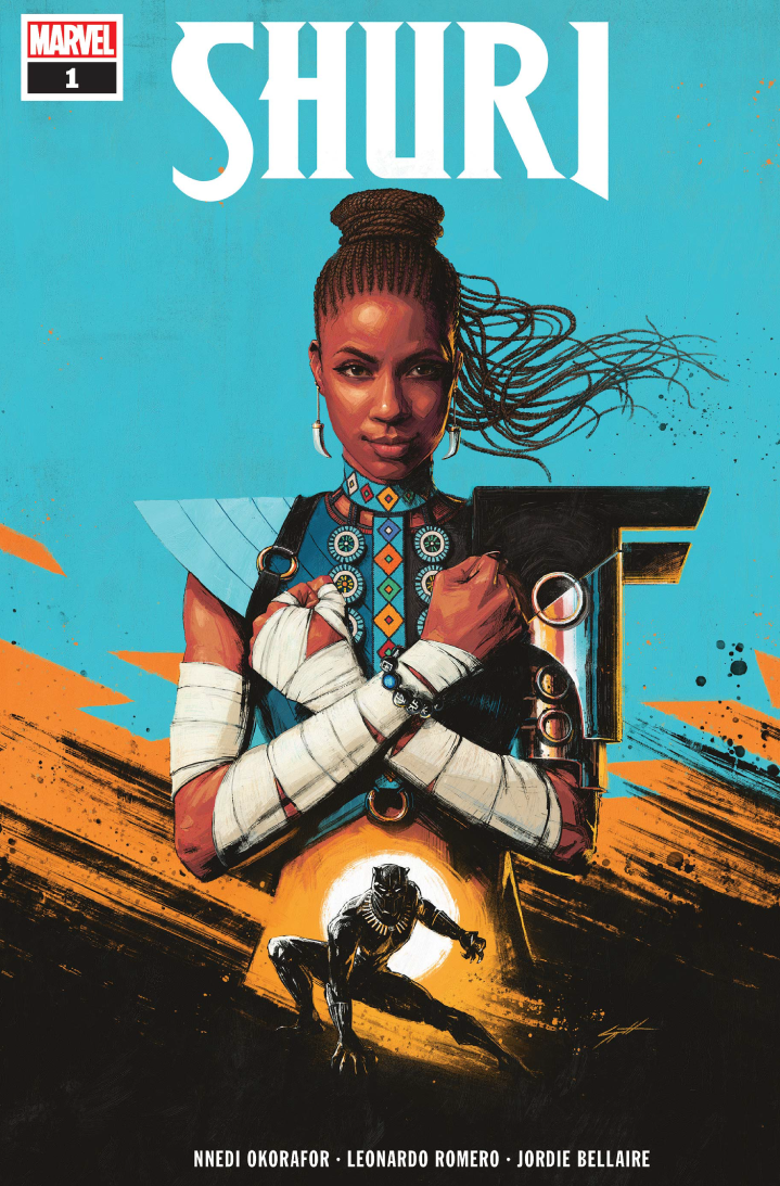

Well decided, and we’re moving forward again. As always, work can be two but not three of fast, cheap and perfect. And we definitely need “fast” ![]()
Brief or no brief: don’t you guys feel like it is time we get our gif game up? look at this work of beauty
If you have decided, this is no longer needed, but I accidentally found a Belgian photographer that puts landscapes (leaves etc.) on the skin of people. It is very suggestive of man-nature harmony.
http://benoitfelten.com/wp-content/uploads/2019/09/190925000111740010-Modifier-2.jpg
@nadia: yay for Wakanda. ![]()
Ok folks, @nadia @matthias @alberto @noemi
we have our second visual. I must say, I think he got the spirit 
Remember: this is a SKETCH, we will have a proper illustration in a few days. For this reason, we must give him confirmation ASAP to start to work on the different deliverables. Deadline is 10th October.
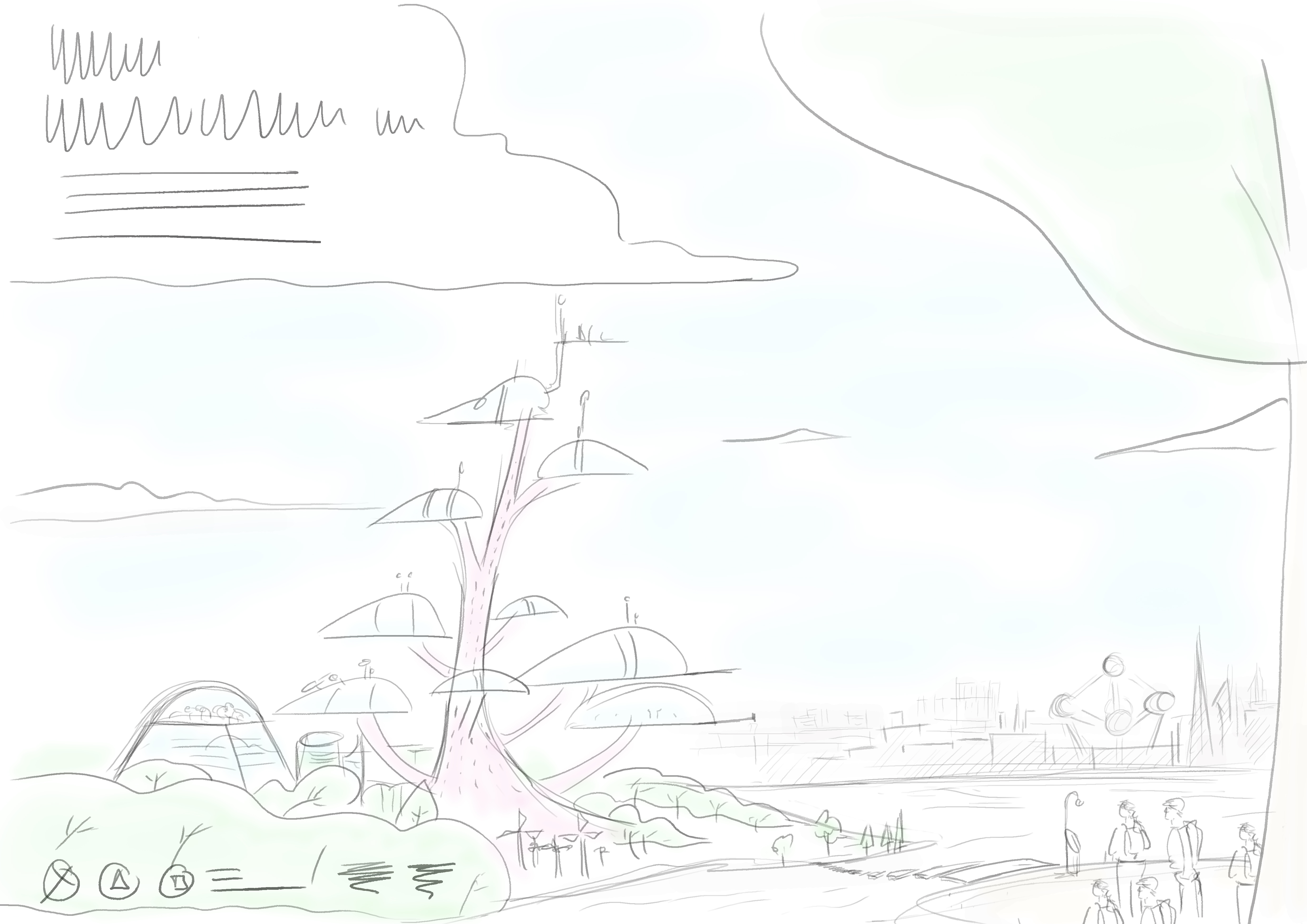
Here you can see the complete image.
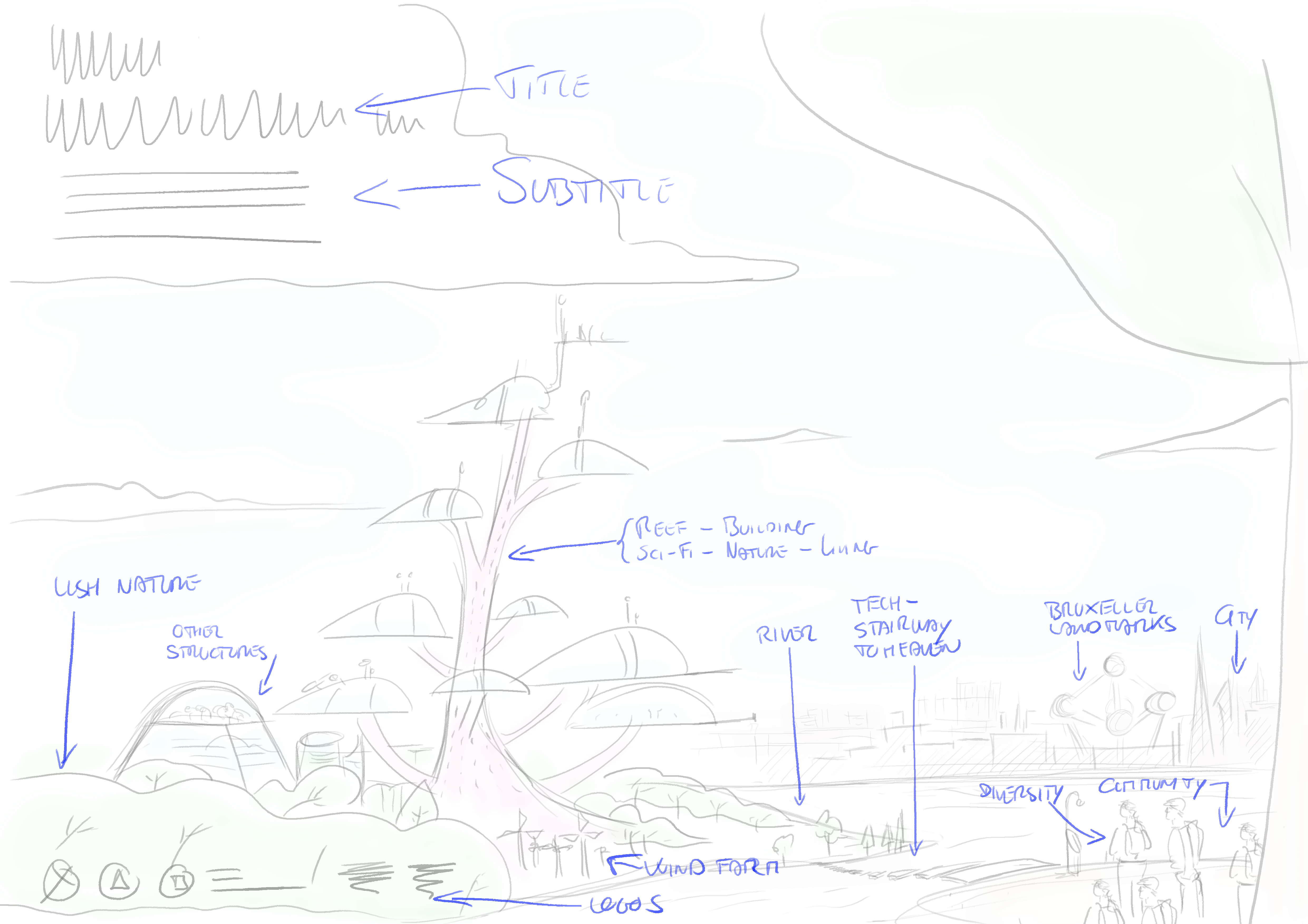
Here he highlighted our requests.

Here are different framing for the different possible formats.
Works for me
Yes, in my mind that’s suitable  But since I’m not gonna live in The Reef, I defer judgment to the others. For the website that I’m doing, there’s no reason against this sketch. It would do the job well.
Has this happened? We kind of need the website out now.
@ilaria do we have the final version of the visuals based on the sketch above? Without that, I can’t really do anything for finalizing the site …
Yes, we would have the visuals by the end of today.
