The Reef Visuals

We received the first draft concept for the visual of The Reef graphic design. As Lorenzo said,

This is just a concept, that means that if agreed upon, I will design it, add details and develop it further, so the final result will be visually different from this, but it will follow this basic idea/content/style. Let me know if you have any question.

I gave him The Reef category + the pitch and solarpunk art as references.

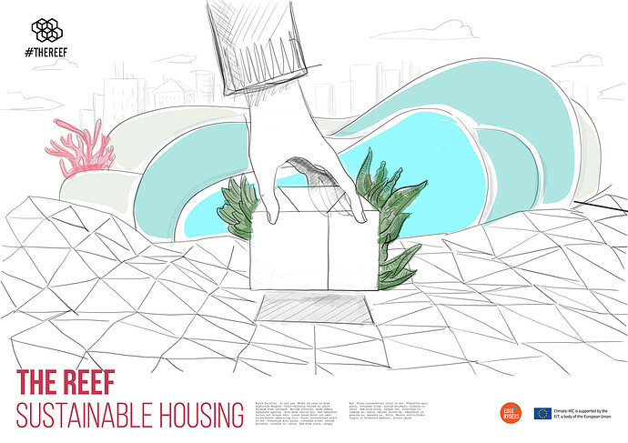
So, this is the draft visual concept:

Personally, I really like it. I have two feedbacks, though:

  1. Just one hand would make us miss the collective spirit of The Reef.

  2. As The Reef will be in Brussels, I would add some reference to the city skyline on the background.

Now, we need your feedbacks! But please keep in mind that we gave him a very short time and a limited budget, and by contract they will propose us up to 2 options for the main project visual. The main visual, also, will dictate all other deliverables.

Ping to @noemi @alberto @nadia @matthias @BaobabUrbain @chantal_vanoeteren

Better not be one white hand :slight_smile:

For me it depends on what the final visual finish is/ colours etc. Also - I would need to see some kind of self-standing elements in addition to composite illustrations.

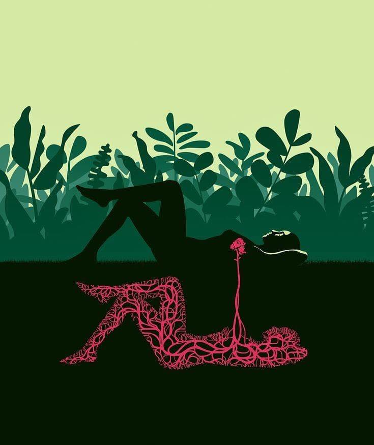
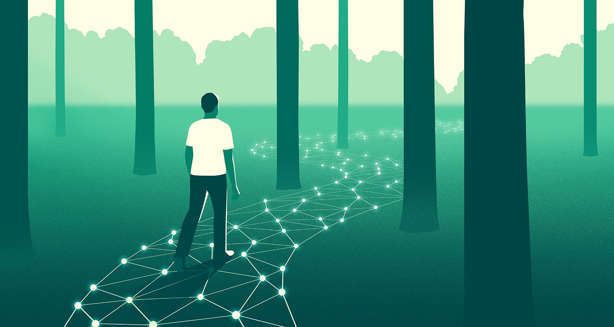
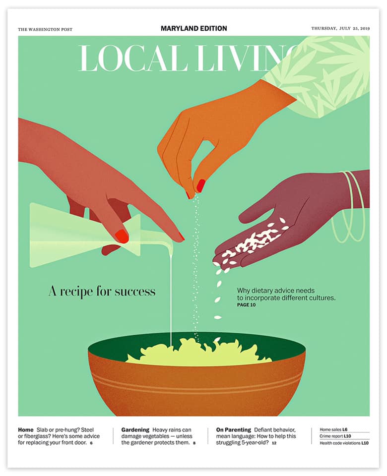
Some examples I really like:
71038658_2645933252112114_6761025315637559296_n

66180345_619234655263608_944675471184887808_o 67965829_636218443565229_7406005970431639552_n 68725147_641610086359398_6870931346898812928_o 68548294_646445772542496_301007963986853888_n 69224912_646445795875827_3342010526573002752_n 68934028_649078638945876_8926460762998702080_n

1 Like

I don’t like it, I’m sorry! :frowning:

  • Style is watercolor-y, not solarpunk at all.
  • Is that a coral to the left?
  • What would the blue thing in the center be?

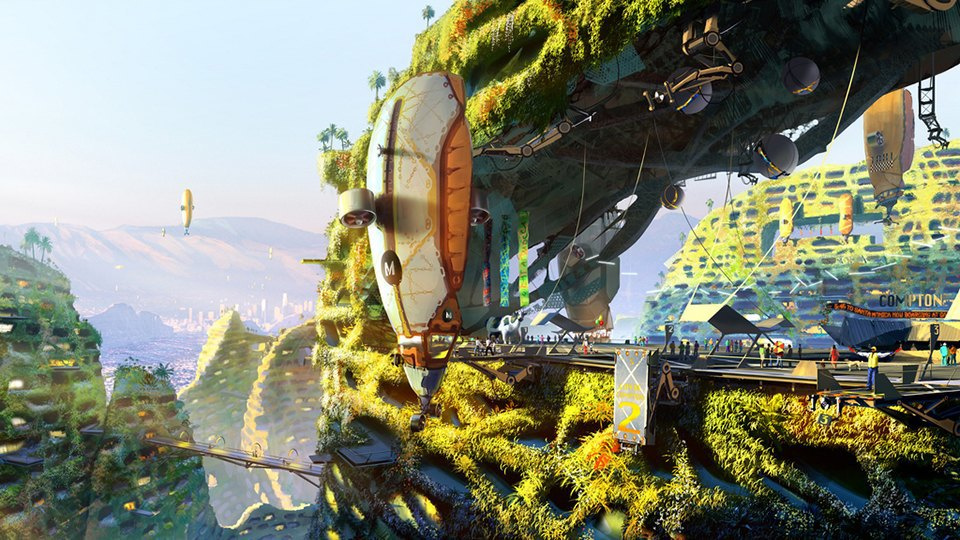
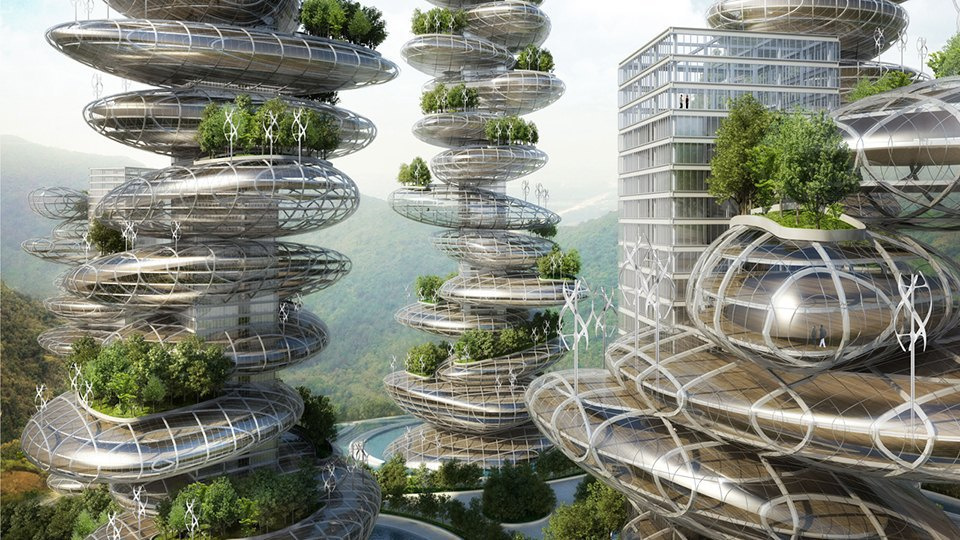
The solarpunk aesthetics is more like this (but I also like Nadia’s examples).

image

image

image

image image

A powerful approach is to have him/them/her develop a set of icons that give you some kind of idea of the call to action or elements involved. Look at these ones we developed for Stewardship: Dropbox - Edgeryders LOTE4 - Simplify your life

Thank you for your first feedbacks.

What is important here is to focus on the content.

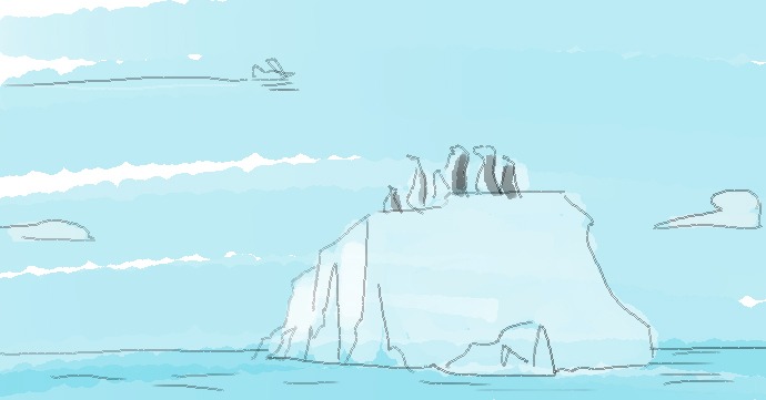
This is a sketch and the final version will be of course different. For example, he sent me this sketch he just made to show how different it is from a finished visual.
index

The designer has 10 days to deliver all materials and the budget is 1k. Let me say, the budget we have here wouldn’t pay for an illustration.
Here you can find the contract we signed with him.

So I’d say that we provide him a list of requirements but keeping in mind that we can’t have as a result a 3D illustration or a very complicated design.

The other option is to have a stock image with some copy on it, but I think it would be a shame to renounce to something made for us :slight_smile:

1 Like

Regarding the style of the illustration (Alberto: “watercolory”) and the basic idea of big hand(s) manipulating houses, I’m fine with that. That’s not opposed to being solarpunk.

But it has to be solarpunk :slight_smile: The only solarpunk-y element in the image so far are the triangles, as they look like the construction often seen in geodesic domes (which are solarpunk).

Solarpunk housing, in our minds, is nature-dominated techno-positive futuristic pleasant living space. Like what Alberto posted in that other thread:

image

So: there has to be much more nature, and the house must not be in any traditional shape. Ideally an original architectural idea.

1 Like

Second that, and it’s important because it’s not man-dominated. The hand suggests man making something and placing it in nature. It’s not making in harmony with hature…
I like the triangles/domes too though.

Yeah… it has to go, why so literal… ! :-))

2 Likes

Actually I loved that coral :blush: because it’s so funny. I don’t think it was meant to follow the Reef concept to the letter but a semi-serious nod to the word origin. Obviously there are no bush-size corals growing behind houses so it’s a mysterious and then funny thing to encounter. Both mystery and fun (“playful nonsense”) are solarpunk. Let’s keep it?

3 Likes

OK. Wow imagination and sense of humour :stuck_out_tongue: I hereby renounce my rights to interpret and think in visuals… not my cup of tea, so please carry on :-)) This to not distract Ilaria and make sure she takes in your feeback more seriously than mine. By all means!

1 Like

Noemi :smile: It’s art. Everyone can say about it and understand it in what way they please. You’re welcome (too). We’ll figure it all out somehow …

1 Like

Then what do we buy? If we don’t get to what @nadia calls “polish”, I would rather pay the license for a high quality reproduction of a work of solarpunk art.

What I meant is that the budget we have normally wouldn’t pay for an illustration, but we will have a polished work, of course.

We buy the design and the deliverables in which that design will be converted. What you see is the sketch of the first proposed visual concept, based on the information he had. If we think he should change something, we have to give him feedbacks on the content of the picture, things that can be changed, but we can’t tell him to make a painting or a 3D picture or try infinite times to adjust to what we have in mind. Probably the first references weren’t enough to get to The Reef spirit: now we have the chance to address with more accurate direction his work.

As I see it, there is an old city on the back ground, in the past. Then, through different layers of some sort of organic passages, we get to The Reef, which is in the shape of a house - I suppose to make it understandable - there are the triangles, as @matthias says, reminding geodesic domes, the human being manipulating it and a growing nature popping out of the house.

My concern, as previously stated, is just one (white! thank you @nadia) hand and the lack of references to Bxl. Maybe, also, because we want The Reef to be the present and not only the future, and be integrated to the city, this aspect could be revised to.

So, to sum up, we want a “nature-dominated techno-positive futuristic pleasant living space”? Do we agree?

Plus, I would give these keywords: community, rooted, flexible, solarpunk.

If you agree, please put a heart and/or comment :slight_smile:

1 Like

hmmm seems quite pricey to me

What seems pricey?

Design is an iterative process, either everyone is happy with the final result - which illustrators will also understand, or it is very pricey because people will want to redo the work later

anyway - too many chefs also makes for a shit result.

I agree with you @nadia and I know that the designer understands and wants us to be happy with the result.

For this reason we have the possibility to give him the more accurate directions to have what we want. Let’s use this possibility well, let’s help him get The Reef spirit.

This is the first time he’s working with Edgeryders, so we can’t take too much for granted.

Agreeing with your points Ilaria, just wanting to emphasize this one point I made before:

Probably to make it understandable, yes. But this way, in the current illustration, the house is a symbol. That’s what does not work because it does not capture the “nature-dominated techno-positive futuristic pleasant solarpunk-y living space” spirit. It should rather be an example of what The Reef 2.0 could look like.

1 Like

Dear all - @alberto @matthias @nadia @noemi

This morning I had a conversation with Lorenzo who explained me better the kind of work he can do and the kind of request he can accomplish. We decided that he would have done a simulation of the possible final result using an illustration, like he proposed to do with the first visual I posted up here, and with a stock solarpunk image.
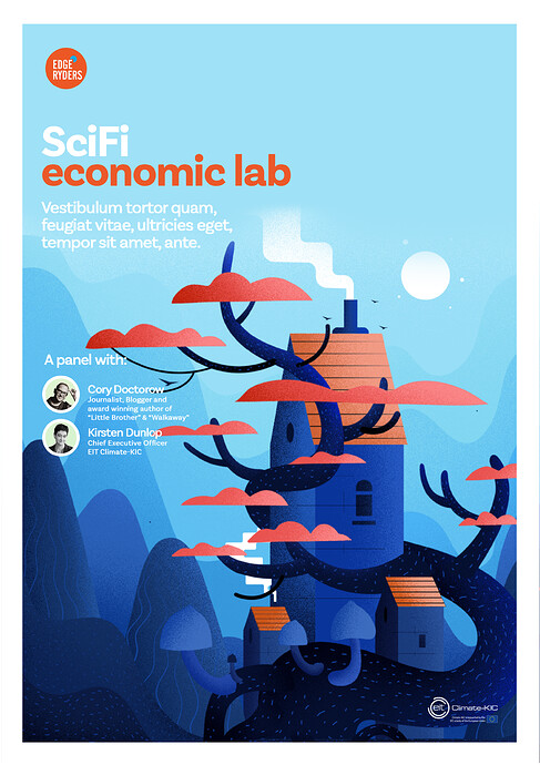
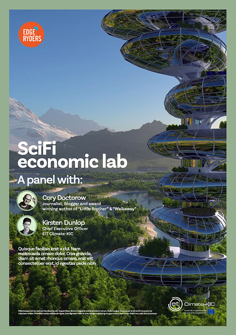
As he’s working on The Reef and SciFi Economics Lab, he used the stock solarpunk image @augusto found and wrote on it the copy of SciFi Economics Lab; but, you know, the purpose it’s to show how it will be in the two cases, in order to visualize it.

Well, he wrote me an email with more details I copy you here.

Hi Ilaria,

As per our phone conversation, here you can find 2 explorations for style , that could be used on both projects: The Reef, Sci Fi Econ Lab.

I’ve done 2 options for SciFiEconLab, and 1 option for The Reef.

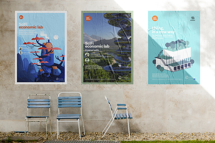
I’ve also added a mockup as a bonus, since some people might struggle to imagine the final look of these visuals.

As we decided, we are doing this as an intermediate step between BRIEF and PROPOSALS ROUND 2. In fact there are countless possible way to design the same content, but as we are all aware, time and budget allow us only a certain number of feasible solutions.

As I’ve explained, this is a style exploration, done, as agreed upon over the phone, to understand the clients’s tastes in matter of visual treatment of the content.

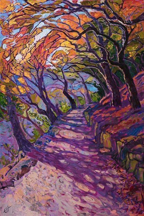
This is not a concept proposal. The illustrations you see here, are the work of art of other professional illustrators. They are not for sale and they are not a concept proposal. They are only examples of what the final outcome could look like, if the clients want to have an illustration as a solution. Just FYI, any of these illustration examples would probably cost easily ÂŁ2000/ÂŁ3000 if commissioned to these illustrators. Not considering the cost of producing designed deliverables, twitter posts, and so on.

As you know “bespoke illustrations" are not part of our contract. Anyway, as we discussed over the phone, as a personal favour to you Ilaria, I’m happy to explore a bespoke illustration route for both projects. Of course only if this is appreciated and people understand the amount of skills and work hours that have go into this.

Here I’ve outlined two main approaches that can be delivered on time and budget, and that can match the client / clients personal tastes.

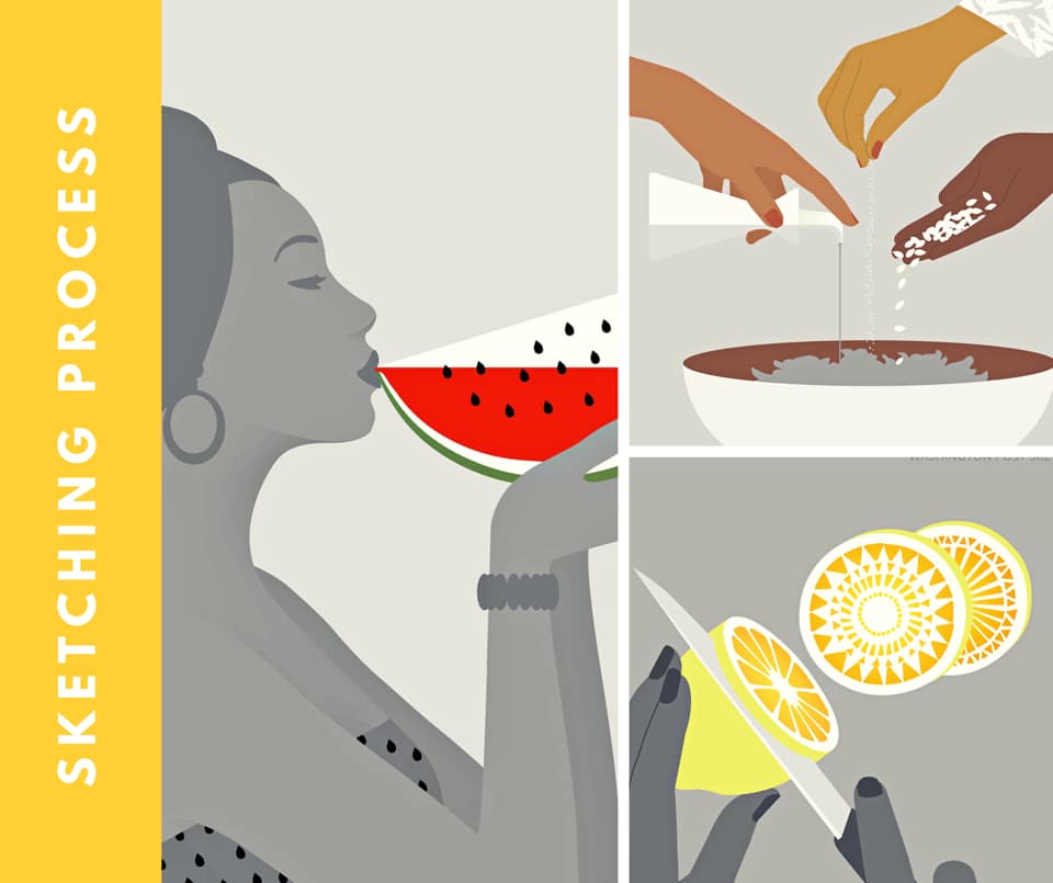
One approach is a minimalistic stylised illustration. As per examples.

If client/clients like this style of visual solution, I’ll go back to the drawing board to put together Proposal Round N2 (of the 2 you have available in the contracts). The final result will be in style with these examples I’m sending.

The other approach is, as per client request, a Royalty Free image in a designed layout with information about the event.

Please check this image, or any future images, can be commercially used and, most importantly, be printed/used on a high number of supports.

As per our contract, any cost related to the purchase of any image and/or its licensing rights, will be solely at client’s expense.

Now, here are the options:


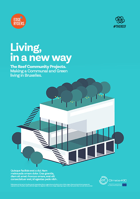
This is the mockup:

So here we have the two options: please, let me know by the end of today which way you prefer to go :slight_smile:

2 Likes

Wow Ilaria, thank you for the effort you put to be the connection point with Lorenzo, it had to be challenging :slight_smile:

I think now we have a very clear vision of what the two different paths could lead us to (btw I really appreciate the mockup Lorenzo created).

Both the stock route and the illustration one are suitable to me, personally I would go with the illustration, given that Lorenzo is able to render the solarpunk esthetics with his illustration style, but if you prefer going with the stock image I’m totally fine.

1 Like