Visual material: Logos, Banners, Headers, Videos etc

opencare communication recommendations

Following our hangout meeting of Thursday, April 28th [@melancon, @LuceChiodelliUB, @zoescope and @Costantino] and according to what was decided on that day, a discussion took place between a small group of partners to come up with a number of recommendations on our communication strategy.

Several aspects were taken into consideration:

  • A number of things were already done on the communication front (great video from LOTE5 rushes, community and research pages on the edgeryders.eu portal, etc).
  • The activities taking place under the hat of opencare are twofold, they carry an intrinsic duality, that has recently been identified and distinguished under the terms “community” and “research”.
  • Partners all wish to be visible and seen as participating to the opencare EU funded initiative; they also wish the EU initiative to be visible as well on its own.
  • The funded initiative relates more to the research component than to the community component although we must recognize  (and stimulate!) the necessary and profitable synergy acting within this twofold structure.

Our recommendations include:

  1. It is good practice, if not a necessity, to use a unique spelling for the project name.
  2. Although we are pushing for everything to take place online (in order to collect proper research material), we must not assume the crowd targeted by opencare to be as “digitally educated”. As a consequence, the use of digits should be avoided as it resonates as some geekness or weirdness to some. This has a number of consequences as discussed below.
  3. A series of channels have been identified (some new, some less new) and could be used in the following manner:
    • Keep using the @op3ncare twitter login account but associate it with the opencare name. An existing twitter account already uses the @opencare login; other accounts use names similar but distinct from opencare (OpenCARE, Open Care with a blank space). This would make the already existing @op3care twitter account compatible with the opencare name spelling.
    • This is already the case with the Facebook account pointing the op3ncare page (login) seen under the name opencare. We are not saying this Facebook account should only be used for research related stuff, we are suggesting it can comply with the above recommendations.
  4. Registration of these names has not been identified as urgent. When labelling our activity with the opencare label, the category (or class or activity type) rather than the name itself is as important. Because we adopt an open source strategy, we are protected against copyright infringement claims or ownership claims.  [Edit 02/05/2016 - By browsing the website for the European Union’s Intellectual Property Office (EUIPO), it appears that the trademark OpenCare is already bought by a Japanese company for the product class we would be targeting (“consultancy, technological services and design”). The name OpenCARE is also registered by a German company, hence the corresponding twitter account.] 
  5. We therefore choose the name opencare, which is the simplest version available that also meets the recommendations we listed previously. 
  6. We maintain the use of the color and fonts that were adopted.  

    Blue and purple. We’ll need to make this as precise as possible for future use (RGB, HSL encoding).

    We should stick to the use of Monserrat fonts.

  7. We need to have a channel where all project videos are published and made accessible, although some videos may also be published on other channels (Vimeo for instance, as is the case for the video shot at LOTE5).
  8. We recommend creating a Google+ account associated with the opencare brand (https://business.google.com/create).
    • To start a Google+ page, we have to create a Gmail address first (opencare.h2020@gmail.com). This e-mail address shall not be shared / displayed nor used, - except for automatic replies, if the case presents itself.

    • This automatically creates an associated YouTube channel.

    • We may then follow the same @op3ncare / opencare login/name pairing as for twitter and Facebook.

  9. We need a landing page making the www.opencare.cc URL visible and distinct from the edgeryders.eu portal.
  • We keep this to a single page including:
  • Project name and “official” spelling, project logo (network + heart)
  • A one paragraph, elevator pitch, on the project
  • A clearly visible, attractive, clickable and catchy motto bringing people to one of edgeryders.eu landing page.
  • All EU and partners logos redirecting to each partner’s official website.
  • This page being distinct from edgeryders.eu makes it Drupal upgrade-proof.

Additional remarks:

  • The adoption of the above recommendations may have a number of consequences on work that has already been done. We need to decide who can take care of doing a series of things:
  • The Facebook profile picture needs to be adjusted (to opencare)
  • The LOTE5 video needs to be edited, so it shows opencare (and not Op3ncare) – keep it to a minimum (maybe only make sure the front image shows opencare instead of Op3nCare)
  • Anything else?
  • There does not seem to be any opencare (or OpenCare) GitHub account for now – just in case it would be useful to also have a GitHub account under the exact project name.
update

We’re working on a Design Survival Guide coherent with @LuceChiodelliUB remarks. (will be shared until the end of the week)

  1. Working on The Facebook, and g+ and twitter, profile picture
  2. we created some graphics for Milan's video (uploaded on the google drive)
  3. Github organization already created
  4. working on the landing page 
  5. we'll share also some other graphics material we're working on right now.

1 Like

Great - I can’t wait to see more

Can we test this?

I am not enthusiastic about having a landing page that links to another landing page. It seems more a political compromise than anything based on design principles.

Why don’t we do a real alternative landing page (linking to the relevant pages: how to participate, challenges etc.) and then test the performance of the two (or more) alternatives? I am not sure how that would work in practice. We normally do A/B testing with Google’s Content Experiments, but that assumes you are staying within the same “web property”. I think we could still do it like this:

  • Create an alternative landing page wherever you want.
  • Associate it to the existing Edgeryders web property and create the Google analytics tracking widget accordingly. 
  • Point opencare.cc and op3ncare.cc to one of the alternative landing pages. 
  • Choose a goal, for example the node creation page (https://edgeryders.eu/node/add/*)
  • Create an experiment, with all of the variants associated to it. 

Works?

About social media accounts

… this is more or less the same strategy that all EU projects have adopted since the Internet became a thing. The result has been a big digital junkyard of nearly-unused accounts on social media, hosting contracts that expire as soon as the funding does etc. Luce may have a point that it “looks good” when the project is live to the reviewers (depends on the reviewer I guess). Just staying in the fantastic world of CAPS (FP7, so projects that have at least 2 years of mileage already), check out the YouTube account of WebCOSI or the Twitter account of IA4SI (active project). There is even a CAPS project called SciCafe 2.0 that returns broken links.

This does not happen because the people behind those projects are stupid, but because running social media accounts, blogs, websites etc. is hard work. Doing it well on a project that will only live two years is wasteful.

On the other hand, if we did score a resounding success, we would start a spinoff producing care services.

But then again we would probably run into copyright/trademark issue if that spinoff were called OpenCare.

So.

Digital squatting is cheap – good idea to squat everything opencare.

On the other hand, our dedicated social media channels are hard to grow into useful tools. For now, we get much more mileage pushing OpenCare content on the Edgeryders Twitter account than on the OpenCare one. For now, we use the OpenCare one to put out a sort of “corporate” feed about the project, with most of the interaction done through Edgeryders or our personal Twitter accounts. Same thing for Facebook. I predict most of the social media traction will be exerted through the partners, rather than the project.

Twitter followers, Facebook page likes
  OpenCare Edgeryders WeMake
Facebook 134 2,915 4,420
Twitter 144 3,579 1,581

When you move beyond FB and Twitter, I do not think it’s worth putting any work at all in keeping OpenCare social media accounts. Our web analytics show that other social networks bring in a negligible amount of traffic. Uploading stuff onto project accounts should be viewed as an admin activity, not a communication activity, and therefore should be kept to a minimum. Low overhead is the way to go.

1 Like

Regarding “landing pages”

> Why don’t we do a real alternative landing page (linking to the relevant pages: how to participate, challenges etc.) - See more at: https://edgeryders.eu/en/comment/22790#comment-22790

Gets right to the heart of the matter because a “landing page” has to be less like the frontispiece of a publication and more like a well-designed rail or air terminal where you, who are in a hurry and who has never been there before, can efficiently get to your destination as quickly as you wish.  Of course there are compromises because we don’t want to put everything right there to the point that it is nothing but lists devoid of aethetics.

In all my 30 years in online networking, even with all the massive developments in visual and audio media, speed is still the most important thing.  More people use Facebook or Twitter to come to our site(s)?  Then it is even more true that whatever drove them here must fulfill for them their intention on their first visit.  One extra click could be, and often is, the thing that is just one task too many for someone on the move.

So make it look good and label it so that one cannot mistake where one is, and make it useful right there.

1 Like

Makes sense.

The world is full of sleek design etc but this does not move people. Even with mangy design what draws you in is cool people with whom you wish to engage. We have seen this play out many times over. A lot of it comes down to f2f interaction,  effective copy in the hands at exactly the right time that directs you to a person with whom you can interact. It’s the social filtering to direct attention and energy. Meeting people= results. The return on investment from weaking and discussing design details yields diminishing returns.

The right perspective

The recommendations we have must be looked at from the right perspective. There is room to adjust things. Let’s work together to find a consensual solution.

[The best for me would be to have a face-to-face meeting on all this. I personally believe digital media not to be so good at solving the discussion we are entering. Why not put that at the agenda in June and make it an item to be discussed by the steering committe meeting. If June is too far away, let’s make it a closed, official, mandatory meeting with steering committee members.]

I encourage everyone to appreciate the efforts made to come up with these recommendations. That being said, Alberto is absolutely right: part of it is a political compromise. I personally would use the term “institutional”.

IDENTITY. On the identity side, the recommendations are right: for now, the use of different spelling is confusing. I agree with Zoe with the fact that the “3” is geek habit and can hinder our will to engage with “ordinary” people. The use by others of similar names, in similar context, has to be taken into account. This must be clarified and I am confident we will find a viable solution.

NOT ONE, BUT TWO COHABITING PROJECTS. The situation also partly holds to the fact that there are two projects running in parallel and mixing together. The institutional, funded, partly academic one partners engaged into; and the one promised to live long after the EU initiative and run by EdgeRyders – I admit it took me some time to realize this. And in fact, the EU initiative was triggered by EdgeRyders’ fantastic capability to have people and ideas come together and great project emerge.

LANDING PAGE. I am ready to comply with the experts and designers advice on the use/design of single/multiple landing page(s), etc. I guess one main issue is that the EU project and partners of this EU initiative are simply non visible on the actual websites (the pages hosted on the edgeryders porta). And this is a problem that must not be too easily discarded/ignored. I hear this sounds dramatically narcissic, but hey, academia lives on recognition and visibility – that’s what fuels the funds we will be able to get the next time we run a tender. That’s what fuels the whole of academia, from the baseline researchers to the top institutionals in the organizational chart. I believe it might just be the same with non-academic partners that nevertheless mostly live on public funds.

A distinct landing page looked like a good compromise to satisfy all these (narcissic) expectations. This distinct landing page is not about moving or having people meet, it has other “intitutional” aims, that are not addressed by the actual setting.

SOCIAL MEDIA. What I hear from Alberto is that trafic anyway takes place on EdgeRyders accounts. That bringing trafic to these other “opencare” accounts is a lot of work – I hear he asks whether we (and who?) are ready to put the efforts to keep these accounts alive. So the question is (asked to the steering committee?): do we want/need these “institutional” channels, and if so are we ready to invest the necessary resources?

A question is asked about the relevancy of having a G+ channel (devoted to videos, from what I understood). Again, to be accepted, the answer must take the dual nature of opencare into account.

Ok, that comment is far too long already. I hope its content makes sense.

I’m looking forward to read all your constructive propositions.

1 Like

Multiplicity in unity

I agree with most of what you are saying, Guy. It is very true that a EU project is two things, and this not only for us but for everyone, at least in theory. It is its own thing: a project with a pulse, practices, a management structure, rules etc. It is also a stepping stone to wherever its partners want to go. There are some organizations that treat EU funded research as a market, and see themselves as active in this market. They do projects just to do projects. From what I hear, the Commission is not happy about this at all, because the lack of ambition of these organizations translates into a lack of impact of EU taxpayer money poured into research.

On the other hand, the EC is a rule-based organization. Therefore, we do need to tick all the boxes. This leads to running two projects at once: one is, as you say, institutional and funded, and it will end on December 31st 2017. The other one is entrepreneurial and not funded, and it will live on or not. The two share some activities.

The activities most central to the entrepreneurial side of the project should, wherever possible, overdeliver. We committed to delivering 1,000 pieces of content (posts + comments) by the end of the year. We are already over 1,500 – no problem for the institutional project, the box is ticked. But for the entrepreneurial project, we would love to overshoot the goal: get to 3-4,000.

How is this achieved? By mobilizing people. ER is committed to mobilizing its own community (broadly intended). We believe this is, for us, the best use of our limited communication resources. And it’s working out, given that most of 113 people who have contributed content to OC so far come from that direction. But everyone else is more than welcome to go fish for people and content in other spaces. We appreciate they may require different communication styles – even different philosophies of engagement. @Costantino says “user experience works”, and he is right. @Noemi says “people are interested in people and their stories, not in websites”, and she, too, is right. I have no problem with any of that – it probably means that Costa can reach out to a crowd that will react to Ux, and No to one that will react to stories. So, it makes sense that Costa is free to build a landing page he likes, and No to share links pointing directly to individual challenge responses. We will have more people, more diversity, better collective intelligence. Whatever works.

The style guide is impressive work. We are grateful for it, and we will use it. But we will only use it when the benefits of doing so exceed the costs.

tho things?

what exactly do you mean two things?

@Alberto

@melancon

ps:

I’ll listen but as you know I strongly disagree

Two things

@Costantino @Alberto

It’ll be interesting to share our thoughts about this. I’m not sure we’ll have time to do it during the “official” steering committee, let’s find some time off the official agenda.

I find the “two things” perspective quite natural. The project (not the EU funded one, “the” project) can be thought of as a lifelong journey. The EU funded project is a vehicle you use at some point to speed up your travel from point A to point B, hoping it will fuel your “project” to help get where you want to go.

“Two things” probably sounds differentyl to you. I am curious to better understand your view on “things” :slight_smile:

1 Like

Social Media

Hi, I have just a question because I don’t understand @Alberto message about not agreeing on having Opencare social media channels: why  Edgeryders team opened up Twitter account and Facebook page at the beginning? (I think @Nadia and @Noemi opened them) .

We accepted the decision you took and already agreed of giving our contribution on Facebook page and we can do it also on Twitter and we are happy to upload our videos on Youtube. We are just proposing to open up Youtube as a repository of all the videos we create so we can point people to 1 channel and find all the videos, otherwise they are spread around. It doesn’t prevent all the partners to post each video on their own private channels if they want.

best

Zoe

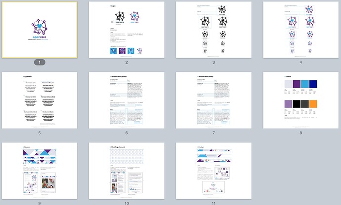
Draft Graphic Style Guide_opencare

Hi,

here a preview of the Graphic Style Guide aka Graphic Survival Guide for opencare partners aka Consortium.

@ChiaraFrr and @Silvia_D’Ambrosio made a pretty cool job ;)


Appreciated!

Thanks team WeMake!

Using the right visuals and denomination

@Noemi

I hope posting this here will be useful, I can’t relocate the post concerning the email notification you guys send.

I saw that @Natalia_Skoczylas (I am not sure I point to the right Natalia, the email sender simply is natalia@edgeryders) used the header visual proposed by WeMake as part of our panel of visuals. I am a bit sad to still see the “3” form of the project name though. This will eventually bring confusion. I known these things have only been half-decided as things were being done, but now that we have this kind of chart, we should stick to it as muc as we can.

Just thought I should mention it.

Yes, some time needed

I hear you. Natalia probably picked it up from the Op3nCare communtiy site, which has the same header.

If you or @LuceChiodelliUB can make it on Monday’s regular call maybe we can see how to achieve the consistency we are going for.

which visuals should I be using then? @melancon - sorry if i create confusion, I wasn’t aware

No problem at all, as @Noemi mentions, these things take time. I appreciate the work you guys are doing. I just thought this was the occasion to underline it (and I saw you indeed used one of the recent visuals). We’ll clarify things this Monday.

I might be late at the meeting though. @LuceChiodelliUB and @Costantino (hopefully at least one of them will be there) can point at the material they hae  gathered and tell you where to find all of this.

here an help

… and if you have access to the opencare google repository

… I have built up a folder named “opencare visuals” where you can find the opencare style guide, all members’ logos and the communication recommendations. :slight_smile: