We had a chat about this and thought it made sense. So we can also connect it with the project in Nepal. Then @ElaMi5 tweeted about the project with the futuremakers hashtag which I guess makes it official. Now all we need is a logo and we’re off?
3 Likes
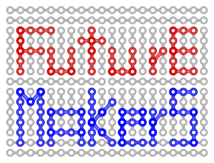
Logo proposal draft
This can easily be expanded or modified of course. Here

is the .svg that you can change once you rename it.
The image is a modification from the bread-board schematic on wiki. It would look more dynamic perhaps if the bb gets an arrowhead on the right side? Also, I thought one might want to add a “human touch” perhaps. Other ideas were “hitch hiking into the future” (just tilt a little more). Or shining light on the future. All a bit on the geeky side, I admit. Please feel free to mix and match. ![]()
1 Like
Ping
What does the crew in Nepal think (btw while you’re at it can you ask what the symbol/words for Love and Future are in Nepalese- working on an idea with Susa)?
? @Noemi @Alberto? @gazbee_sorour what do you think, which proposal above can best be modified to a logo in Arabic you would be happy with?
What about in Armenian, Georgian and Russian?
Like it!
It would need some contrast to be easily readable, and the colors could change, but I like the idea!!
@anubhutipoudyal, can I ask you to translate the words “Love” and “Future” (and “Future Makers Nepal” I guess) to Nepali and write them in Devanagari here? Nadia wants to do something with them for the logo. I don’t trust Google Translate for even this ![]()
1 Like
Yes please!
Am worried about making a mistake and writing something wrong or worse, offensive ![]()
To the future with love! ![]()
Hey @Nadia,
Sorry for the delay! I missed this message, somehow. Here are the translations.
Love - माया
Future - भविष्य
@Matthias, we might need to discuss the translation for “Future Makers Nepal”. What do you think, @Dipti_Sherchan?
Thanks so much!
Wow, @trythis, thank you so much!
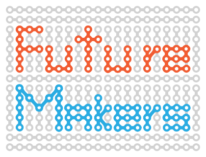
I declare incompetence on all things visual. I have to say that I find the draft a bit hard to read! Getting rid of the gray meccano pieces would probably solve the problem.
How can I attach a file here?
I have the svg, and all you have to do is change the opacity of the big white square. The other colors are based on the common bread board design but they can also be changed easily. However the size of the logo will also play a big role in legibility. What is the RGB of ER colors? Another option would be to base the logo on an image of a hand crafted version if you have a bb flying around. With the extra wide capital “A” I was shooting for a little inconsistency/emphasis, but I have no heart invested in any of the details here. This is the original bread board:

Color codes
I have them in this format: red is #F15C32, blue is #2AACE2, grey is #5A5B5D
It’s very generous of you to pick up on this logo thing. Like Alberto, I can’t comment because I’m not the one doing the work. Btw, you seem to have new skills every day ![]()
FutureMakers Global?
To differentiate it from FuturMakers Nepal…
1 Like
Definitelly hard to read, but the idea is quite nice. I’d love to see arabic written with these little elements;)
Nice one!
I like the logo, reminds me of bike chain, though A in Makers doesn’t have to be a capital letter.
In Armenian Ապագա Կերտողները seems correct. What do you think @zaraavi, @gratian, @Amalia Kamalian ?
In Russian Cоздатели будущего.
Cheers,
Anna
2 Likes
Anna
Of course it’s the correct form
I like bike chain!
Hm… perhaps if I have the time…
1 Like
Yes 
That’s a quite correct equivalent in Armenian, Anna.
1 Like
Adding another one to the mix

How about this one + the name in each language? I think this can work in black and white, as well as be set against different colour backgrounds (The file is modifiable). Btw if you haven’t already discovered nounproject.com where I found it, you now have yet another site to sink tons of time into.
What do others think?
3 Likes
like it but it doesnt say “future” to me
…yet. If one could fuse it with this:

Somehow, it would say “heartbeat” == “time” (almost future) to me.
Dang! The NounProject looks good - that’ll go into my mock-ups
1 Like
Like this
(Oh, yes, it’s a network, is it not? I am so predictable.)
Next versions
or

the background should be slightly different levels of gray but I think it is not visible in a browser. I tamed the font a little, but stuck with the A for legibility, changed colors and removed opacity.
Question is to what other sizes this should be adaptable? Here are some common options: https://dev.twitter.com/overview/general/user-profile-images-and-banners not sure what is best on this platform…
If you want me to try other changes just holler.
Also Noemi and others please do criticize or comment if you have the time and feel like it.
1 Like
Trying it on for size
Since a rough consensus seems to have formed around the basic motife and the text is now visually distinct in ER colours, let’s just roll with this. Thank you!