How do we interpret the Degree of interest graphs?

Playing with the newest version of the dashboard. I am unsure how to interpret this view (http://164.132.58.138:9000/#/dashboard/doi). This is the Degree of interest view centered on the post How Open Insulin works to open-source science and medicine by @dfko . The root node is the post itself, (bottom left, in bright blue). It elicited 16 comments, but only one of them – titled Yes! – is shown. Why only one? Why that one (it is neither the first nor the most recent)?

The comment is linked to the dark blue node representing its author, which is me. In turn, that node is linked to four more comments and three posts I authored. Again, why those and not others? The rest of the graph is connected to the root only through one of the other comments by me, (Interesting) which is a comment to a post called How to build a revenure stream to support your activities. This was authored by @Nadia , so it is connected to her node too. It elicited 15 comments, but here we only see one, and that was authored by @Noemi , so that it connects to the upper part of the graph.

It seems very arbitrary and cryptic at first sight. Can @melancon or @Jason_Vallet explain its logic?

2 Likes

I’m not sure either but…

I’m not sure either but this is very interesting and I’m looking forward to learning more.

Exciting!

Yes, @dfko , it’s quite exciting. We are combining ethnography and graph theory into a new research technique. We are still not nearly advanced enough, but if you are intrigued you can read this and compare @Amelia 's “pure ethnographic” reading of the data with my own network interpretation (as a non-etnographer) in the same thread.

You can also play with the data. I suggest starting here and filtering the graph for higher numbers of co-occurrences. Any feedback is of course superwelcome.

In a nutshell, the term “degree” is taken too literally

I did not touch that part of the view yet, only the neighbour display, so this is for now still the same as previously.

In that case, for the DOI, the degree of the nodes indicates their relevance/importance in the grand scheme of things. We found previously that nodes with a much larger degree than the rest (e.g., the moderators, a much commented post, or a popular tag) act like magnets by attracting the attention to themseves, resulting in what you see there. Basically, for whichever post, comment or user that is selected, and provided it is connected to the main component of the graph, the result will end up nearly identical with the “heavy” nodes out-weighting the others and stealing the spotlight. Here is the same event happening with the tag rural area:

For this example, research question and migration are completly out-balancing the initial tag, not due to their degree but because of their high number of co-occurrences (the metric used to find the interesting nodes).

So we still need to fine-tune this display. For now, we plan to force the addition of any immediate neighbours and then add the elements of interest, with an emphasis on content-content and content-tags relations (thus avoiding the consideration of users to identify interest). However, we may have to consider restricting some of the too-good-to-be-true possible matches to avoid the kind of situation discussed above.

Several questions here…

Thanks @Jason_Vallet … but I still don’t understand.

For starters, it does not look like I can select an ethno code, like you did in your comment. I can only select posts:

But even then, I don’t understand this:

because of their high number of co-occurrences (the metric used to find the interesting nodes)

I assume you use “co-occurrence” in our usual sense: a co-occurrence of ethno codes happens when codes are associated to the same contribution, which can be either a post or a comment. Each contribution’s number of co-occurrences is a k-clique, where k is the number of codes associated to that contribution. Since we are on a quest for collective intelligence, we normally focus on co-occurrence across entities. This is why we never look at the unfiltered co-occurrence graph; if we impose that the number of co-occurrences is > 1 we are sure that two codes will have been associated in at least two contributions. The number of co-occurrences can link any two entities:

  • link a post/comment i to other posts/comments j = 1, 2, ...n, j≠i with max (n_(i,j), where n is the number of codes co-occurring both in i and j
  • link a code w to other posts/comments z = 1, 2, ...m, z≠w with max (n_(w,z), where n is the number co-occurrences between w and z
  • link a person to another based on co-occurrences across the corpuses of the content they authored

But this is not what the view does. Consider my previous example. The post about open insulin has 16 comments. The view only selects one. And that has no codes associated to it (it is short and semantically insignificant). So, it cannot have been chosen by number of co-occurrences. In fact, no code co-occurs in both the post and any of its comments (see below). So how was this particular comment selected by the algorithm?

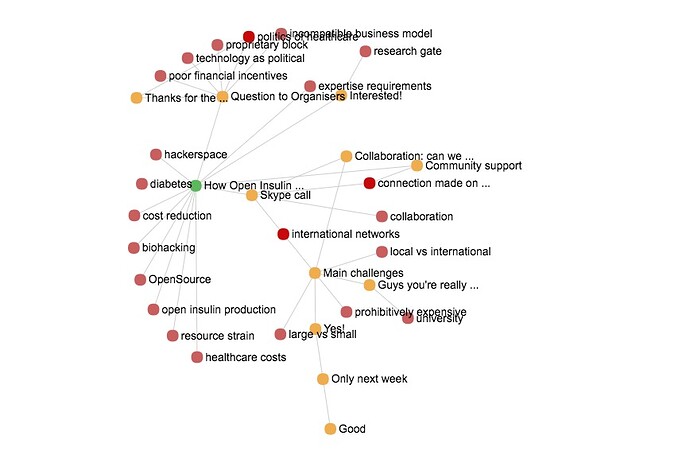
A much more simple view to interpret is the one called “neighbours”. It’s simply the post, plus its comments, plus the codes associated to both posts and comments. With this view, the first Open Insulin post by @dfko looks like this:

Co-occurrences of codes between the post and its comments are non-existent. Comments have not been coded with any of the 9 codes associated with the post. In fact, this graph is almost acyclical: only three codes (international networks, politics of healthcare and connection made on site) co-occur in two of the comments each. So, there is not much co-occurrence to drive the assemblage of the DOI view, let alone interpret it. The neighbours view could be interpreted as indicating the richness vs. coherence of the thread: more codes indicate a greater richness, more cycles in the graph indicate a greater coherence. But this information could just as well be conveyed by scalar indices. More in a further comment.
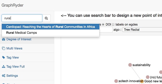
The tags should appear in the search field but sometimes do not; the page just needs to be refreshed to correct this. I know about it but I did not had time to look in details as to why is is so.

You are entirely right about the current behaviour of the DOI view. At the moment, I use two different graphs as basis: one which contains users, posts and comments, and a second one which contains posts, comments and tags. The first graph is the “old” solution which does not take into account tags and is more oriented toward a social network point of view where users are at the center (when you look for users in the DOI view, this is the graph the result is based on). The second graph is focused on content instead and is used for instance with the neighbour display.

What the DOI does is, starting from a node, find the best candidates around and beyond and add them to the selection according to some measure. Finding which indice or metric is appropriate is the current problem. As you have seen using the degree to grade the nodes is worthless as nodes with the highest degree will always out-balance the others. For instance, take a look at the resulting graphs with three different users as focus:

We have several nodes in common which are always present due to their over-whelming degrees in comparison to the rest of the nodes. So we are looking for a way to work around this problem. Note that the same problem appear when looking at tags, for instance:

The views are out-balanced by the usual behemoth research question, migration, case-study and community-based care, which, due to their high degree are deemed more interesting by the algorithm, thus ignoring other elements closer to the initial node.

So we are working on changing the doi view (and its name!) to something which is more focused on the content, and use co-occurrences and common innovations subjects (to a lesser extent) to find content related to the initial post/comment.

Removing research question and case study

Can we remove research question and case study from all of these views? They are different kinds of tags and will make the visualisations inaccurate. if there is a way to put them permanently in a separate kind of category, that would be excellent as this keeps coming up…

Harder than it seems

… because it affects the data model level itself.

To do this cleanly, we need to instantiate a new type of entity: let’s call them pseudocodes. They can be associated to an annotation, like ordinary codes, but do not constitute a semantic interpretation of the primary data. They are just a bookmark.

An annotation would have the usual fields (annotation_id, entity_id, entity_type, quote, tag_id etc.) but also a pseudotag_id one. You could retrieve content bookmarked with research question by a database search, but GraphRyder would ignore pseudocodes and build all views just with the codes.

If you think that some codes could be born as real ones and then become pseudo (or viceversa) in the course of the study, then we could implement a different solution: a Boolean field like pseudo in the code entity. The dashboard would know to include codes only if pseudo == True .

UPDATE: no, taxonomy terms are not a content type and we cannot customize them with extra fields. A workaround is a naming convention: for example pseudo:research question. Them we insert an IF condition in the code that discards all codes whose name begin with pseudo: . Not very elegant though.

@melancon | @Jason_Vallet : any thoughts?

Another solution would be to use browser or online bookmarks!

Notice how this collaborative, data-oriented way of doing ethnography is forcing you to clean up your way of working, You have to enforce logical consistency from an early stage. I think this is likely to be a boon (though it can be annoying).

Cleaning up

Fair enough! I’m going to eliminate the “case study” tag because I don’t think it does much work in practice anymore. It was an early idea.

I still like the idea of having a way to aggregate the research questions everyone is asking, because it really reflects the idea of collective intelligence that we’re going for here. How a community can shape the directions of research itself. Then later when we are deeper in the analysis phase I can go through them and see what kinds of questions mobilise people. I am open to ways of thinking about how to maintain the category without messing up the visualisations. It is such a heavy node that it makes significant changes.

1 Like

Ping Guy and Jason :slight_smile:

@melancon | @Jason_Vallet this is just a pointer to the comment above this. The issue of non-semantic tagging came out again in the consortium meeting.

Again only a superficial comment by me

I like the color coding in general.

As you get more complex clusters following the edges with the eyes can be kind of difficult though. So here is one proposal to address that:

The color of the edge could be taken from the node it leads TO. So if you have an edge between a red node and a green node, you can just look at the color of the edge next to the node in question and train your eye approximately into the direction the edge is going and look for the right color (green).

When your eye locks on a the green node you’ll still remember that you just came from the red one, and so you know the edge next to the node you’re looking at should be red. In effect this is like a color coded checksum.

Next thing is that you could help the eye find the connecting node by having the edge only color coded along its outer 1/3rd (other fraction e.g. golden ratio may be better, dunno). Back to our example:

You come from a red node with a partially green edge. Your eyes can can easily get the length of the green portion of the edge - and mentally extrapolate it by a fixed factor (e.g. x2). That is the distance at which you start looking for the connected node in the network again. Everything clear? I should have made an image. :confused:

How are the best candidates selected?

What the DOI does is, starting from a node, find the best candidates around and beyond and add them to the selection according to some measure

Sure. And the measure seems to be degree, even though you, @Jason_Vallet , are critical of this choice. But when does, and why, does the DOI select just one entity among the many candidates? If the starting node always seem to have exactly ONE link in the DOI. If it is a post it links to one of its comments; if it is a code it links to one of the posts that were annotated with it. Why only one, and how is it selected? Is it the comment authored by the highest-degree user (me or Noemi)?

rural areas  is used in four posts. The one with the most comments (this) is not displayed. Instead, the only one displayed is this, with only 4 comments against the other one’s 25. Why?

Take it the other way round

@Alberto and @Noemi and @Amelia who might find this thread of interest to them.

So you have the “Global view”. This one shows you everything we have, all the data extracted from the database: people, posts, comments – and tags which are actually not shown. I am unsure the view itself is worth anything.

The DOI shows you only a part of this whole space, but this time with tags. Why is it more interesting? A first reason, one guiding its design: it gives you a more readable view simply because it displays fewer items. But now, hey, since you only take a few of them, which ones should you show? THis is where the DOI trick enters the game, you compte some index, the DOI, that ranks items according to some focus of interest the user has, and make your pick.

Take it the other way round and tell us why you would be interested in looking at the Global view, one mixing people, posts, comments and tags.

We had noted requests such as the ones enumerated in deliverbale D5.1:

  • Distinguish “rich” posts or comments, those having a larger number of associated tags, and presumably being longer posts.
  • The notion of a “popular” tag (associated with more content) also came up as being of interest.
  • The number of persons involved in a post is an interesting statistics.

So this is what that DOI trick should help us locate in the data and bring upfront through this DOI view. The thing is you have to somehow turn this “richness”, or “popularity” into something measurable, and then feed it to the DOI underlying algorithm.

It’s not you asking us “tell me what I see”. It’s the other way round, like we did back in Stockholm and like I always tend to repeat, it’s us asking users “what question you ask and what answer you expect to find”.

As @Jason_Vallet will confirm, this is where this DOI thing is going. And yes, the view needs to be improved and it will.

  • For one, the name DOI view it totally cumbersome and meaningless for users.
  • The list of all available layotus is something that needs to go away as I already mentioned.
  • Entering a number in a text field to expand the selected subgraph is not user friendly.
  • If richness and popularity are the two main driver, we need to allow users to act on the se parameters.
  • Etc. <-- ADD YOUR [QUESTION ASKED, GUI FEATURE REQUEST] here
1 Like

Keep it collective

Thanks @melancon . A general point is that we need to know precisely how any graph was built if we are to interpret the result with rigour. As Fernando Vega-Redondo likes to say, “when you talk about networks, you have to specify what a link is”. So, I would like to know more of how we compute this DOI index.

A more general point is: I am not sure we should even have thread-level views. What can we learn from one such?

Let’s assume the best-case scenario: we look at a single thread that has all the co-occurrences that appear in the conversation-level co-occurrences graph. We can reasonably imagine we could use this highly representative thread as an entry point to the whole conversation. We could read the post and its comments, and immerse ourselves in a meaningful subset of primary data.

And yet, that would be far from the whole story. We are on a quest for collective intelligence. A co-occurrence in our imaginary “golden thread” is only important ex-post, because it also co-occurs elsewhere in the conversation. If it did not, it could just as easily be the quirk of some participant to the thread. Also, the single-thread co-occurrence graph would be flat; we would not be able to arrange co-occurrences in a hierarchy, and so tell the most salient ones from the rest.

For example, in the Open Insulin post (see above) there are exactly zero pairs of codes that co-occur more than once. Of course each contribution with n codes induce an n-clique of codes co-occurring on that contribution, but that’s it. I tried to explore a few more threads. For example, this is @Alex_Levene 's first Jungle post:

Here, we actually have one real co-occurrence: self-sufficient refugee camps and volunteer labour co-occur twice, once in the post itself and the other in one of its comments.

You get the idea. I think there is not much point in having graph views on single threads. There is not much point. If it were up to me, I would simply delete the tab, and focus on building views that help analysts look for the signature of collective intelligence. “Collective” is the operative word: it means the data have to come from the whole conversation.

Still, I see a potential application for the work behind the view. If we can compute indices that represent “richness”, “coherence”, “interest” and the like, we can use them to recommend a point of entry into the conversation. Suppose I come to an already coded opencare conversation. I am interested in data in medicine. I discover a code called medical data. This is what I am interested in! At this point, I could get a list of threads that are associated with that code, with their richness/interest/innovation/whatever score. This would save me time by letting me zero in onto the most relevant content associated with my area of interest. The score could just be added to the list view:

What do other analysts think? @Noemi | @Amelia | @Federico_Monaco

I am also responding to your other question, but I believe this one can be answered quicker.

The neighbour display allows to show a full thread and all of its ethno tags. This is important to find innovations in the discussion. Using your example:

self-sufficent refugee camps and volunteer labour are important but these topics are already mentionned in the original post, meaning that the OP is already aware of this information.

What is more interesting here are the active participation and temporary housing tags which have both been mentionned twice by other users. The other tags only existing in single comments may not be of much importance or may only be wild ideas, but, from a collective intelligence point of view, having two (or more) different users proposing related ideas give some weight to it. This is what @Amelia and @melancon meant as innovation in the discussion (or am I wrong?).

Maybe I should have put it into another tab to differenciate things a bit more?

Concerning the idea of indices to give characteristics of comments/posts/tags, I am all for it.

1 Like

Innovation

The notion of innovation deserves its own thread. I have not even touched it!

sketching a model to detect collective intelligence e-tivities?

I love such threads because go deeper in the questions of research and need of constructing common goals and ontologies.

Of course, i have not a magical receipe, but i can put my two cents in.

I suppose would be worth to build a shared (transdisciplinary) heuristic model in order to understand better in first place what to mean by intelligence in a collective setting and collective intelligence (pp.13-14 for instance); i talk for my side- i would look to former research about collective actions with collective meanings (on my side Hutchins’ Cognitive ethnography might be a good start with computational models to explore aspects of cultural process).

Maybe discussing about a possible model (could even be a simple check list to be used by all to detect better what is being researched)  in Geneva could be one of the goals for the MoN session.

Quick drive-by quibble

If you use “radial tree” representation (but even more so in others) you often get horizontal lines with the text overlaying the next node.

Perhaps one you force an offset of zig-zag if for horizontal nodes, to avoid that?

This is really getting impressive here! I love to see it evolve.

Another question would be how much trouble it would be to replace the (char) annotations with pictos and thumbnails of the posts. Visual memory may work better in some cases - and visual info processing is much faster than by text.

1 Like