The OpenCare project is about how communities provide care, and how that role will change in the future. It’s not about incremental improvements to the existing state-controlled, centralised care infrastructure. It is about autonomous groups developing their own systems of care, using approaches that are sensitive of local contexts and cultural norms - a “deeply human approach”, as Nadia puts it.
I’m doing a PhD looking at communities on Twitter - mostly communties around towns or cities - but in this case I’m going to be looking at various interconnected communties building innovotive, open and decentralised systems of care. My approach is to start with Twtiter users who I know are core members of a communty, and then ‘spider’ out from them - who they talk to, who talks to the people they talk to, and so on.
I’ve started with communities that I’ve found about open source health tech and development health issues, in part using data from here.
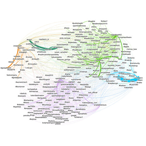
The diagram shows Twitter users, hashtags and the links between them . Twitter users are considered linked if one mentions another, a Twitter user is linked to a hashtag when they use the hashtag. Thickness of the line indicates the number of links, and the colours indicate automatically identified ‘communities’.
The complete network consists of around 60,000 nodes, however, here I’ve shown only those which are connected at least 4 times.
The purple network is focused on open source prosthetics, with openBionics at its centre. OpenBionics are making open source prosthetic hands.
Orange and Yellow are more focused on international and development health issues. Blue shows lots of makerspaces, with WeMake, who are partners on OpenCare, at the center. This occured organically.
Open health software is green, which, perhaps surprisingly, is closely assoicated with the UK’s National Health Service, through the openMAXIMS software. This connection may not be as important to the overall community as the diagram suggests, as more data accrues it may fade into the background.
At this stage, the Edgeryders and OpenCare participants haven’t been added into the network. That data is currently being gatehred, and it will be interesting to see how the project fits into the overall ecosystem.
Over time, I hope the OpenCare project will be able to use this data to invite people to workshops, discover missing links, and deepen the connections between the different communities. It may even be possible to observe increased interaction between the different communities in diagrams such as the one presented here.
This data is provided in spreadsheet form here, sorted into categories. I will be keeping this document up to date as more data is gathered.
I’m sure there are lots of missing Twitter accounts, so let me know if there is anything you think should be added.
